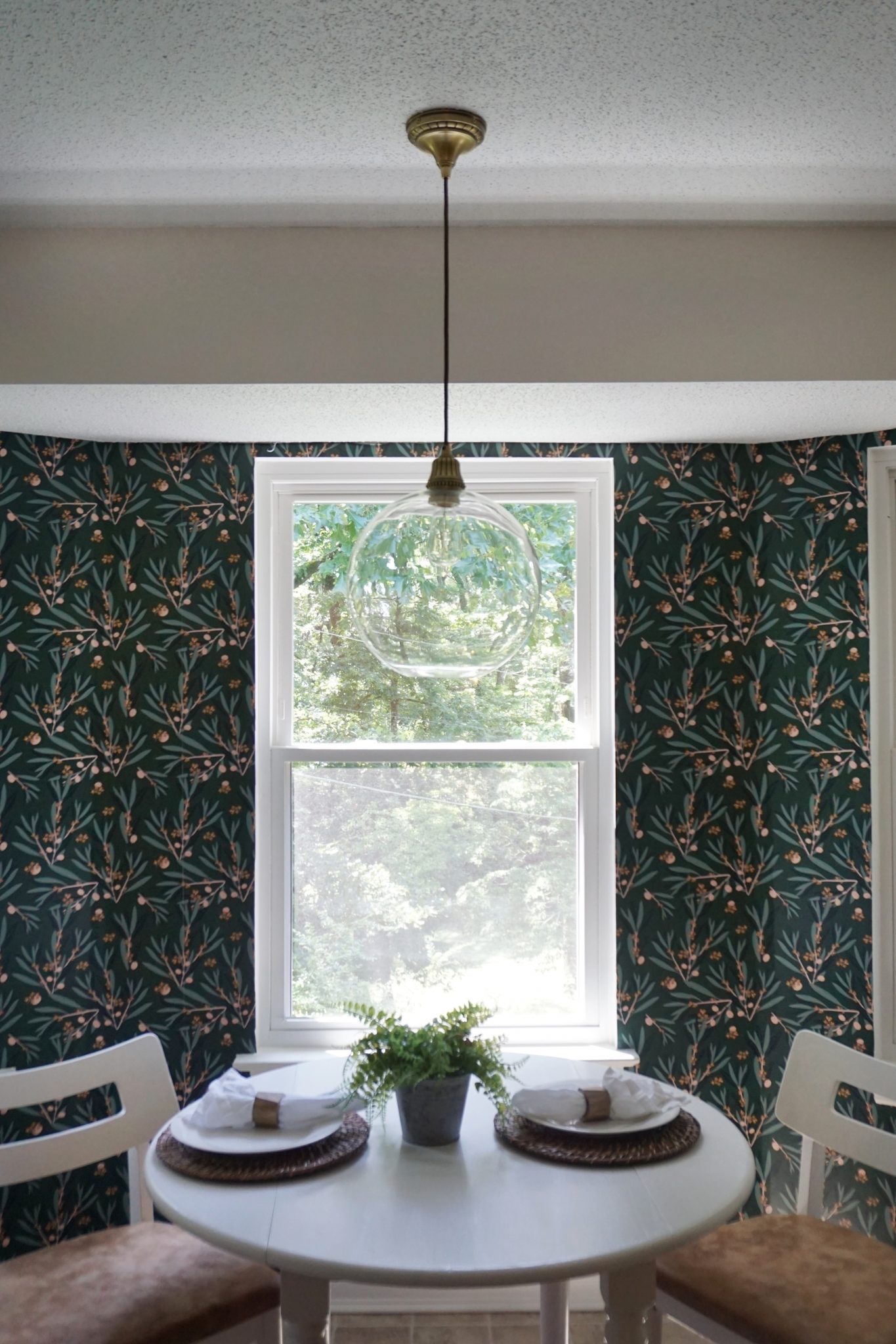
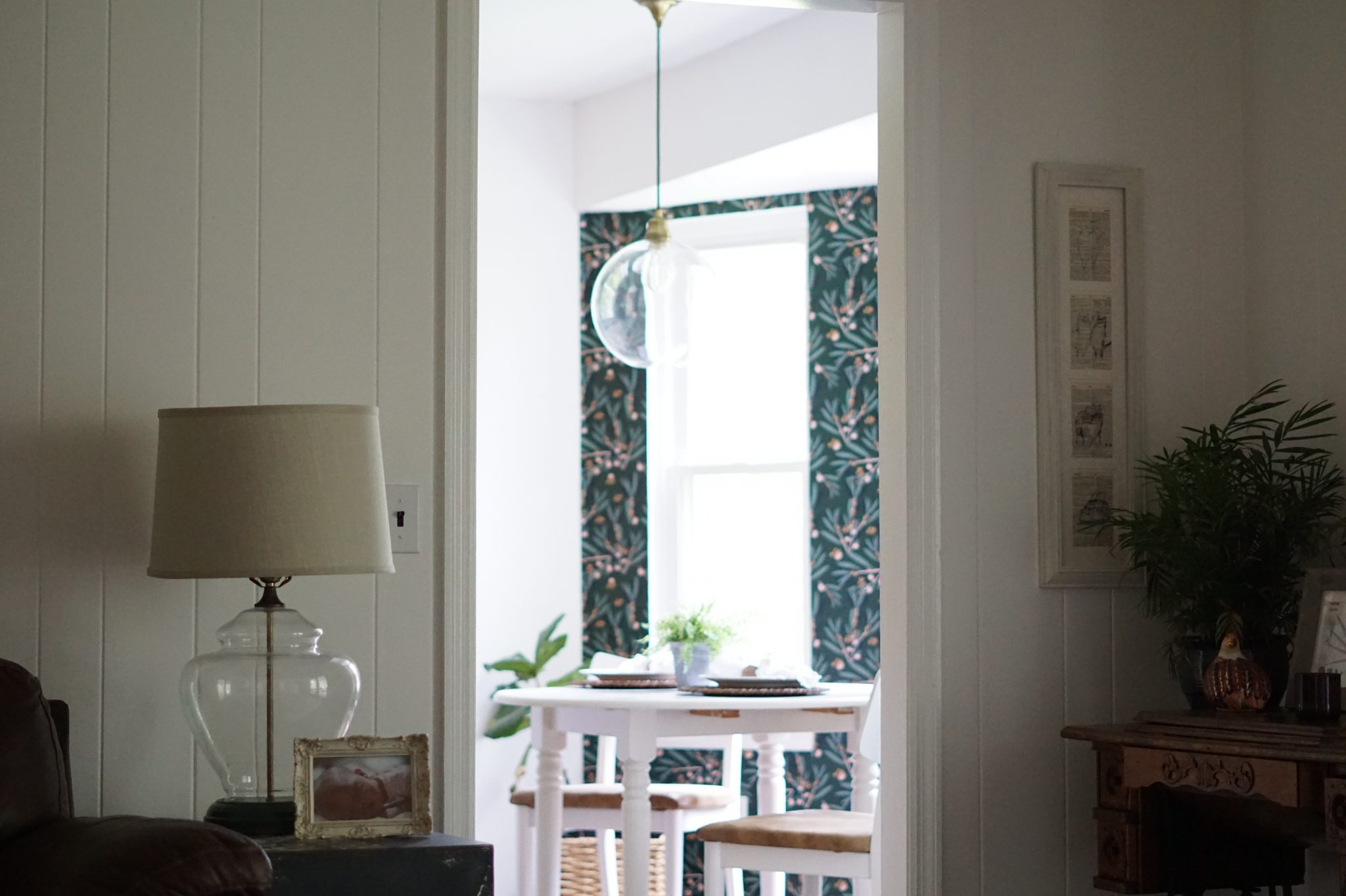
This little nook in our home could have easily been overlooked, but I refused to let that happen. The large windows not only let in the most light in our house, it is painted in trees from our foraged backyard. I saw potential in this cozy little space, and I’m so glad I climbed outside of my design comfort zone on what is now my favorite corner of the house.
(Some links are affiliated for your ease of shopping. The wallpaper was provided by Milton & King. All thoughts and reviews are my own.)
Let’s take a look at the before, shall we? I like to call this Phase I of our kitchen remodel. It’s at the end of our galley kitchen but the beginning of the crisp, vintage, boho vibe (it’s a weird combination, and I’m crossing my fingers it will work!) our kitchen is about to have.
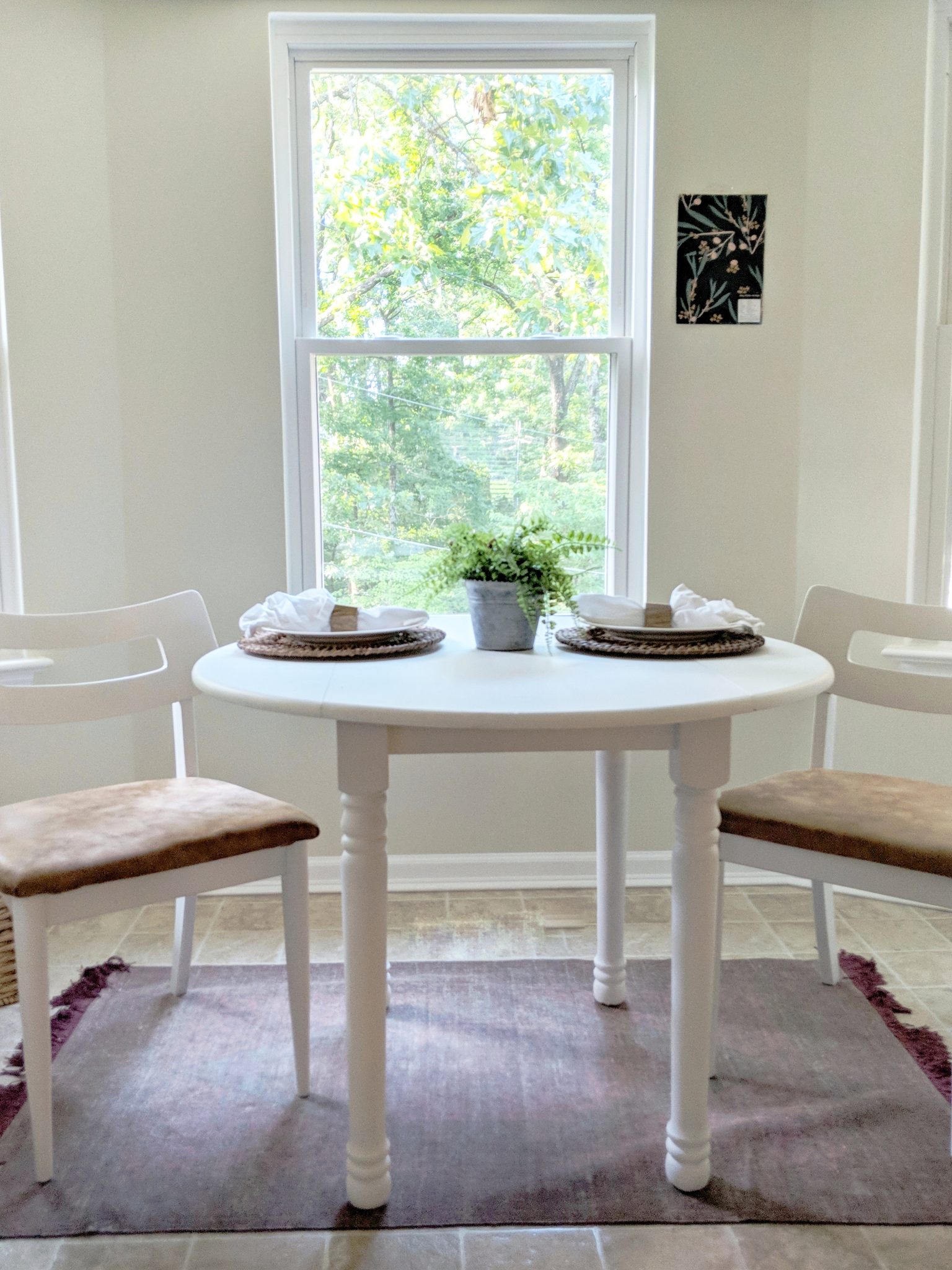
The space was a blank slate with beige paint and a standard nickel pendant, but all I could picture was a whimsy wallpaper enveloping the windows. I couldn’t get the idea out of my mind, so I reached out to Milton & King for some inspiration. I scrolled through their beautiful designs, but I had a hard time fully committing to any of them at first, because we all know that committing to wallpaper is like choosing the name of your first born. Then Olive Dapple happened!
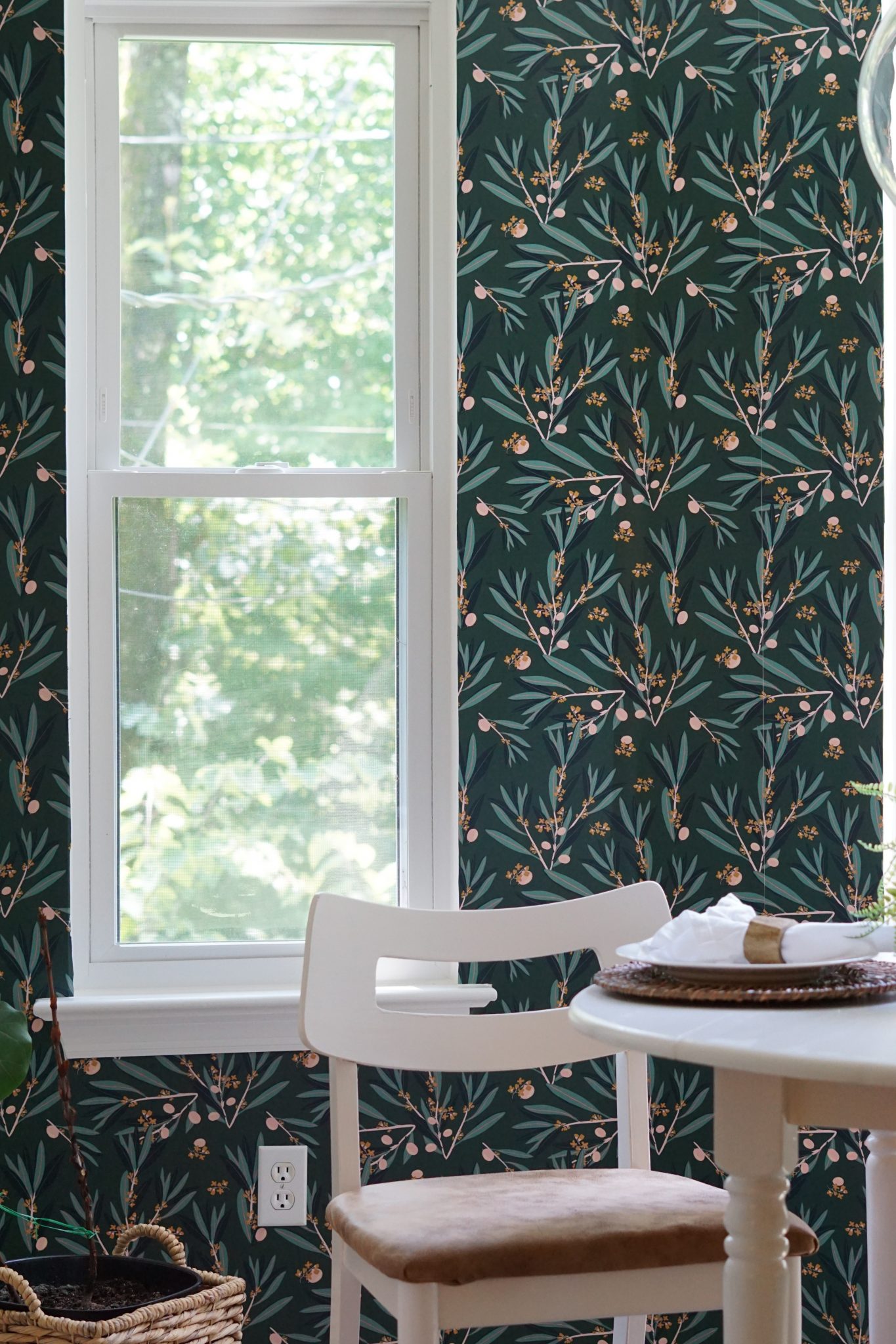
Wallpaper is Olive Dapple in Laurel Wood by Milton & King.
Get This Look!
It fit the feel I was going for and just clicked instantly. It also helped that it has my daughter’s name in it. I’m a sucker for all things olive…except eating an actual olive. I’ll go into more detail about the installation in a coming post. I’ll keep you post on Instagram or in my newsletter, so make sure you’re following along!
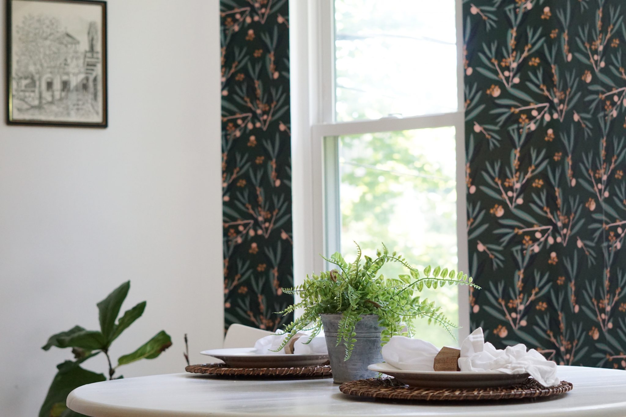
I started by painting all the walls, except for the soon-to-be-wallpaper walls, the same white as the rest of our main floor, Polar Bear White by Behr. This gave the space a cleaner, brighter feel than the former yellowy-beige.
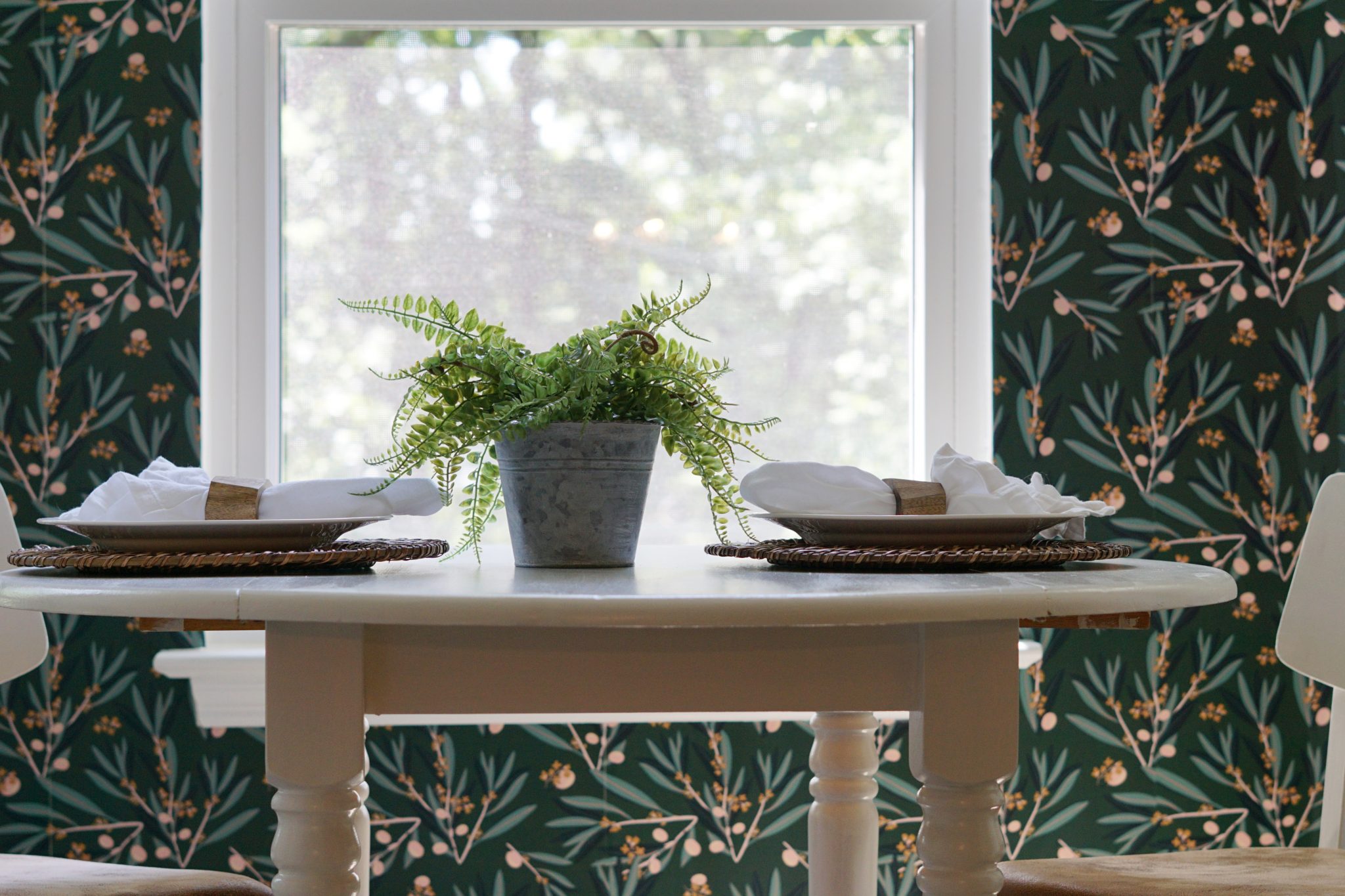
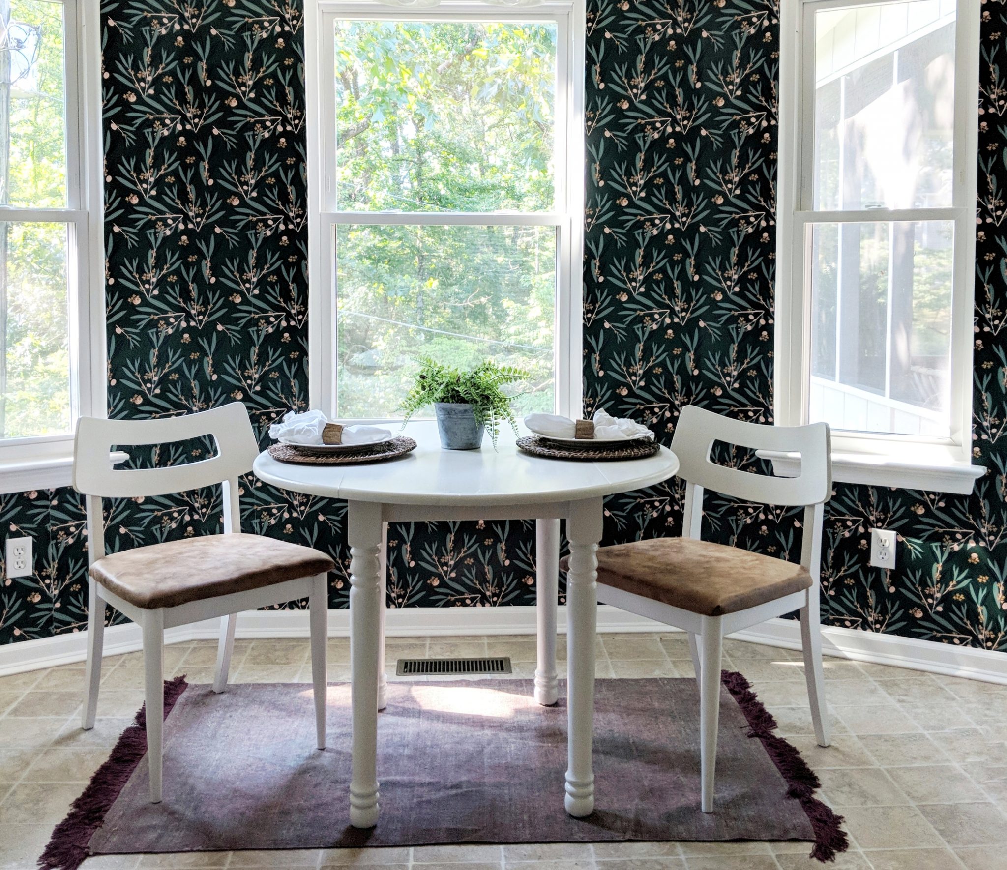
Next, I got started on the table and chairs. The table is a sentimental piece. I found it in the dumpster at the apartment complex we were living in a few weeks after we got married. I finished it by staining the top and painting the legs a dark gray. Since this dumpster table will be with us for the rest of our lives, it needed a refresh in order to fit in the space. I also found the mid-century chairs at a thrift store for $10! Each piece got a fresh coat of homemade chalkpaint in Polar Bear White with Country Chic Paint’s Clear Coat on top. I recovered the seats in a faux cognac leather from Hobby Lobby.
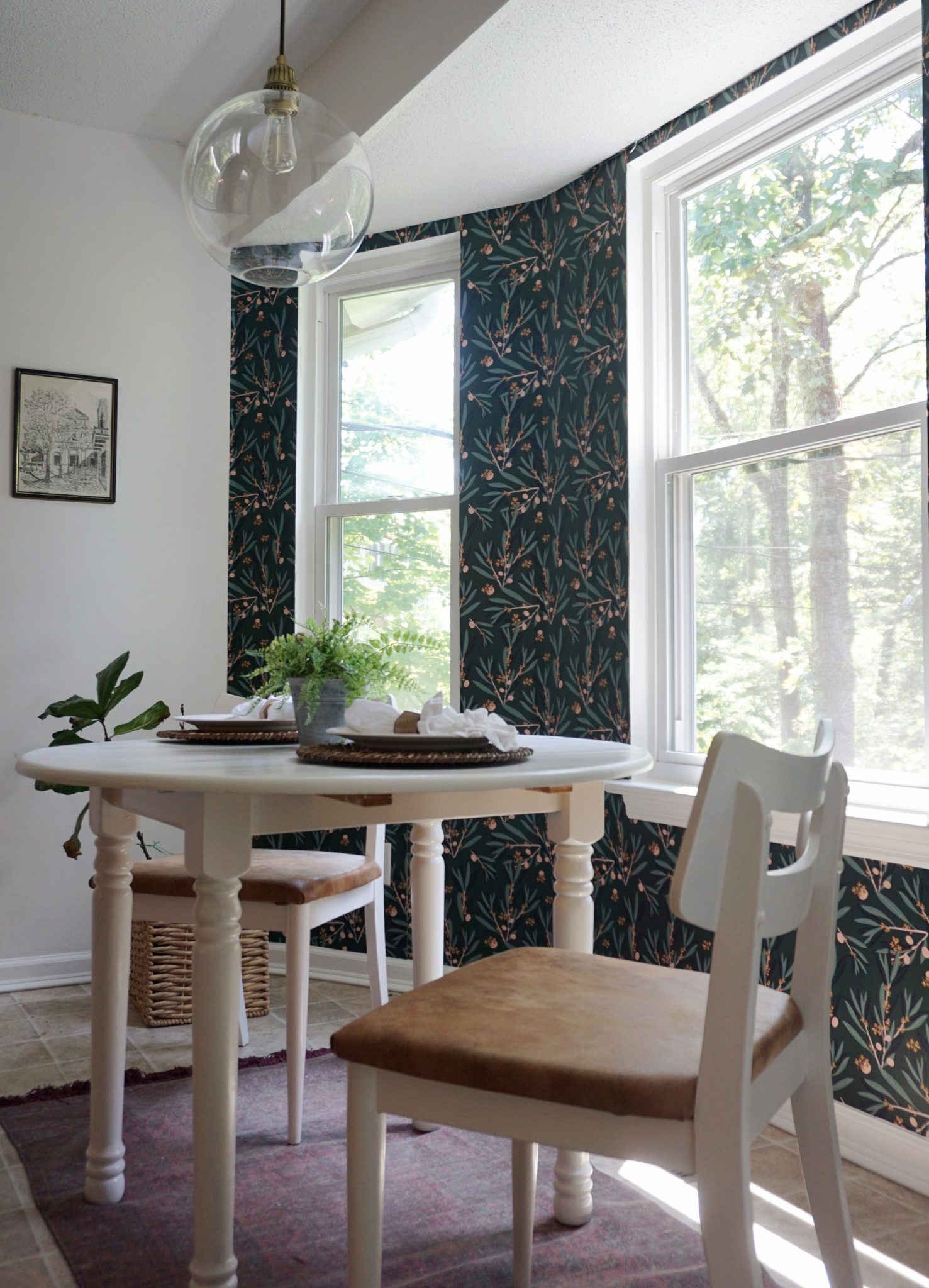
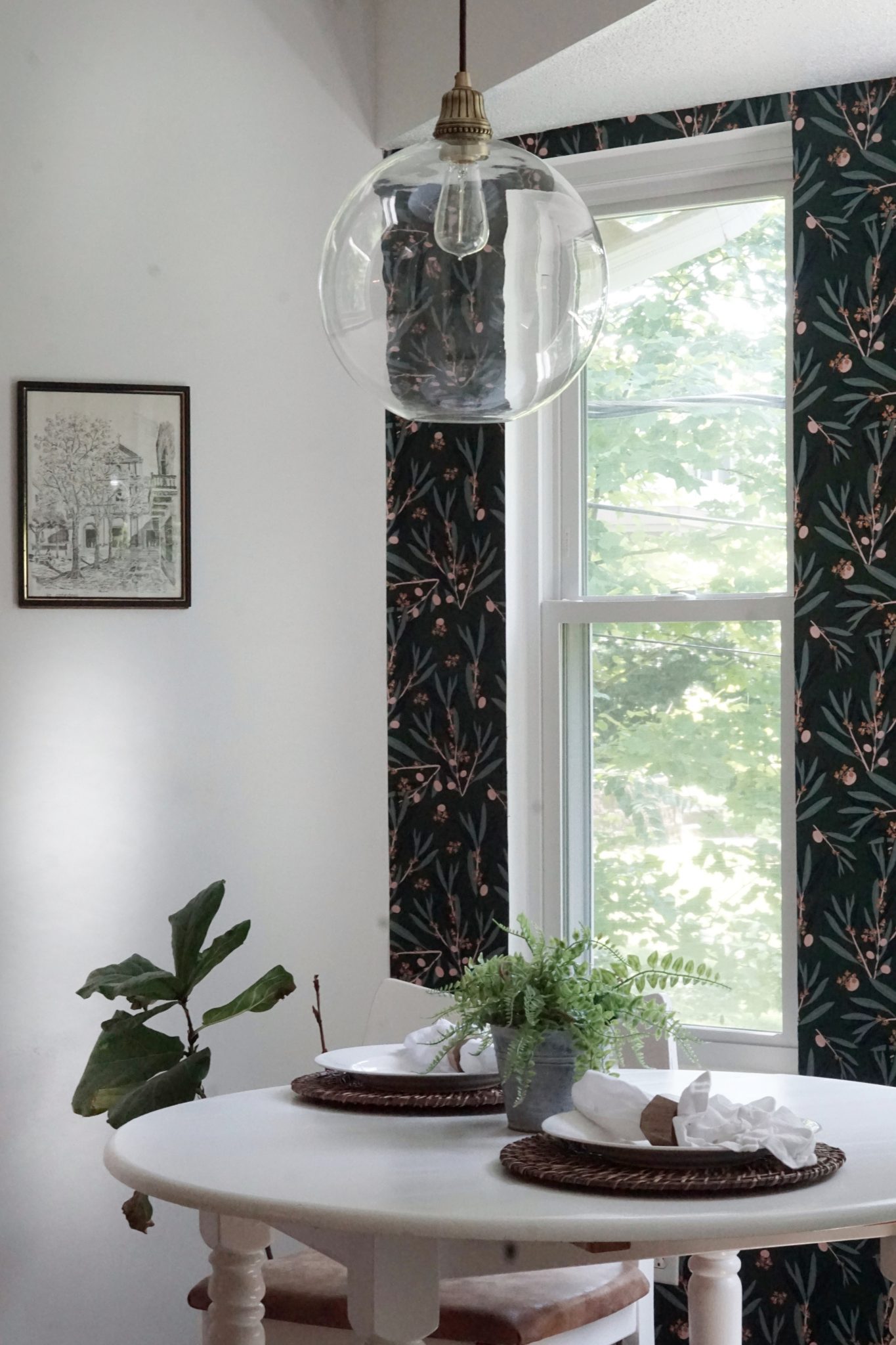
The light fixture stumped me. If you follow along on my Instagram stories, you would have seen my plea for help in choosing the right type of fixture. Knowing that the wallpaper was going to be busy, and I didn’t want to block the view out the windows with a large, solid light, I went with a large glass bulb. I found this one in the romantic cord brass at Pottery Barn on sale (it’s on an even bigger sale now!). It’s EXACTLY what I was going for without even knowing it.
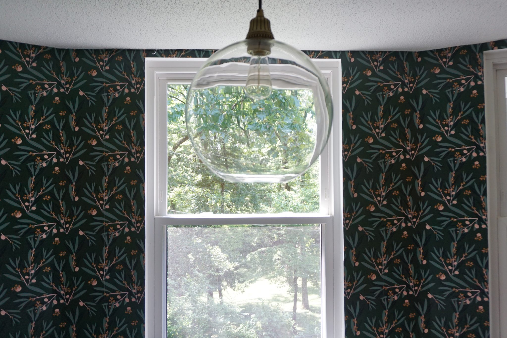
Now that these whimsy design visions are actually in my home, I couldn’t be happier with how it all turned out. This space makes for the coziest little spot to enjoy my morning coffee with a good book (like that actually happens with a 1-year-old!).
Will you come have a cup of coffee with me in my new, cozy little nook?
Sources
Wallpaper – Milton and King, Olive Dapple – Laurel Wood
Pendant – Pottery Barn – large, romantic cord, brass
Print – Thrifted (Similar – Minted)
Chairs – Thrifted (Similar – Amazon)
