I’m outside of my comfort-zone, yet it feels so right. The design process for this kitchen has challenged me to “just go for it”. Why not, right? That’s what everyone keeps telling me.
I’ve coined the overall design of our galley kitchen as “Old Meets New”. There will be vintage touches with the lighting and color choices, but the backsplash, open shelves, and prints will bring in a fresh, modern feel. Here’s a glimpse of the BEFORE.
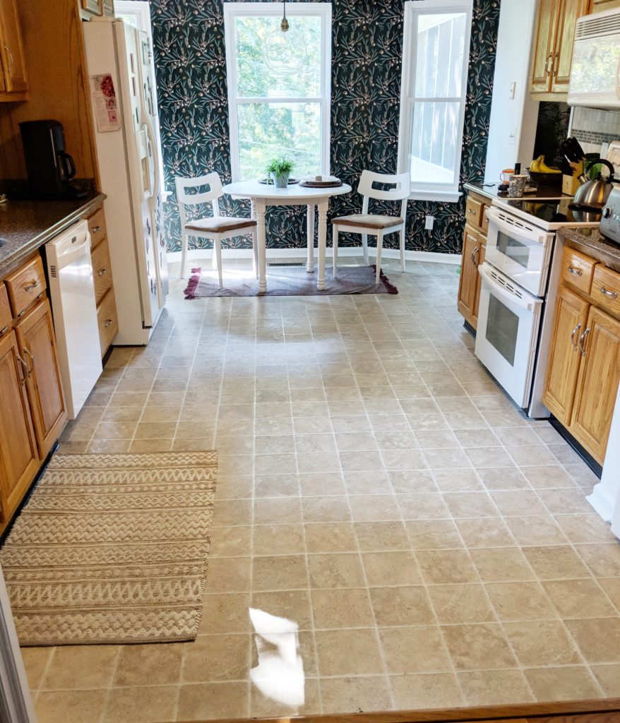
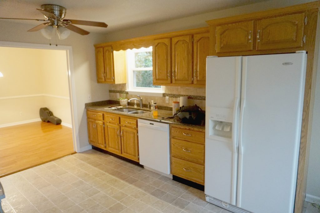
My initial thoughts were to paint the cabinets white and go with a classic, beautiful, yet very safe design. The more I searched and gathered my ideas, the more I wanted to try something fun, daring, and just as gorgeous as my white kitchen obsessions.
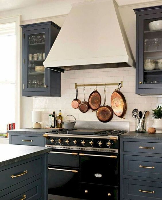
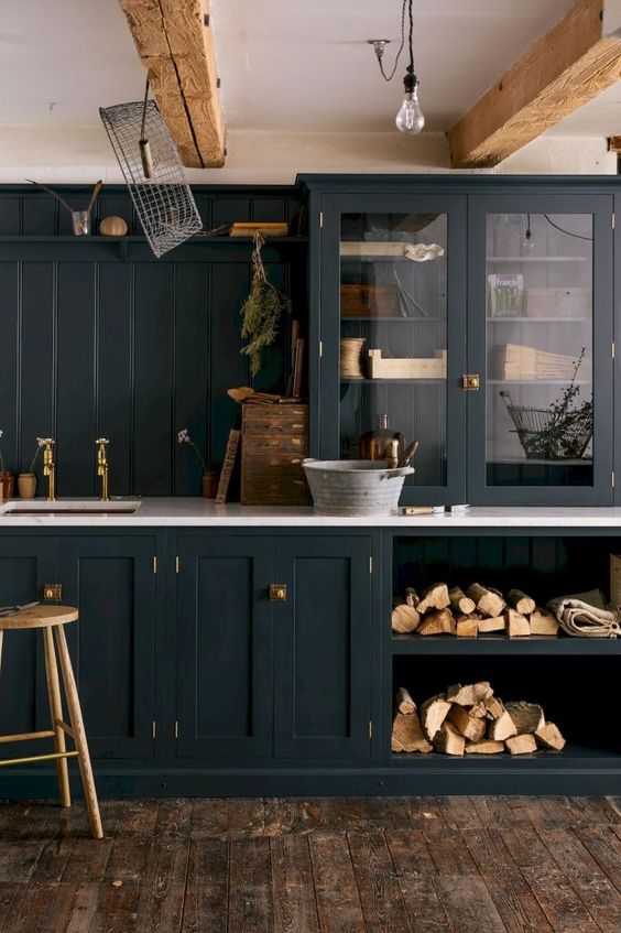
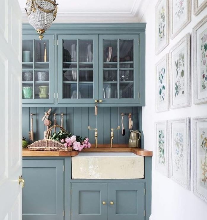
Ever since we moved into our new home in December, I’ve been wanting to use a teal/green/blue in every room. You can even see my overall house mood board here where you’ll see this moody-bohemian color as most of my inspiration. I couldn’t ignore this desire to continue with this theme especially after seeing this picture from House & Garden UK. I’ve also included a few of additional inspiration pictures that set the mood for my dream kitchen!
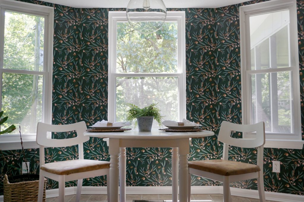
Phase I is already complete! You can check out the Breakfast Nook Reveal with the Milton & King wallpaper, globe pendant, and refinished dining set HERE. The wallpaper was the boldest and most challenging part of our kitchen. Wallpapering a curved wall with three windows can really test a marriage, but I’m completely smitten with how it makes the little nook more eclectic and appear larger, even though you might assume the dark paper would make it look smaller.
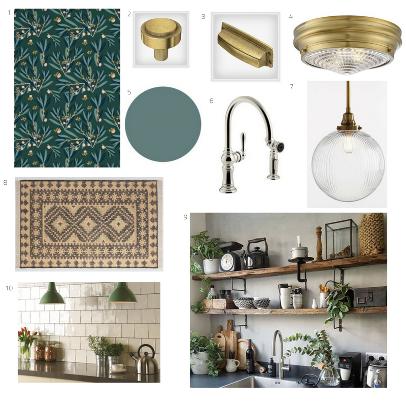
Now for Phase II, I have almost every detail figured out except for the rug. I can either go with a jute rug with a pop of black in the design for a more understated neutral look, or I can go with something a little more bold with the printed kilim rug.
Let me know which one is your favorite!
Option 1 – Neutral Jute
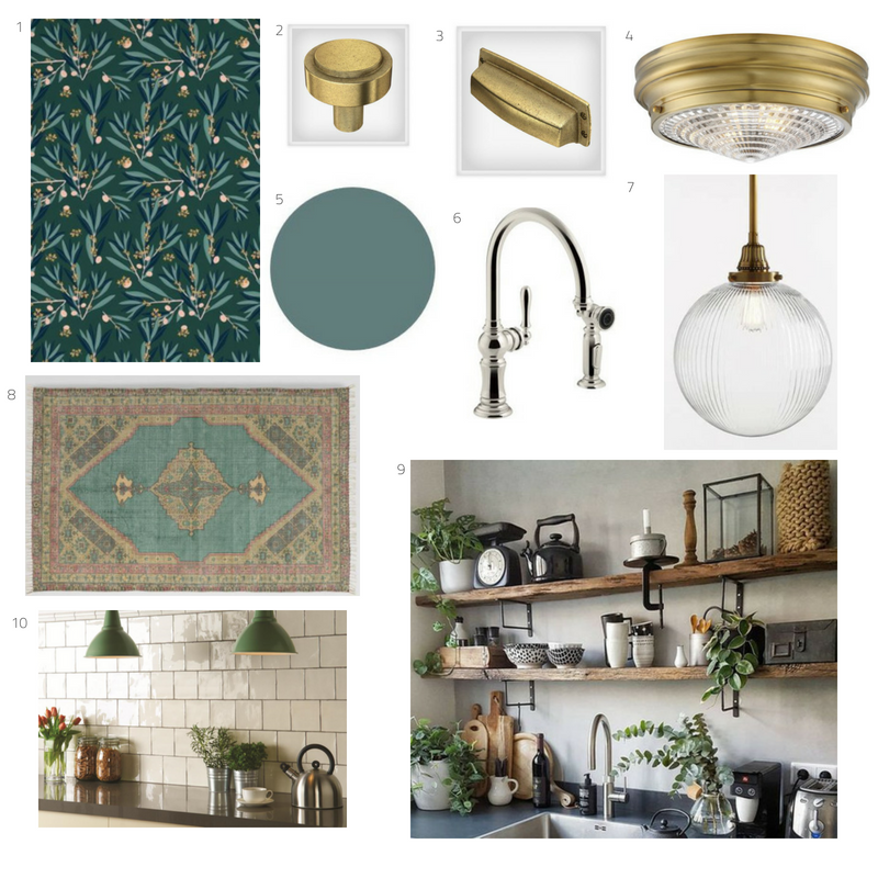
1// Wallpaper 2// Knob 3// Pull 4// Flushmount 5// Cabinet Color 6// Faucet 7// Pendant
8 (above)// JUTE RUG 8 (below)// KILIM RUG 9// Handcrafted Tile 10// Open Shelves
Option 2 – Bold Kilim
Design Details
Cabinet Color // I’ll be painting the cabinets with Country Chic Paint’s clay-based paint in Wanderess. It’s bold yet neutral and unexpected yet charming.
Open Shelves // The upper cabinets surrounding the window above the sink will be removed and open shelving will be put in its place. I will be using a light natural wood with simple black iron shelf ledges.
Backsplash // I’m in the market for a hand-crafted 6×6 porcelain tile. I’m willing to splurge just a bit on this since it will be covering most of a bare wall and will be the neutral, classic piece in the room.
Metal Finishes // To tie into the connecting dining room, I chose warm brass light fixtures and also went with warm antique brass hardware for the cabinets as well. I love the look of brass and a dark green teal together! The only “appliance” or current kitchen fixture I’ll be replacing at the moment will be the faucet. I’m going with a classic polished nickel fixture that will bring in a timeless feel and coordinate nicely with the brass.
Flooring // The linoleum floor is staying for now until we install hardwoods throughout the upstairs in a few years. Until then, a large area rug will cover the majority of the floor.
This is where I need your help! Should i go with the JUTE option or Kilim? Let me know in the comments below.
 //via
//via