Entryways not only welcome friends and family into your home, they also set the mood for the rest of your house. With my lonely, wash-out, plain entry, it did everything but set the mood for my home’s mood and style. It needed love and a modern eclectic twist, and we gave it just that!
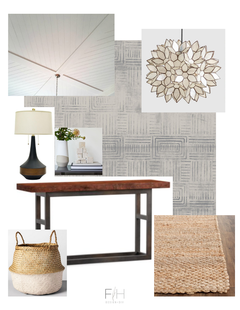
The Before + Mood Board
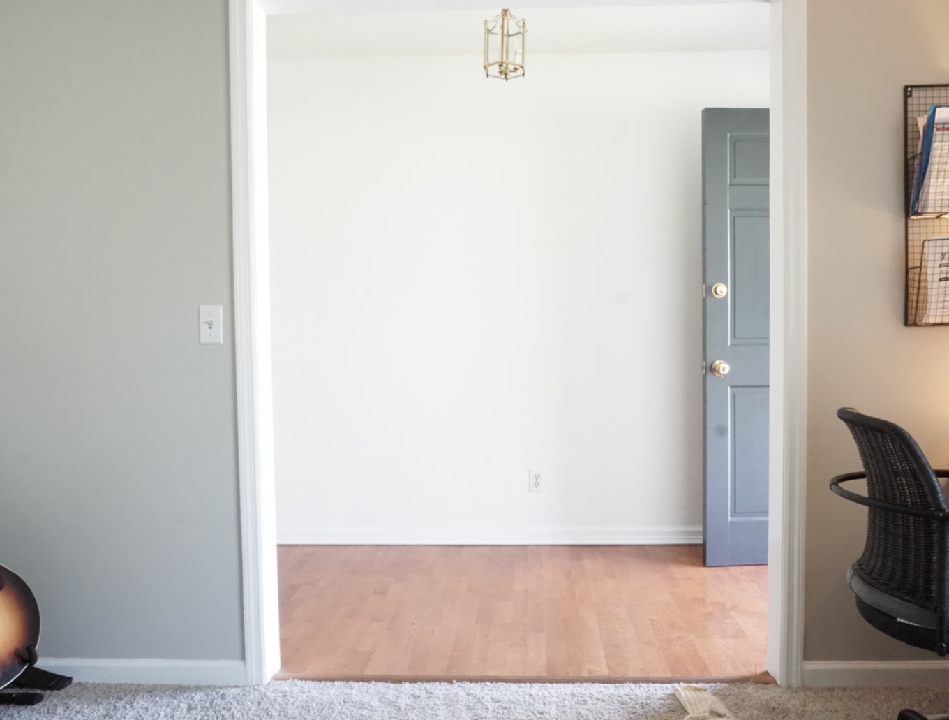
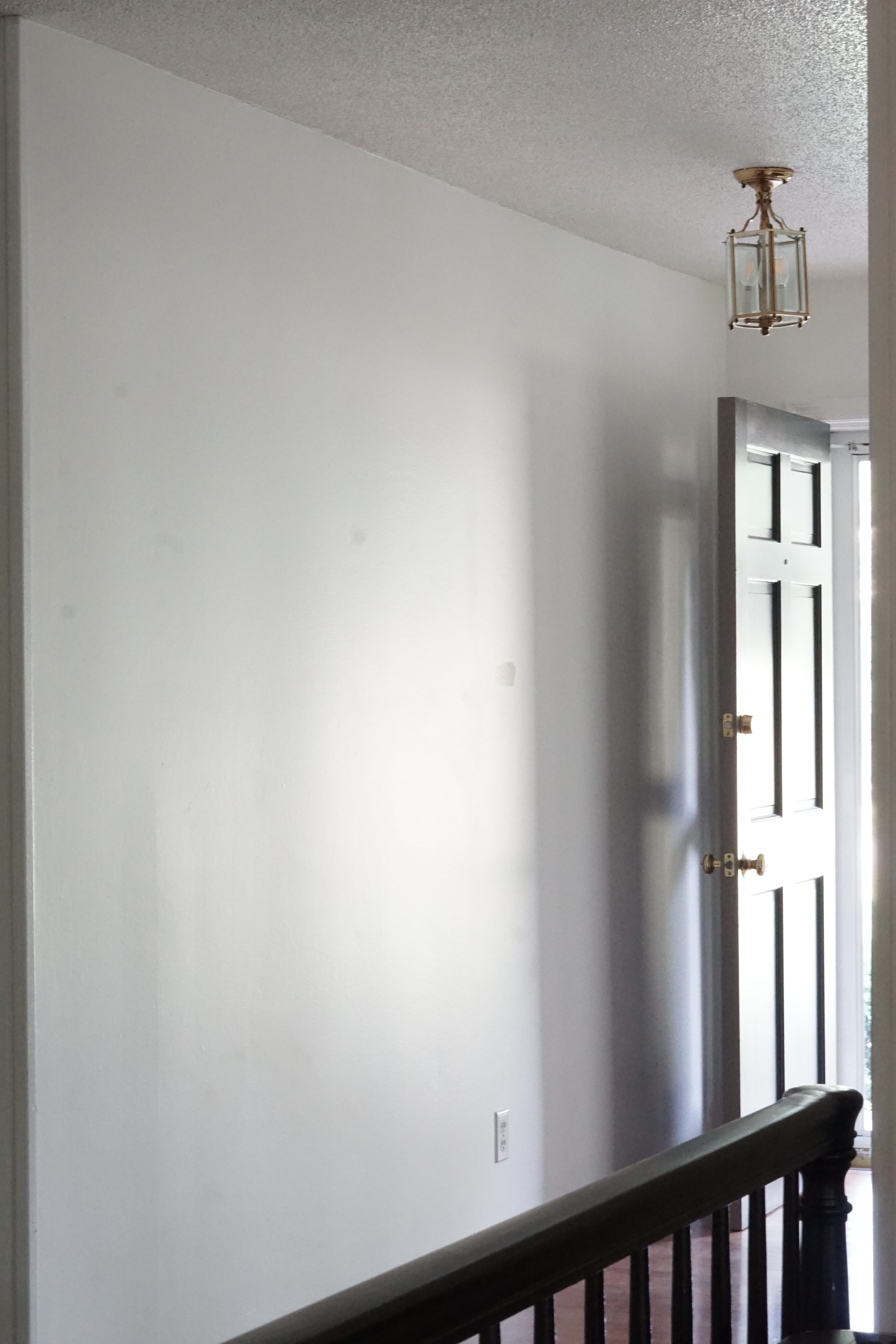
As I’ve mentioned, this space was bare. Other than painting the interior door and throwing down a rug, I haven’t touched this space since moving in a year and a half ago. I wanted to do it right and give it the time it deserved, so it kept getting put on the back burner.
(True Before & After’s are at the end!)
I shared my design plans in THIS POST. Some things changed, but for the most part, I stuck pretty close to the original plan. This isn’t always the case for my mood boards. I usually put together a plan and change them a bit as I go.
The Design Process
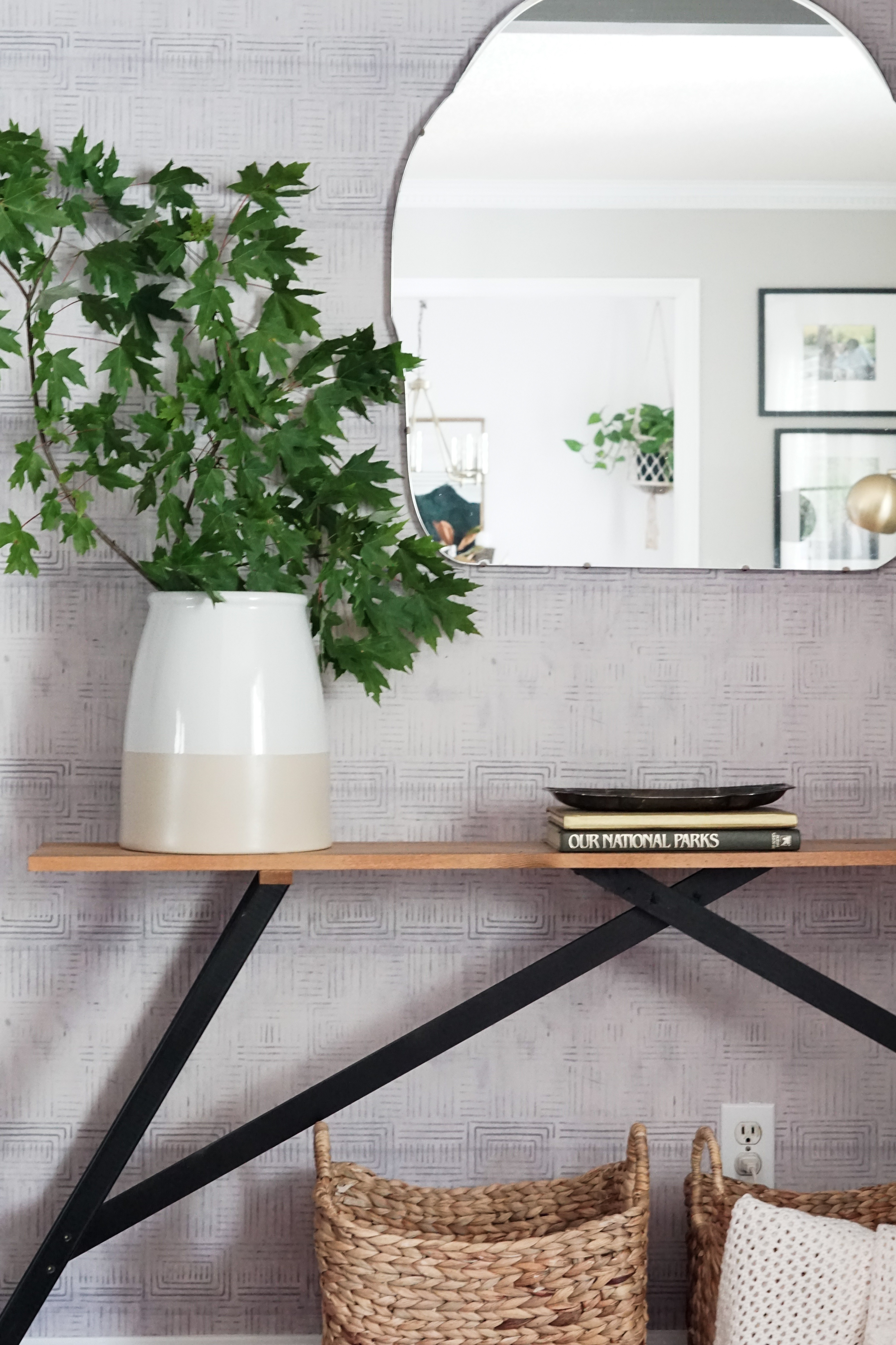
The Table
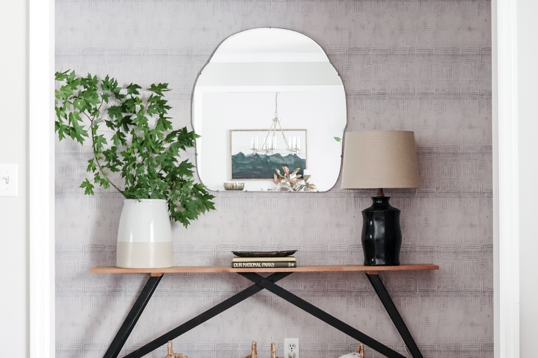
I started with building the entryway table. I decided to build it for two reasons: 1/ it’s more budget friendly 2/ I needed specific dimensions since our entry is only 4.5′ wide.
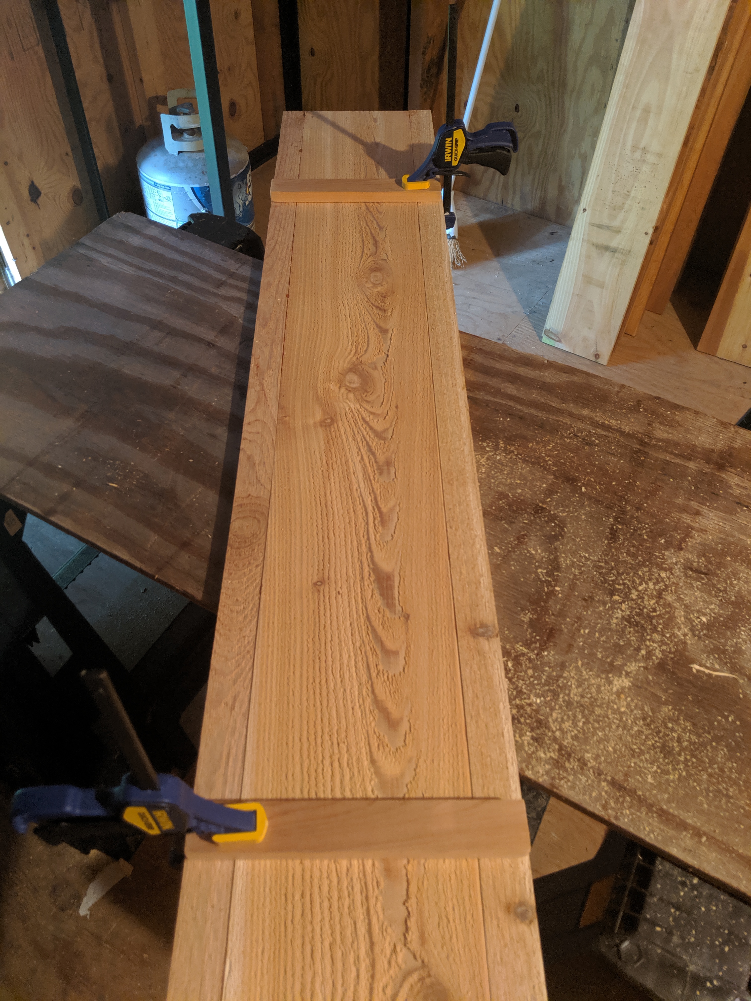
I was inspired by I Spy DIY’s table, and mostly followed the plans but customized the finished product to suit our needs and style. I will probably do a full tutorial since I tweaked the plans.
The Planked Ceiling
This project, by far, was my favorite. It dramatically changed the look and feel of the space. We so often forget to look up when designing a space. Adding an architectural element can transform a room.
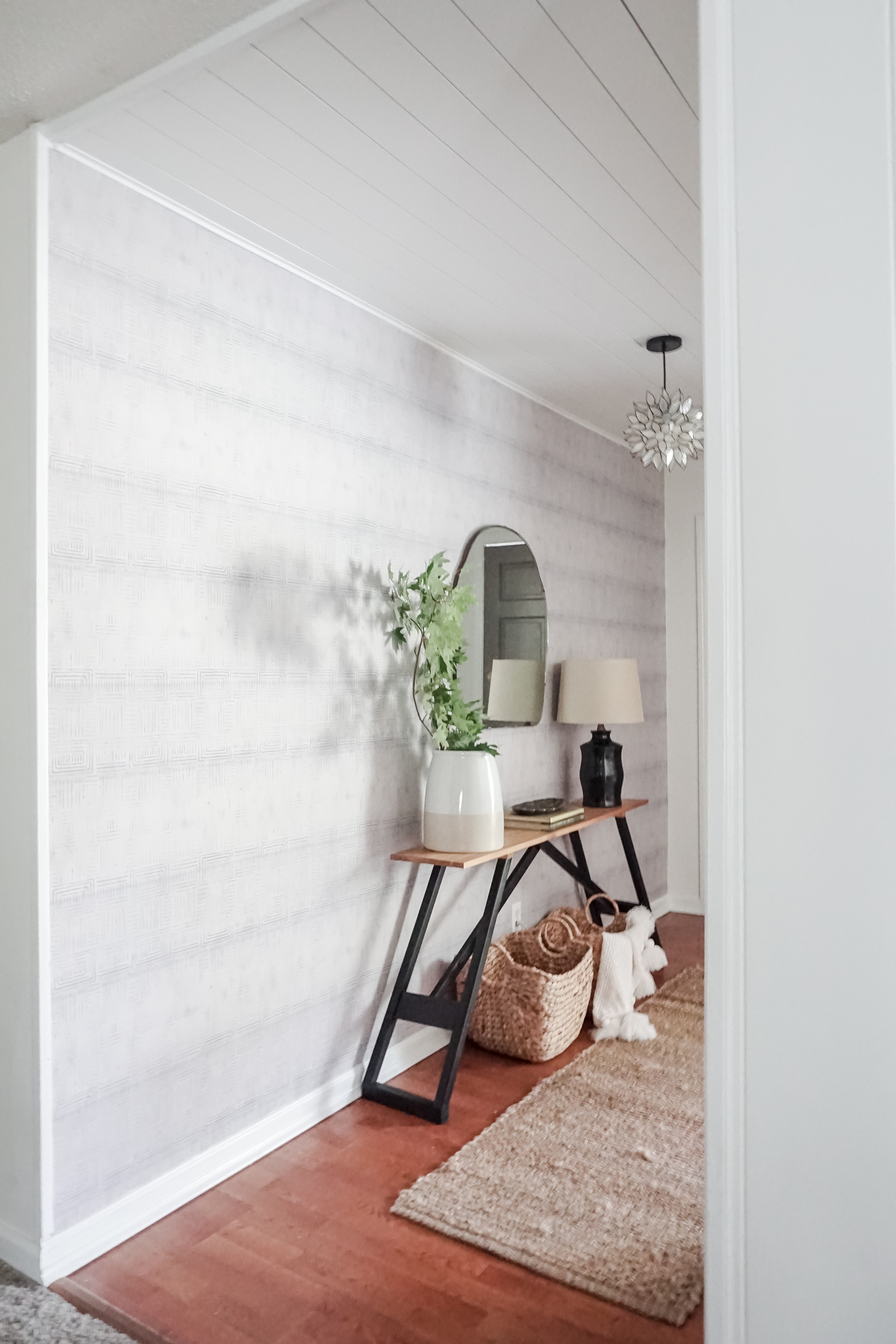
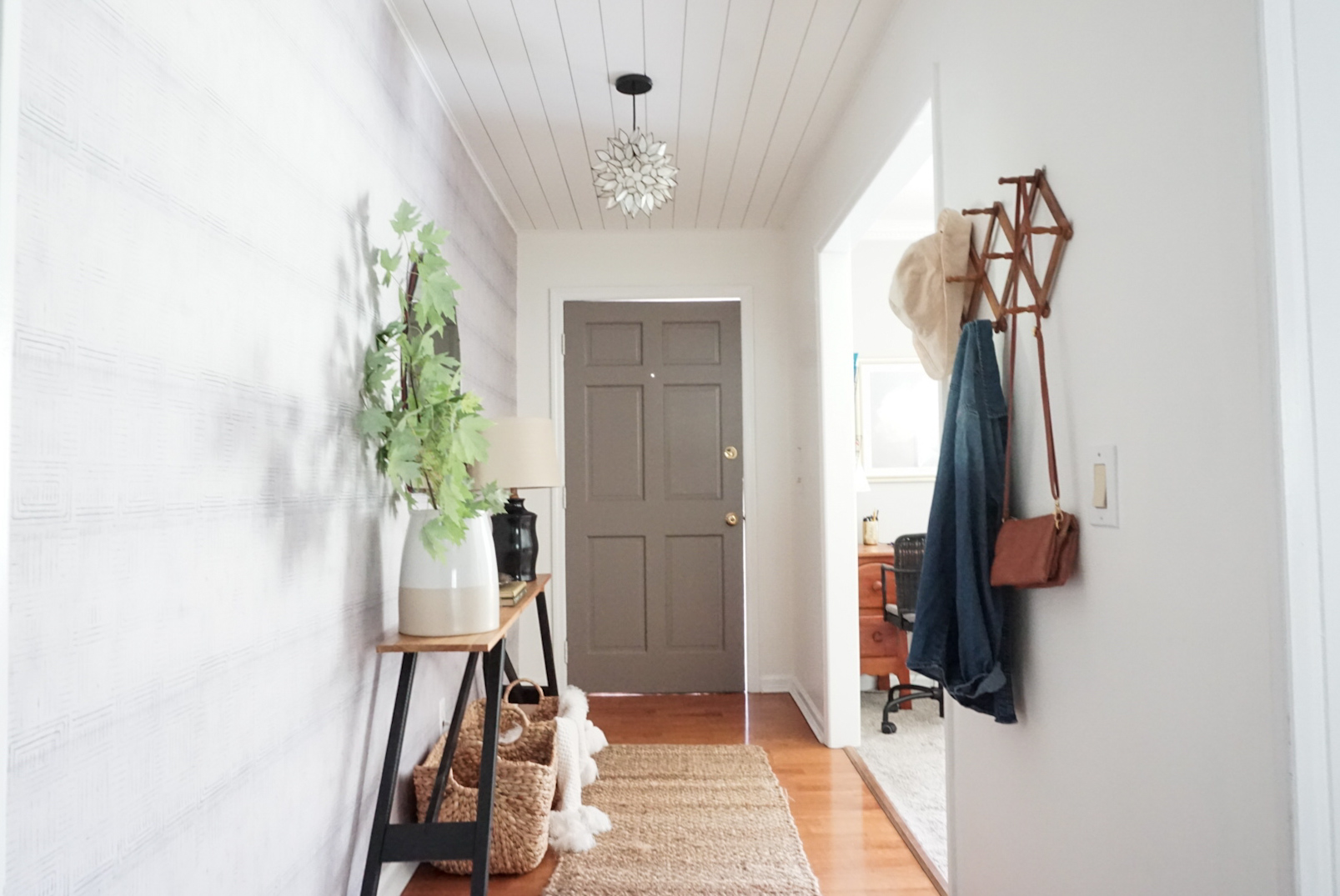
I went back and forth on whether I should install the boards vertically or horizontally, and I’m so glad I went vertical. It not only saved us money and made less waste, it makes the space feel much larger.
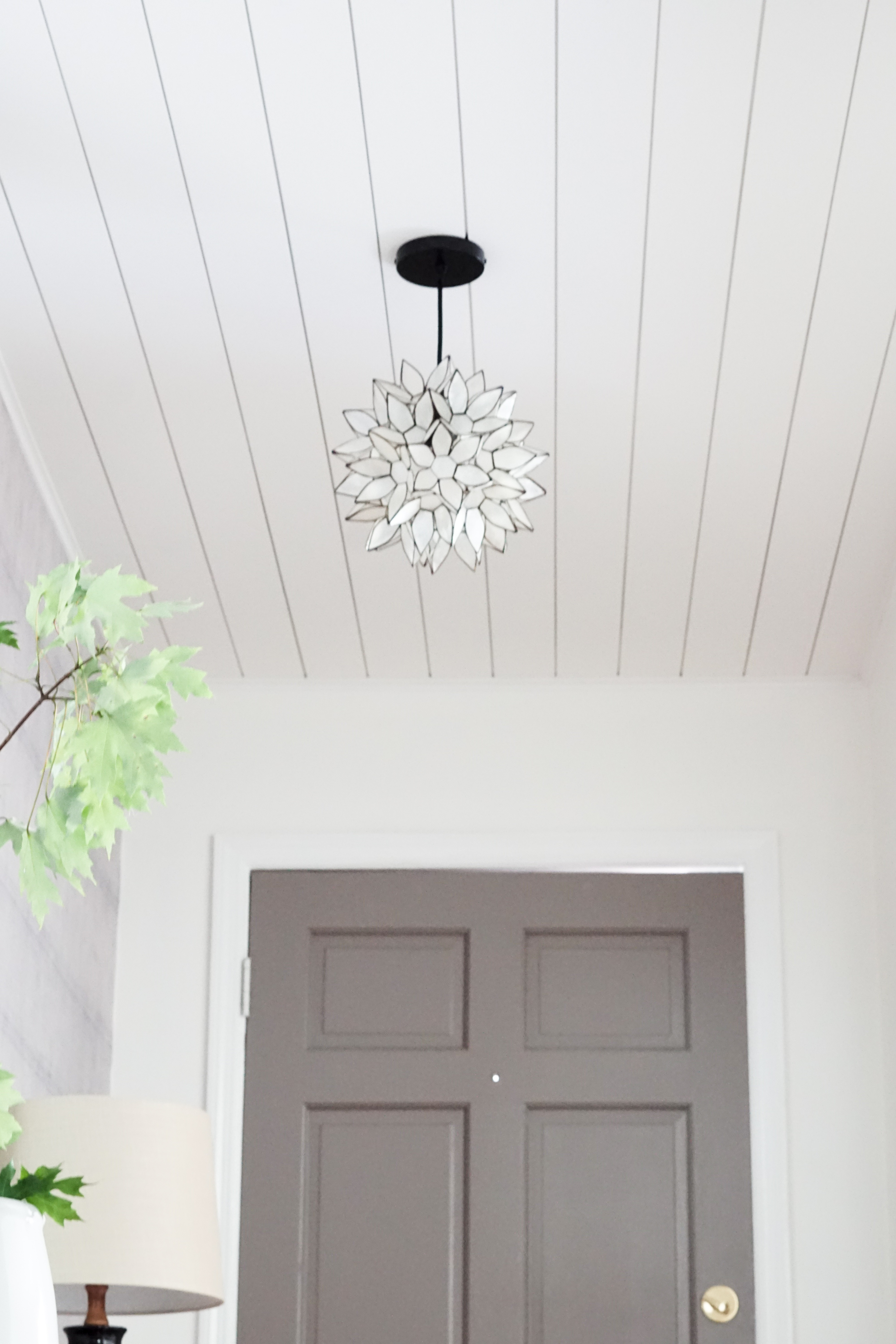
Be on the lookout for a full tutorial on our planked ceiling!
The Wallpaper
This long (12′), blank wall was screaming for a fun pop of pattern and a color to tie into the rest of the main living space. The Layered Boho Removable Wallpaper from Milton & King was the perfect fit. The wallpaper is grey with subtle tribal-style geometric patterns, which flows perfectly with the style of my home.
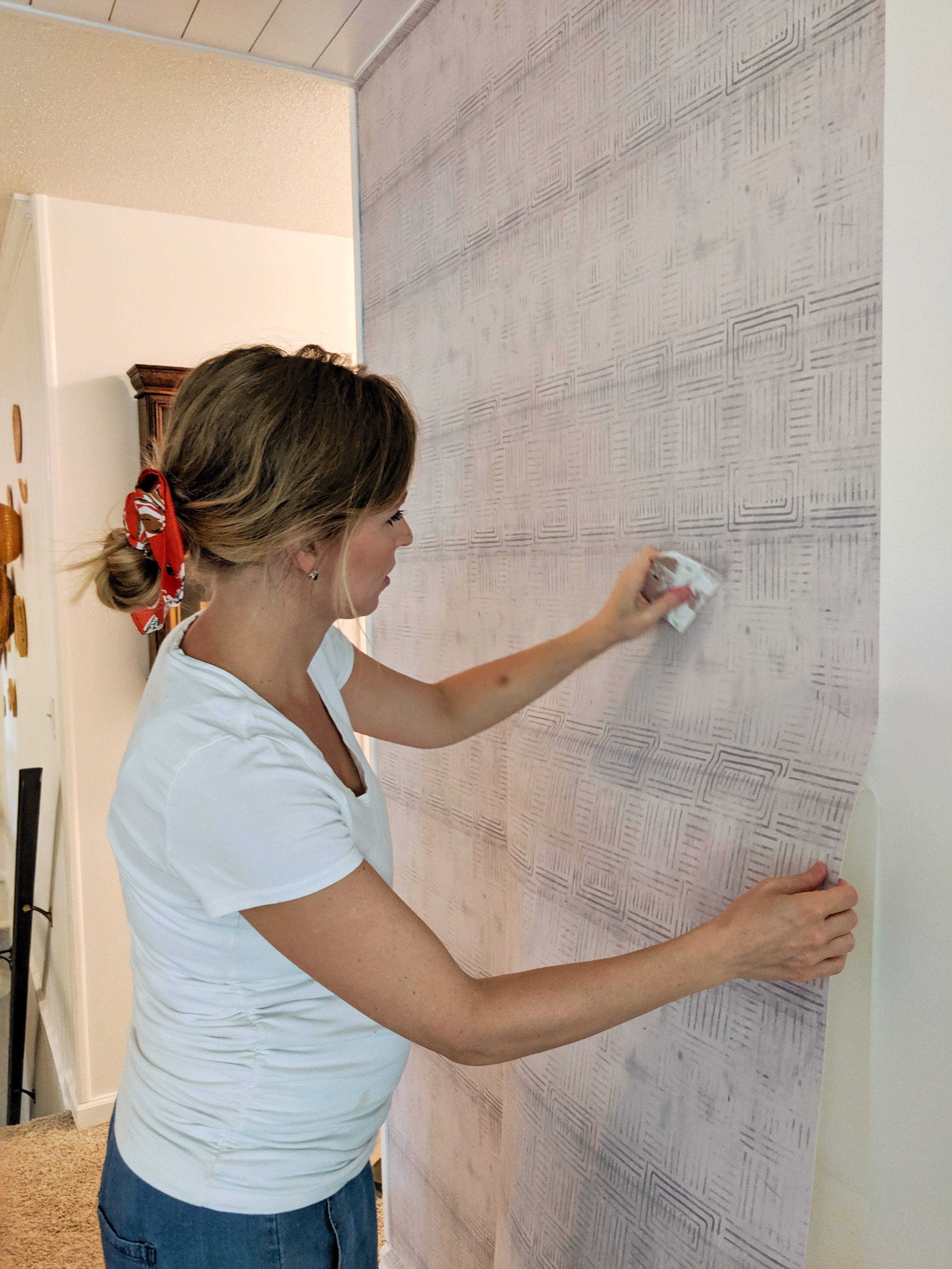
The installation was easy and fairly quick compared to traditional wallpaper, but unfortunately, I think this entryway wallpaper will be more temporary than I originally thought. Whether it’s our humid climate, the type of paint on the walls, or just bad luck, the wallpaper is refusing to completely stick to the wall. I have a fun solution planned though, so stay tuned!
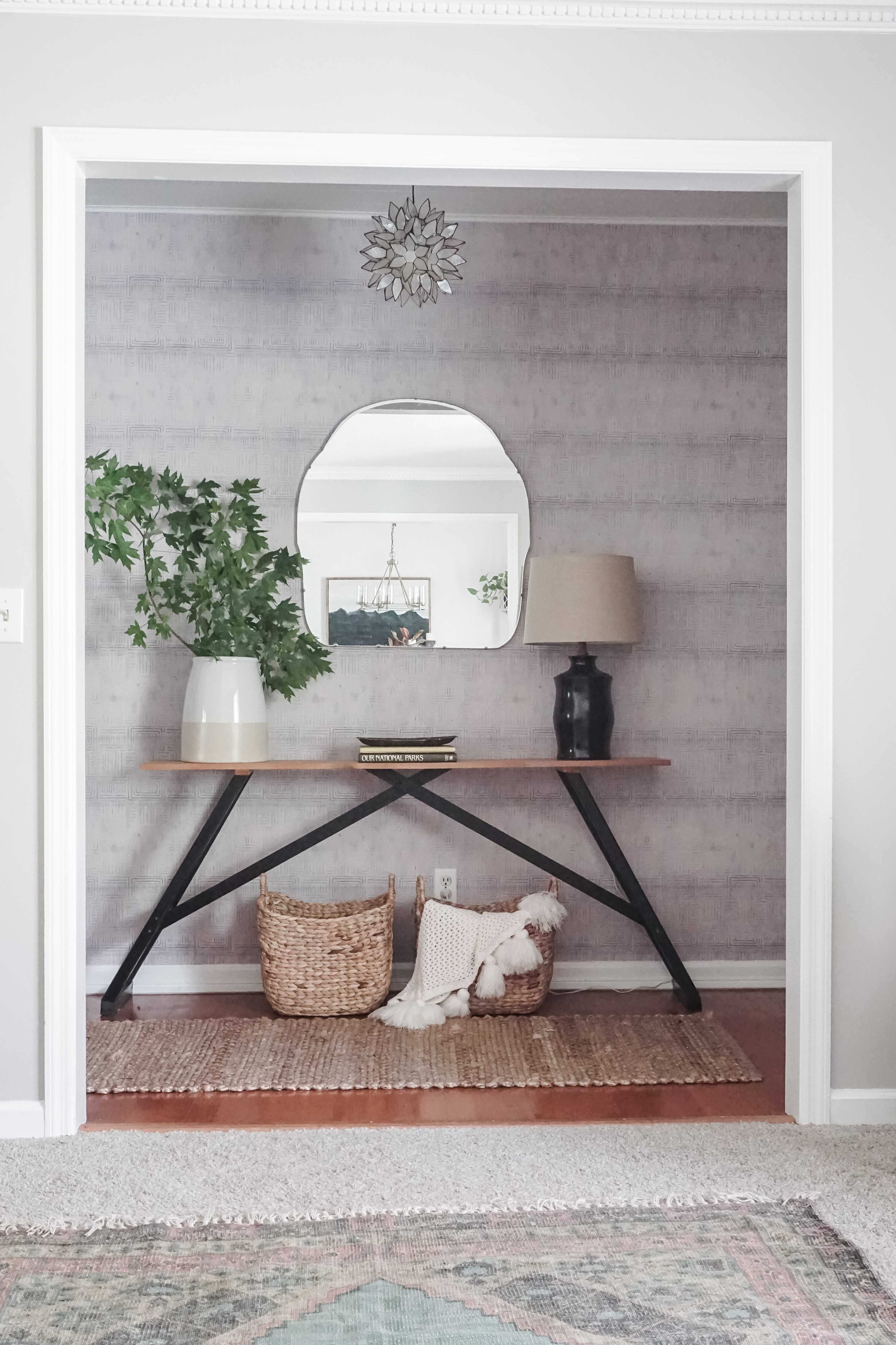
All in all, I love the print and Milton & King’s traditional wallpaper that I used in our breakfast nook has held up like a champ. They truly have the array of prints and patterns when in the realm of wallpaper. And also, a disclaimer: this wallpaper was gifted to me by Milton & King and obviously all thoughts and opinions are my own.
The Finishing Touches
(Disclaimer: Some links are affiliated for your ease of shopping.)
Lighting
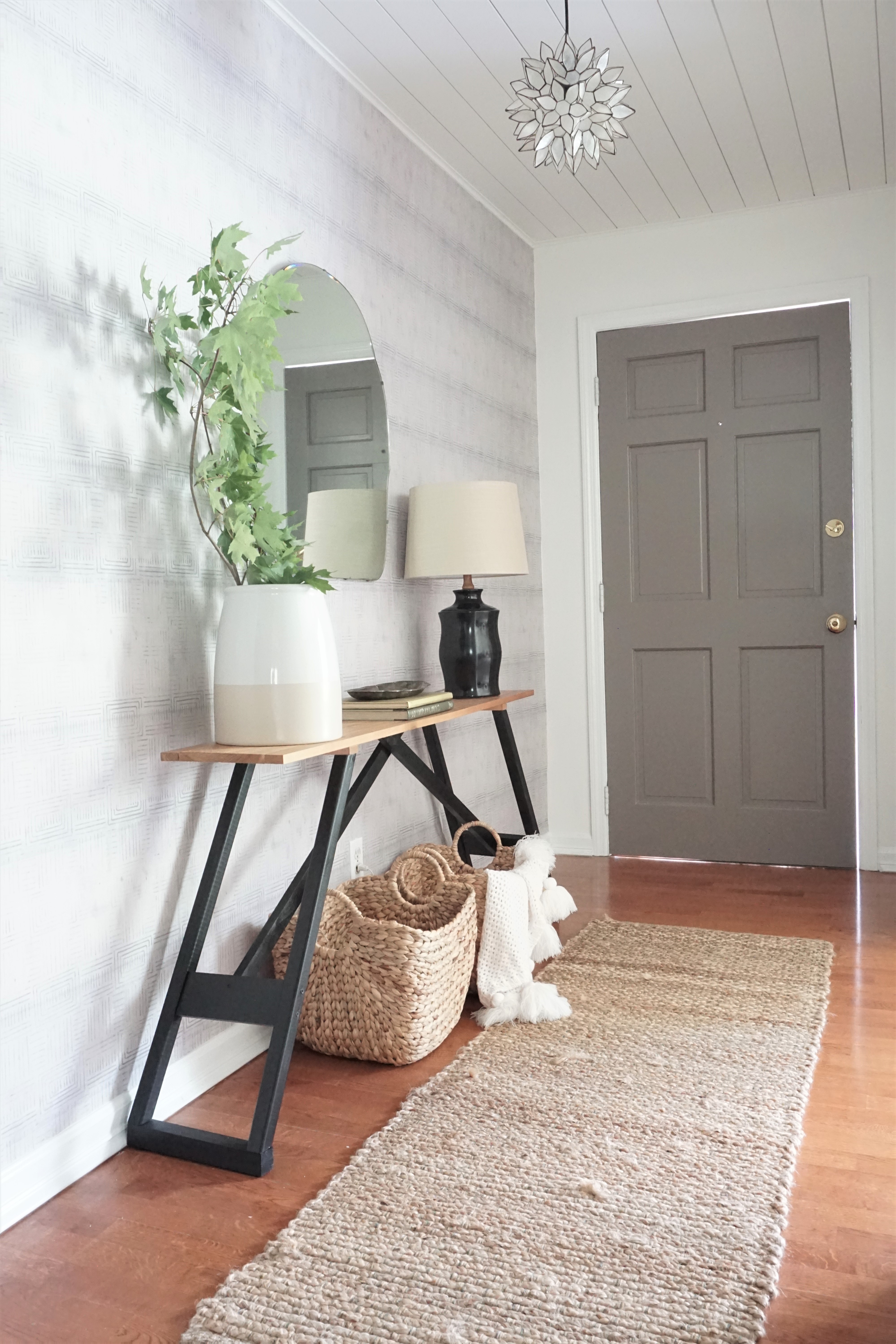
We traded out our dated brass pendant that I think has been here since the house was built in the early 70s for this fun lotus pendant from World Market. I truly feel like this small finishing touch pulls the entire space together!
The lamp was a $3.99 thrift store find with a $14 At Home shade.
Pendant || World Market
Accordion Rack
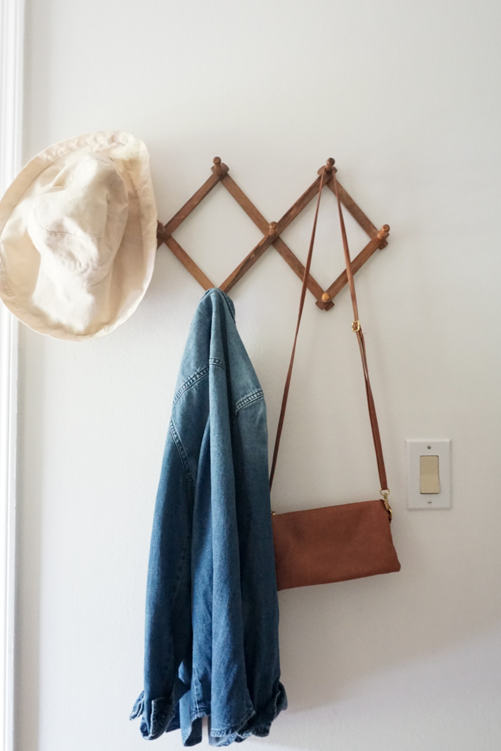
I love this vintage find from Ebay! I had a $5 off coupon, which Ebay sends periodically, so it made it $11 with free shipping! No matter your style, adding vintage touches add a layer of interest to any space. Also, a place for our guests to hang their belongings was a necessity.
Accordion Rack – Ebay || Similar
Baskets
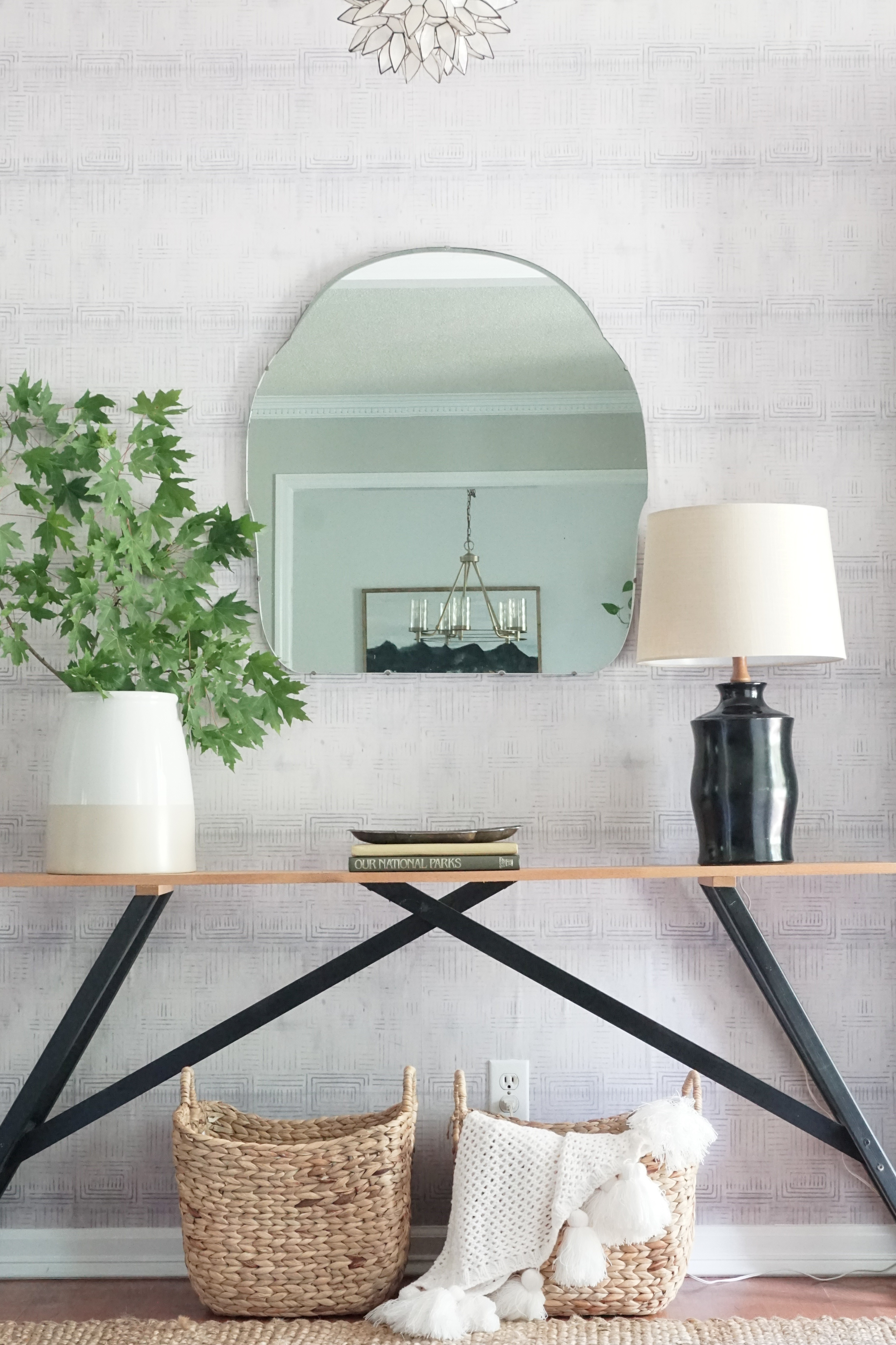
One can never have too many baskets – #lifemotto. I found these two at Home Goods for $14 each, which was a rare find because stores in the Home Goods family rarely sell more than one basket of the same kind and size.
Baskets – Home Goods || Similar 1 || Similar 2
Table Decor

Other than the vase from Target, which I got on clearance, and the lamp shade, everything else was thrifted – included the $5 vintage mirror!
Think in threes when dressing up your tables. A good formula to go by is: Lighting source + Greenery + Books, trays, etc.
Vase – Target || Sold Out
Rug
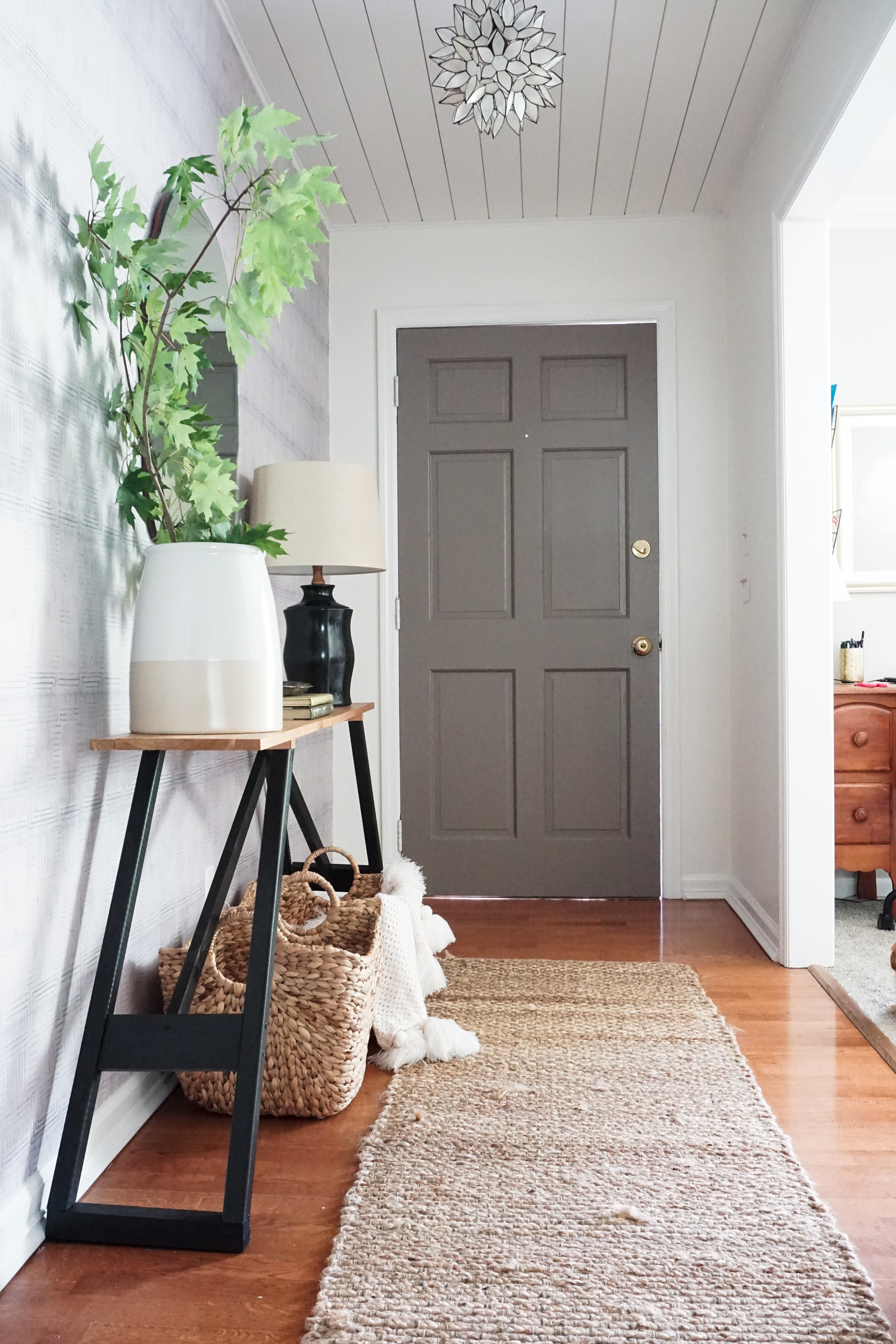
Keeping it simple and neutral so that it doesn’t compete with the wallpaper, the rug is a simple jute runner from Target.
Runner || Target
Before & Afters


///
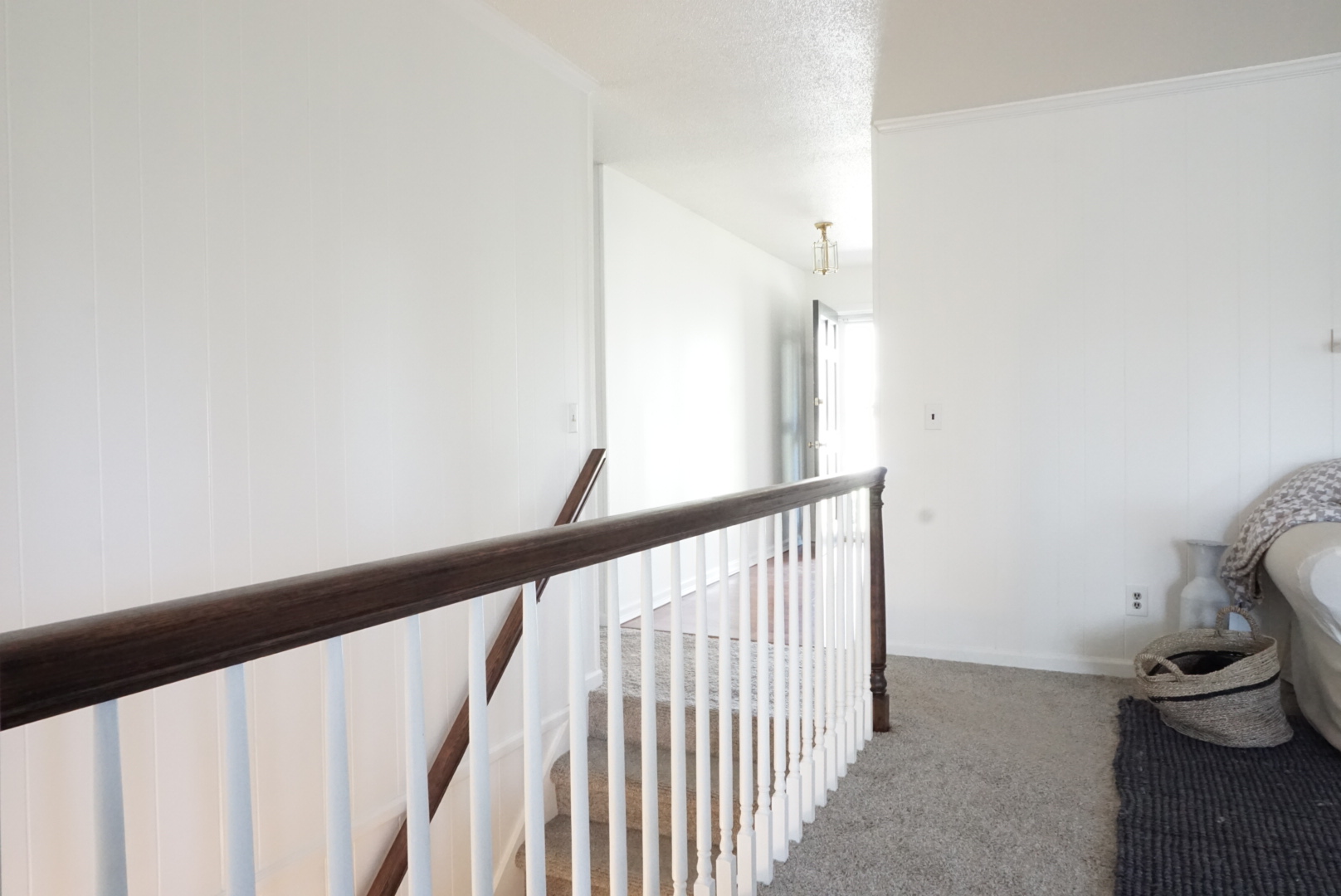
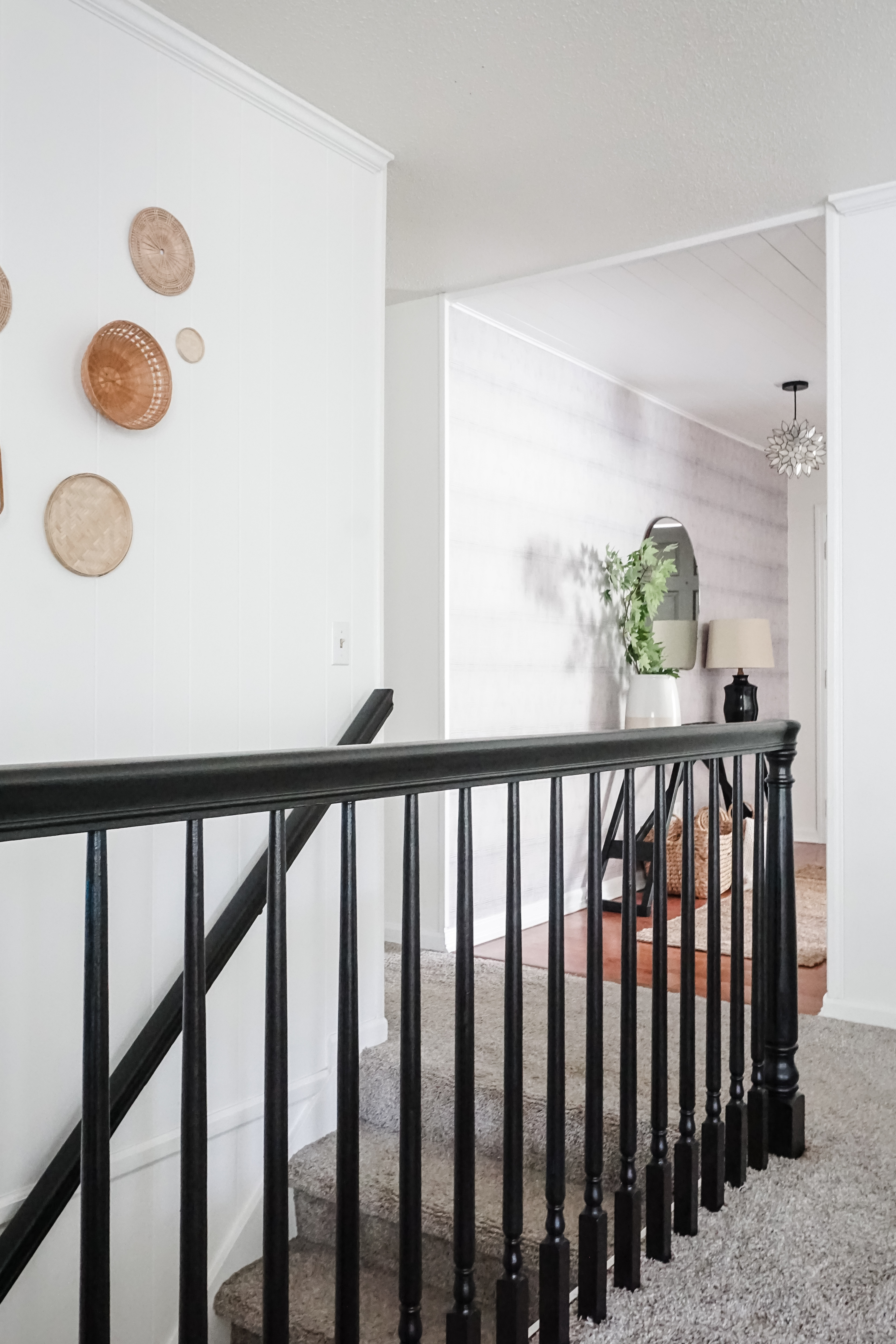
///


The best time of day in this space is at night when the pendant glows on the planked ceiling and reflects a cozy mood through the mirror. This was such a fun little space to design, but just between you and me, it’s only phase 1 of this space. We will eventually get a new front door in a year or 2 and, as I mentioned, the wallpaper will unfortunately need to be replaced. It will be a fun DIY though, so I’m looking forward to it. Until then, I will thoroughly enjoy this cozy, eclectic space that will welcome all of our friends and family!
![]()

