Your bedroom is the room where you will spend the most time in your home. According to an article in Huffington Post, if you live the average life expectancy of 80 years, you will spend 26 of those years sleeping, and an addition 7 trying to fall asleep! Sleep aside, you will probably get dressed, make your bed, clean the room, reading, eating breakfast in bed (do people actually do that?), etc. in your bedroom. If we’re spending so much precious time in this room, it should be an inviting, calming, self-reflecting sanctuary.
This is not the room in your home that you should neglect just because it’s not a room your guests typically see. Here are 5 ways I’ve made our room into a sanctuary of rest and sleep, but first here is a quick before and after of our bedroom.

1 | Invest in Cozy Bedding and Linens
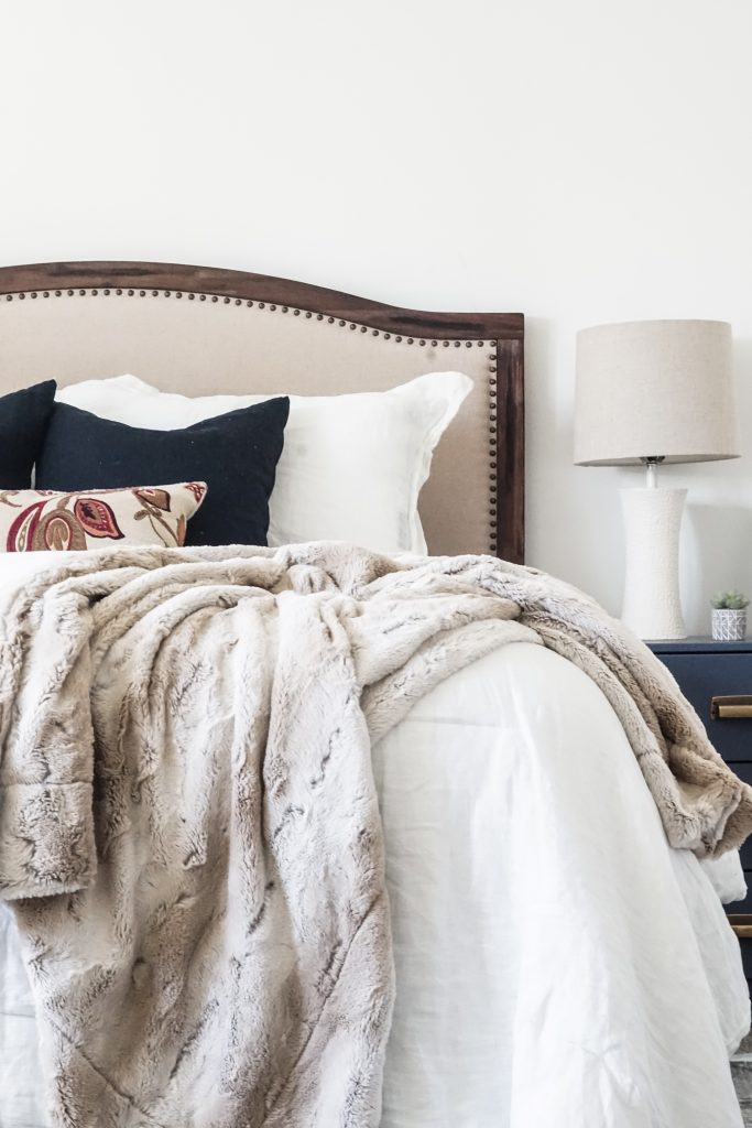
When I was thinking about our bedding, I imagined something that I would just sink into with lots of cozy layers. For this feel, I went with a quilt, comforter, and blanket combo. I chose a thick, well-made quilt that can be used year round and a linen comforter that stays folded down.
Quality bedding doesn’t have to break the bank. All of our bedding, excluding pillows, came from Target. My favorite go-to sheets are the Threshold Performance sheets from Target. These are the ones on our bed, and they’re my favorite pattern yet. Just look for a higher thread count, and 100% cotton or linen. They’re bound to last and be cozy.

Comforter | Target
Sheets | Target
Quilt | Target
Pillow Covers (Blue) | IKEA
Blanket | Similar
2 | Choose a Soothing Color Pallet
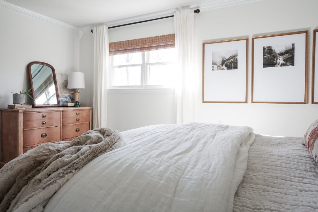
When you think of the most relaxing place you’ve ever been or stayed, what colors come to mind? This is a vital question when designing your bedroom sanctuary. I’m sure a lot of you have the same color visualization as me: blues, greens, and lots of cozy whites. No matter your color choices, lean of the side of neutral. Lots of loud colors or too many colors will cause too much stimulation, which is quite the opposite feeling you need before dosing off.

Though our walls were a darker beige before, I opted to go a few shades lighter with Sherwin Williams Greek Villa, and it made all the difference. I also changed out our curtains with these super affordable, thick, white curtains from IKEA. And going back to the point above, I opted for white and creams for our bedding with a pop of color with the pillows. If you’re investing in a quality comforter, go with a neutral/white. You can always change up the look and feel by the accessories or duvet you add to your bed.
3 | Minimize the Furniture + Clutter
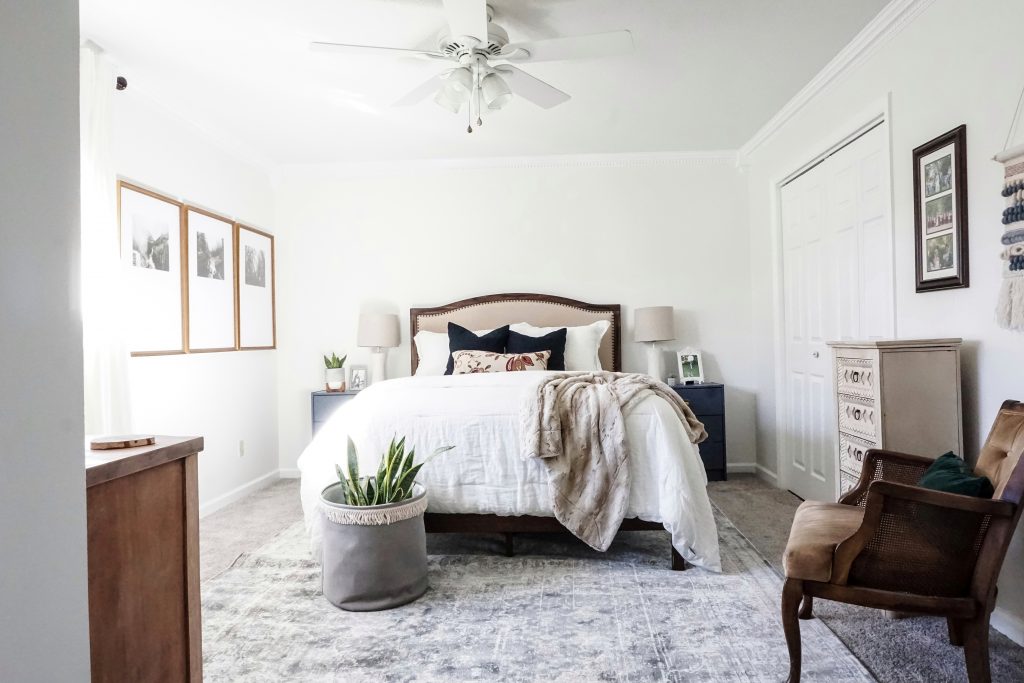
Tidy up the clutter. Isn’t this the theme of the year for all you Kondo lovers? There’s so much to be said for the link between mindfulness and clutter though. Just minimizing the number of pieces of furniture in your space can do wonders. Try combining all your storage needs into one unit and utilize your closet space to the max, as I did HERE. Other than that, a pair of night stands and a seating option should be all you need in your room.
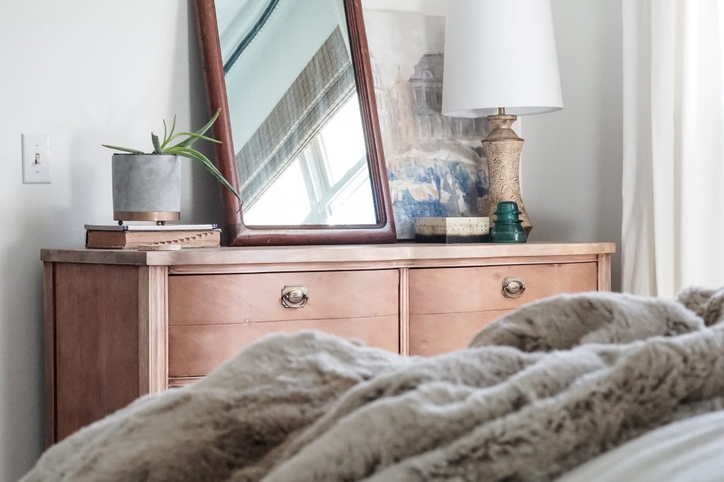
This thought was what started our entire redesign. I found a dresser that I wanted to use in our room that was big enough to combine both pieces we originally had. (Check out the dresser tutorial here.) Just by taking out one piece of furniture, it change the whole feel of our space. It’s created a bit of breathing room that wasn’t there before.
And here’s a quick thought on desks in bedrooms. If you have a space in your house, even if it’s tiny, use that instead of your bedroom. I just can’t imagine getting a solid night’s sleep in my office.
4 | Add in Layers + Textures
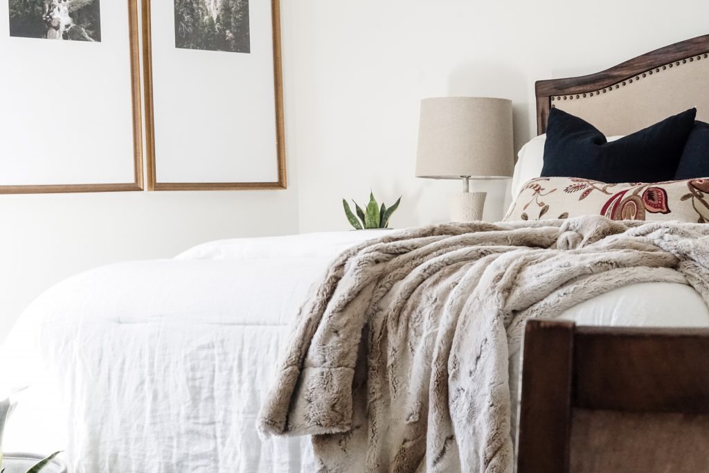
This is truly a pro tip, even though I’m not a pro! Layers and textures take a basic room to the next level. You can do this is so many ways. Think of wood tones, rugs, blankets, pillows, and plants. These are the pieces that make the space come alive. With your pillows and blankets, try mixing up the textures. For example, combine 2-3 of these materials: linens, faux furs, tassels, embroidered, or leather. Also, don’t forgot about rugs! A rug is a quick way to add dimension and color to your room even if you have carpet.
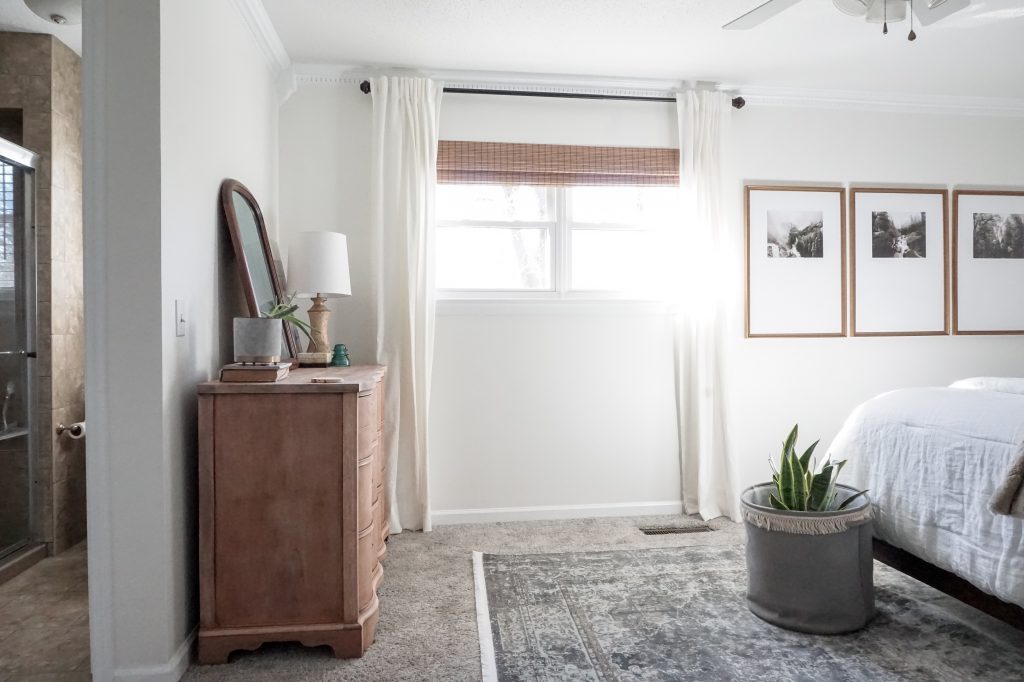
For my space, I changed out the white blinds to a bamboo shade, added a large 8×10 rug, brought the space a live with some greenery, and threw in some texture with a faux fur blanket and linen pillows.
Roman Shade | Just Blinds in Tiki Carbon
Rug ($159!) | Rugs.com
5 | Choose Art that Reflects Something or Someone You Love
Disclaimer: This product was gifted to me in return for service, but all thoughts and opinions are my own.
Now to my final and favorite tip! Personalized art and photographs that bring you joy should hang on the walls and be perched on your nightstands. These are the images you will see before you end your days and the ones you see when you open your eyes. Whether these photographs or art are of ones you hold closest to your heart or of a place that bring you back to a special time with those loved ones, they should calm you and fill you with pleasant memories.
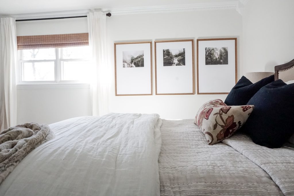
The large art on my walls from Framebridge do just that. They are three photographs of Yosemite and Tahoe. My husband and I took a trip out to the west coast a few years ago before our daughter was born, and it was one of the best week’s of our lives. It was incredible serine and we were engulfed in nature. Two things that we adore. The nature scenes bring us back to that special time and sets the mood for our room. It’s the perfect final touch!
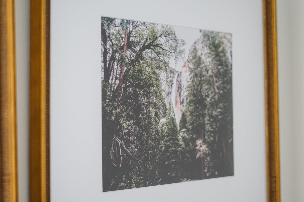
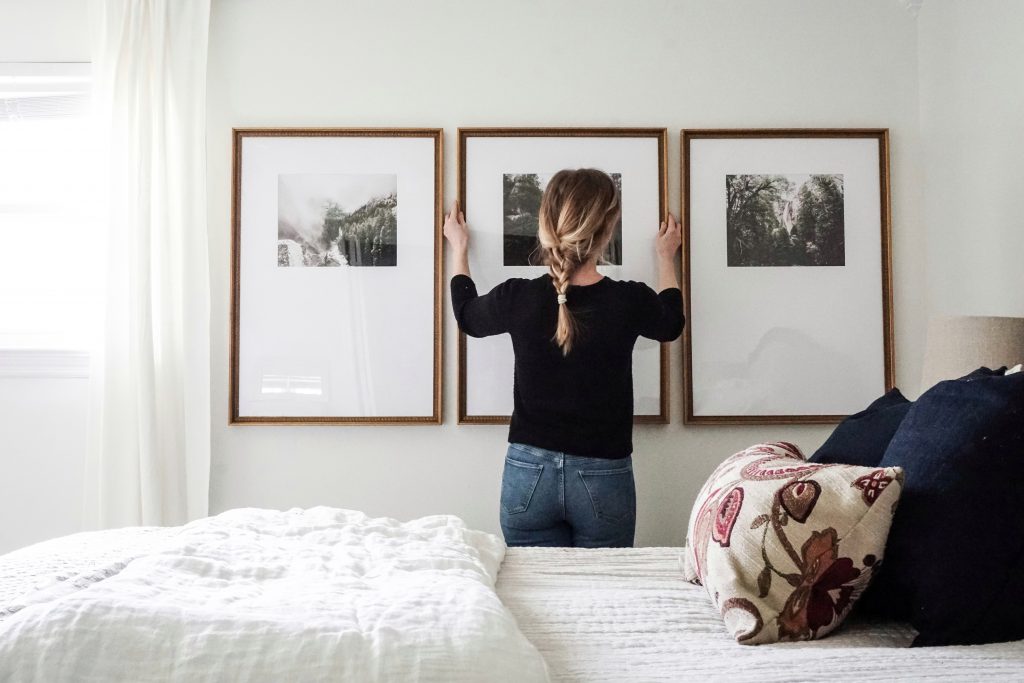
Framebridge is an incredible service. You choose your photos (they can be digital or hardcopy), choose your frame and mat, and Framebridge does the rest. I chose the Triptych gallery wall to fill our window wall. It’s bold and is the first thing you see when walking into our room.
The one thing I loved about going through Framebridge is that they only use the highest quality print. I wasn’t even able to load a digital file if the quality of the photograph wasn’t good enough. This ensures that your product will be at the highest quality.
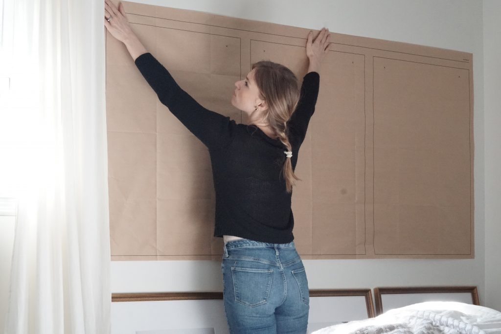
Gallery walls can be intimidating to hang, but the Triptych comes with a template that you simple tape to your wall once it’s at the desired height and is level. You then drill your holes accordingly. It’s as simple as that.

Framebridge not only has several gallery wall and classic framing options, they also has smaller frames which is custom to Instagram photos. If you have a special note, photo, or piece of art, it’s worth getting it framed right to display it in your home. Your walls talk, right?
