When we found out we were having another baby (due November!), we had to make the decision to create an entirely new nursery in the guest room or revamp and personalize the one we already had. It just made sense for us to take what we had and make it baby girl’s own space all while keep most of the elements the same as it was for our first daughter. Major changes were not necessary to completely change the feel to classy and vintage from what once was modern bohemian.
Why Make Changes to a Nursery for a Sibling?
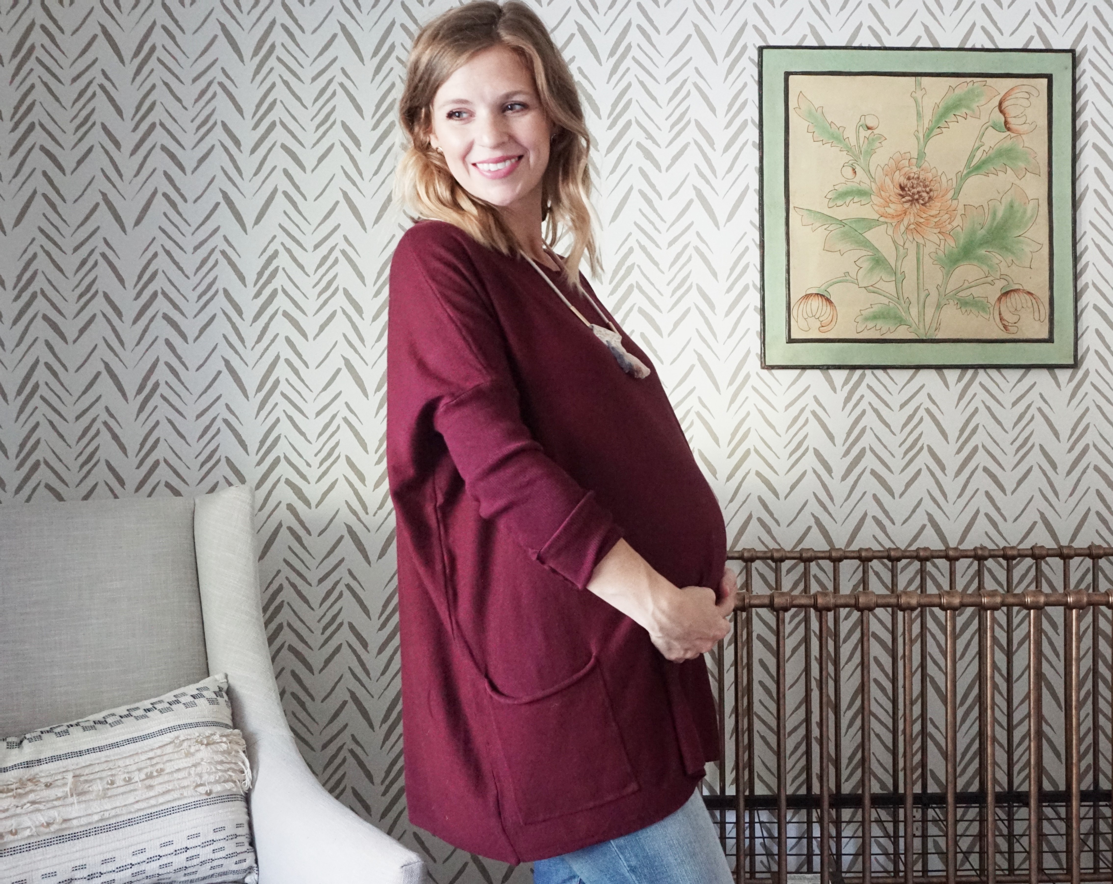
It’s so easy for my practical mind to just leave everything as is for the second baby. The baby will never know, right? While this is true, creating a different environment will help develop a new relationship with the new child/sibling. We did this not just for us as the parents, but mainly for my daughter. Though she got a new big girl room, I wanted to differentiate her old room from her sister’s room. I also wanted her to realize that it was no longer her baby room, but a new space to welcome her baby sister.
This didn’t mean that we had to make major changes or spend a fortune. Simply switching out a few pieces all while keeping the wall color and a few large items the same changed the feel of this space to what is now a classy, vintage room for a brand new baby.
The Original Mood Board
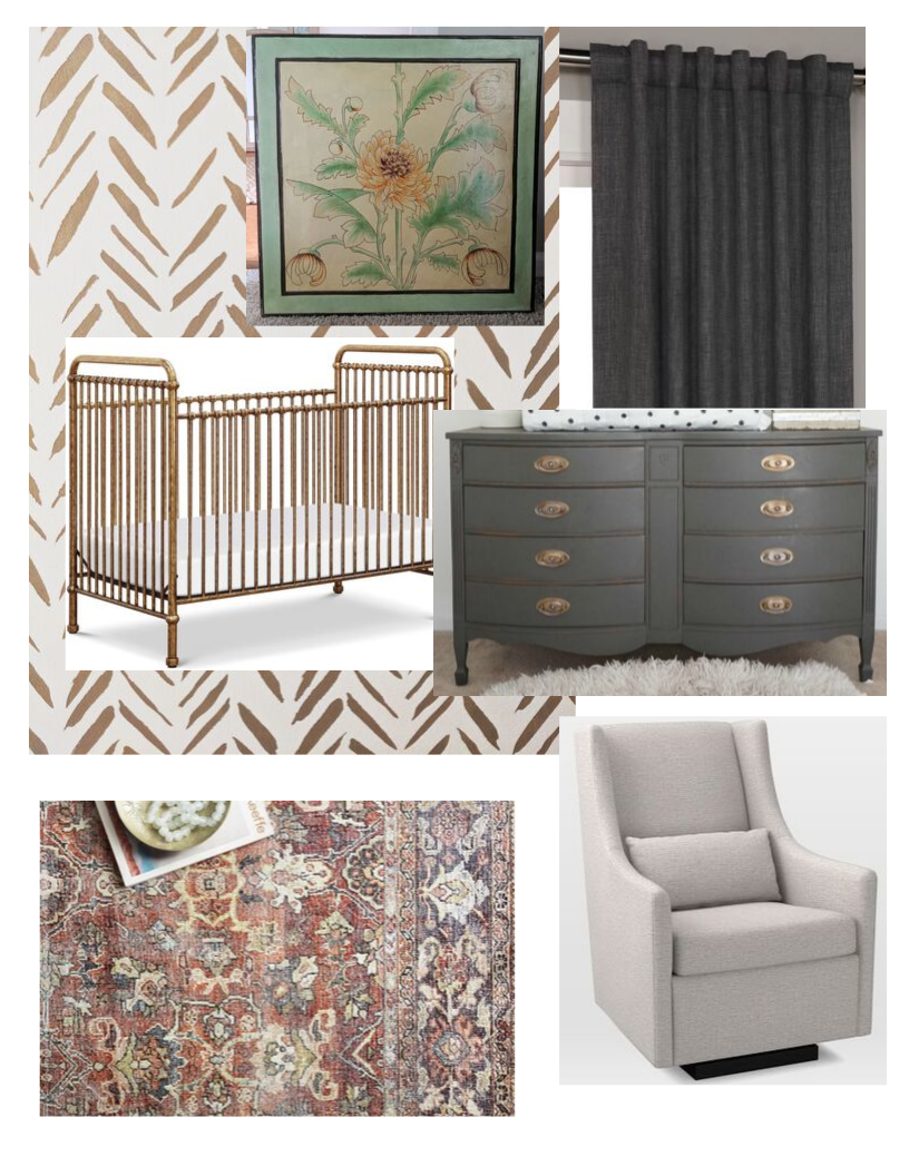
Stencil | Crib | Curtains | Glider | Rug | Art & Dresser (thrifted)
Before & After
Though I loved this sweet space before, it was time for a revamp. (See the complete nursery HERE.)
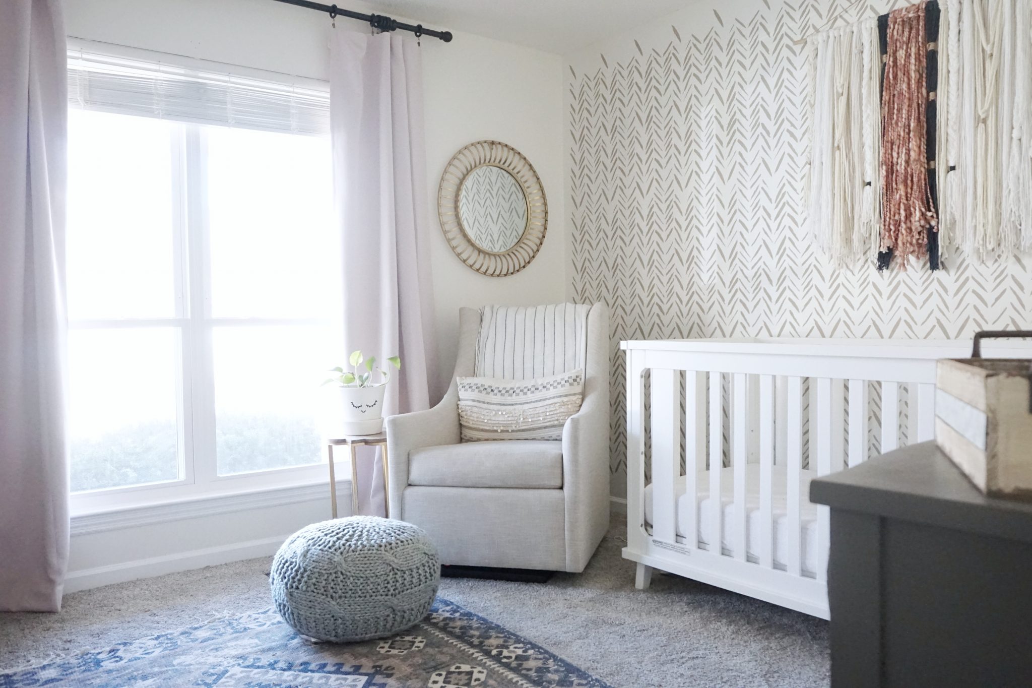
It’s amazing how just making a few simple changes completely changed this space and made it a new room for baby girl to call her own.
What Stayed the Same?
The Wall Color and Stencil
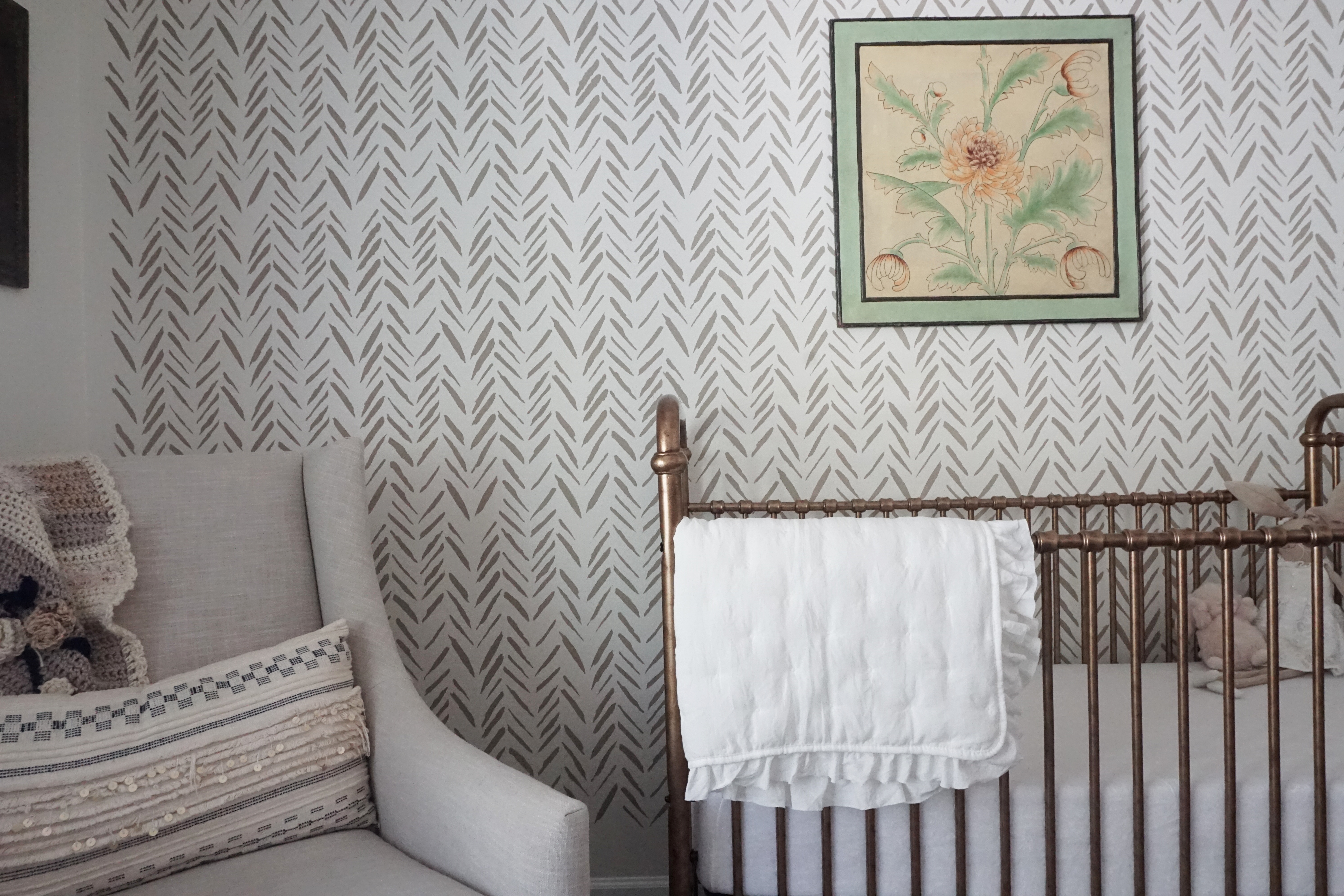
I knew it would pay off in the end by originally painting the walls a neutral color (Swiss Coffee by Behr). I wanted to work around the stencil since 1 – it took some time to paint, and 2 – I still love the stenciled wall. By keeping the paint and stenciled wall as is, it saved a ton of time and made designing easier since I didn’t have to start from scratch.
Dresser and Glider
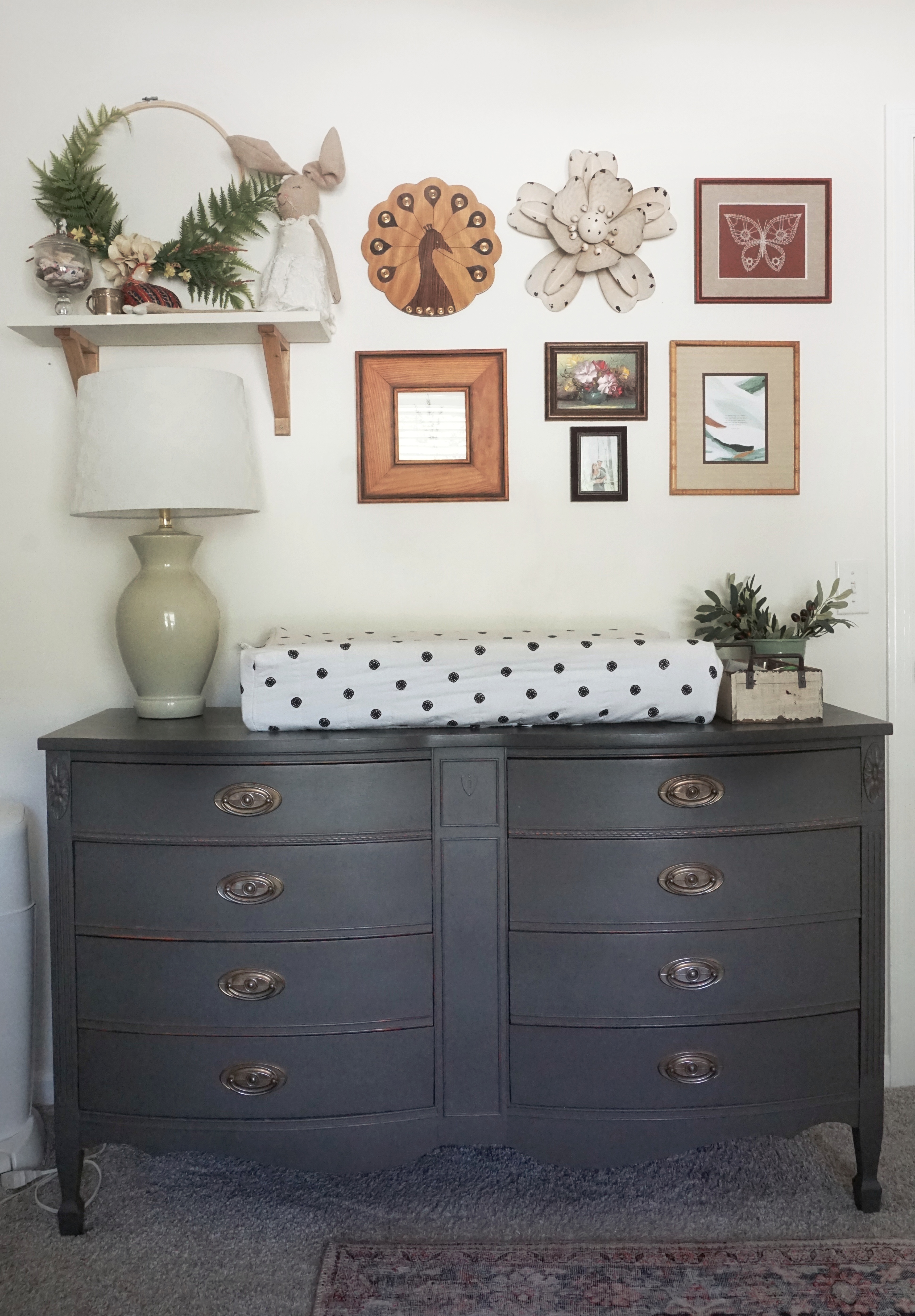
The dresser was a Marketplace find way back before our 2 year-old was born. I refinished it, and I swore I would never get rid of it because I love how it turned out so much! It has made the perfect changing table for 2 years, so there was no need to change it.
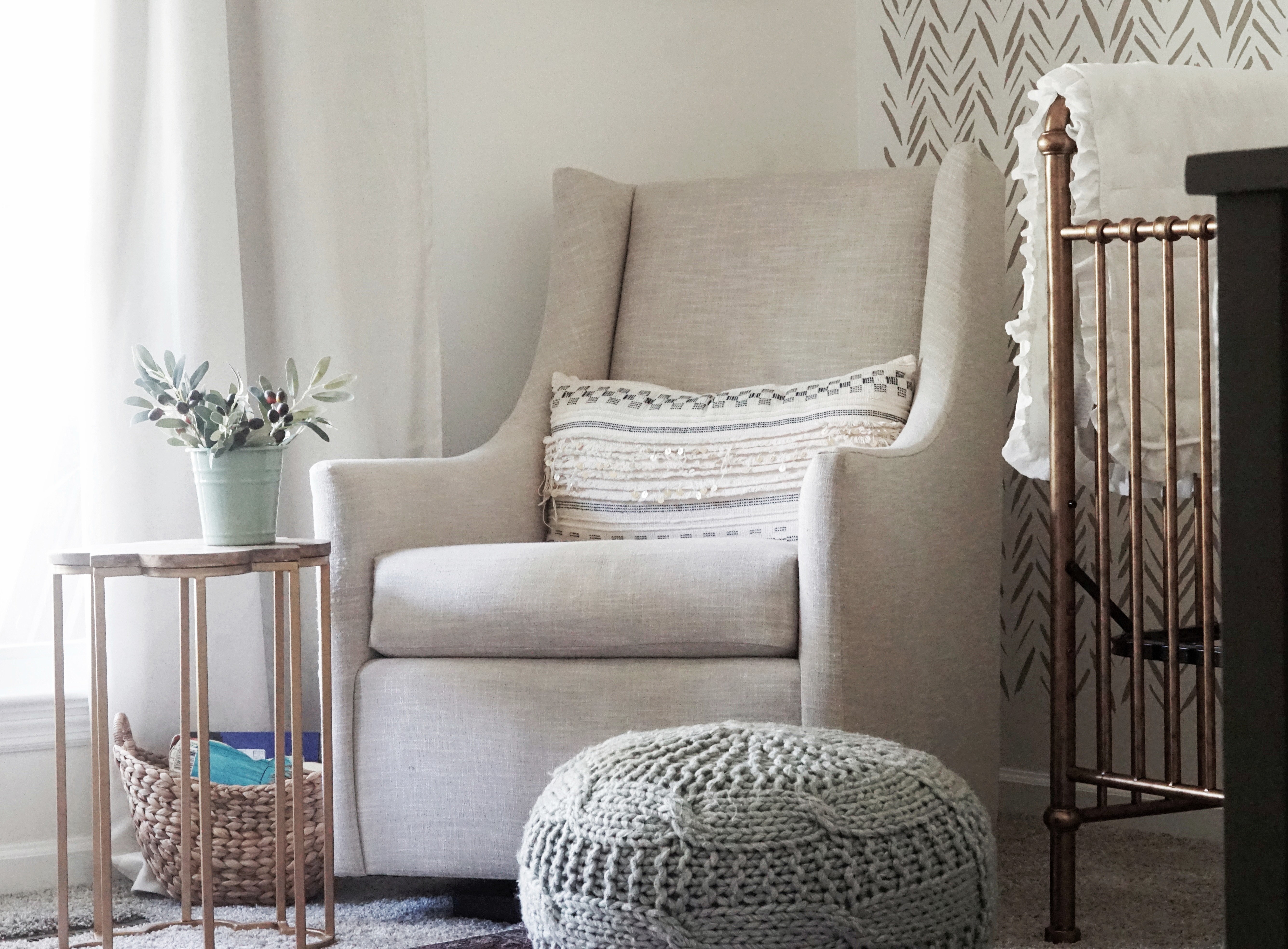
If you’re looking for a glider, I would highly recommend the West Elm Graham Glider. I love the high back, cozy cushion, and the width of the seat. The neutral fabric allowed me to easily add it into any design, and it will also be easy to add into another space in my home when the rocking and nursing days are over (which seems like an eternity from now!).
Book Ledges
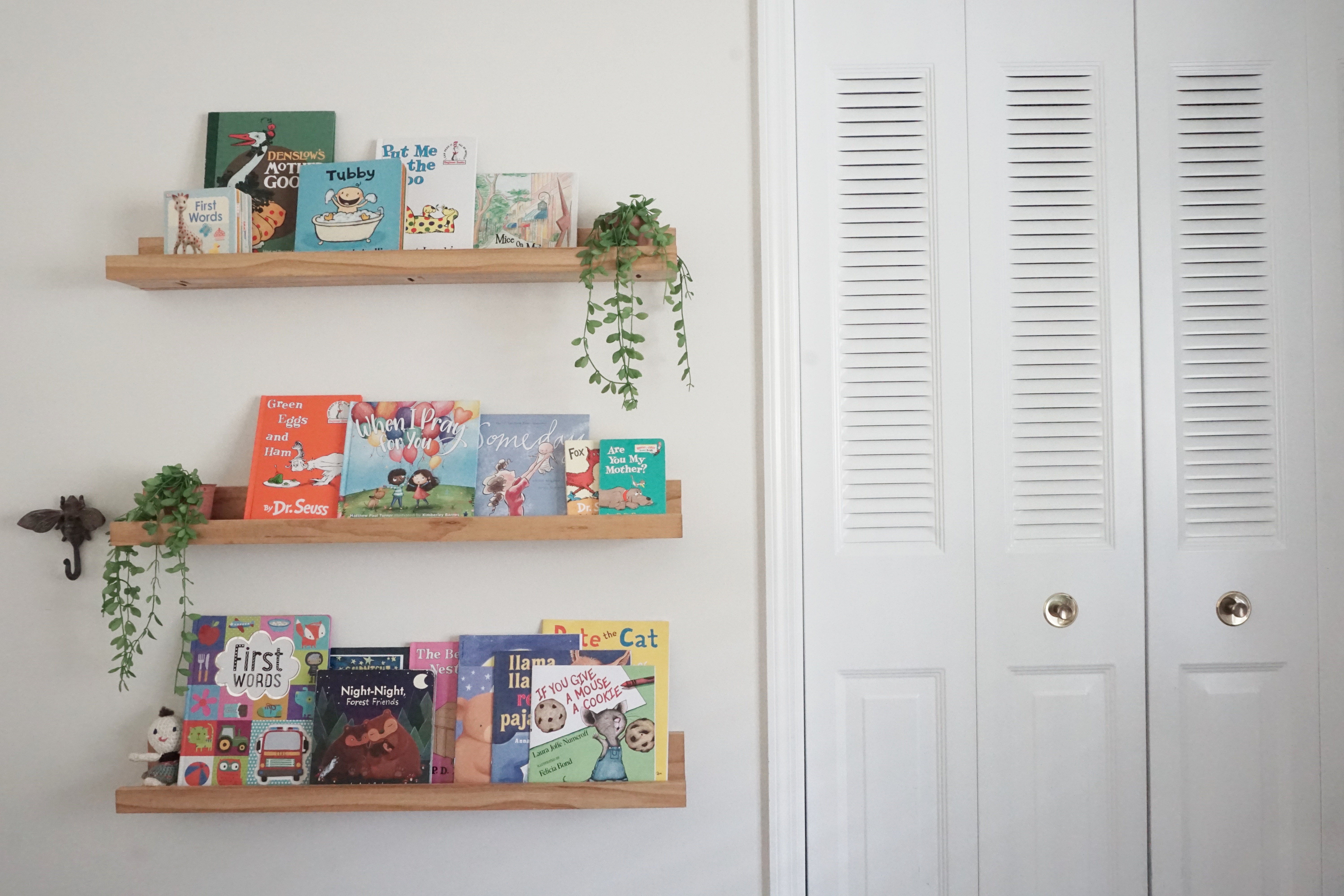
The book ledges may always remain in this room. Not only are they great for this stage of life for easily retrieving books, but they’re also great to display art. We love a good book ledge so much, we’ve used them in 3 separate spaces. You can find the tutorial HERE.
The New Additions
THE CRIB!
(Disclaimer: This post is kindly sponsored by Million Dollar Baby. All thoughts and reviews are my own.)
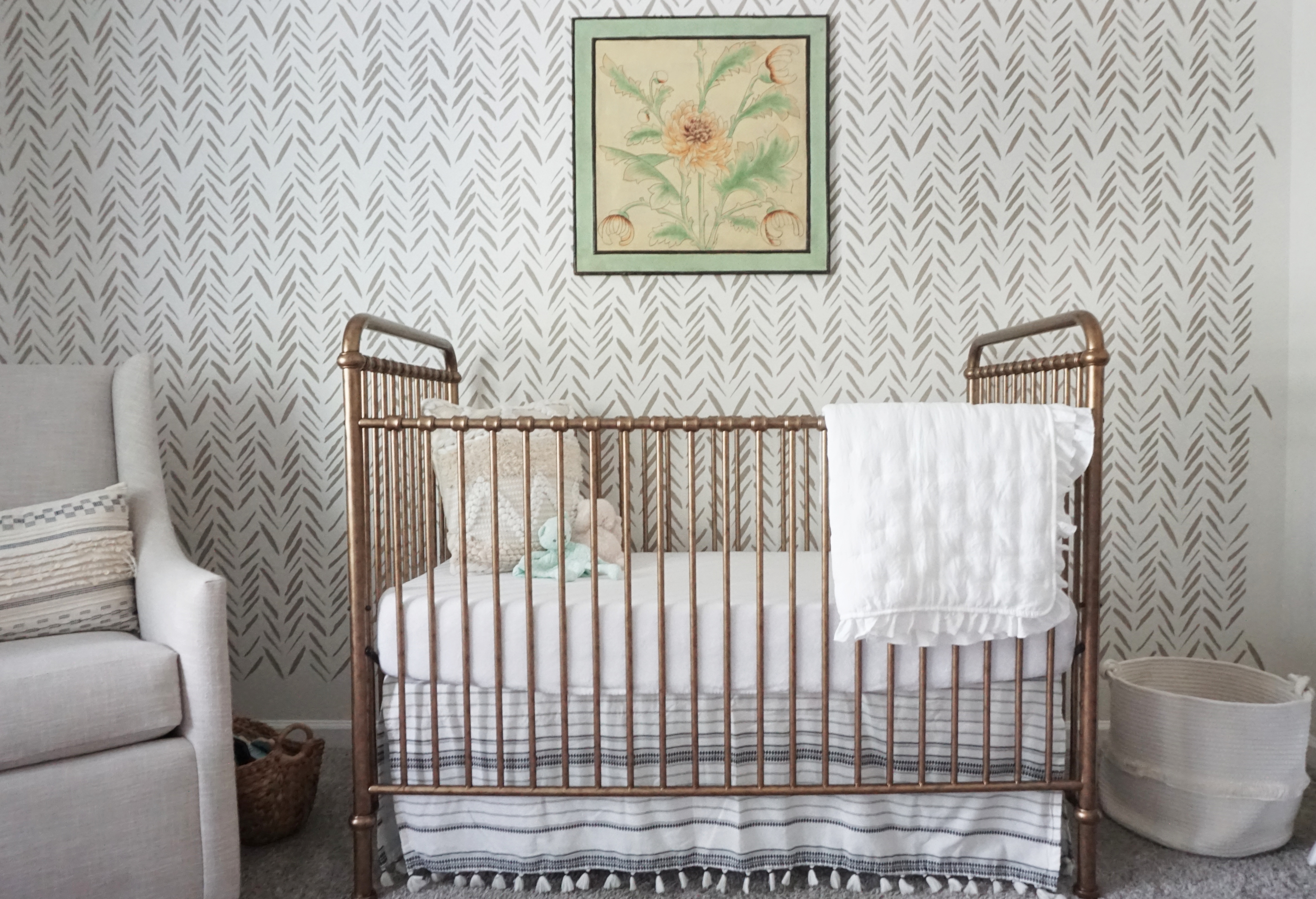
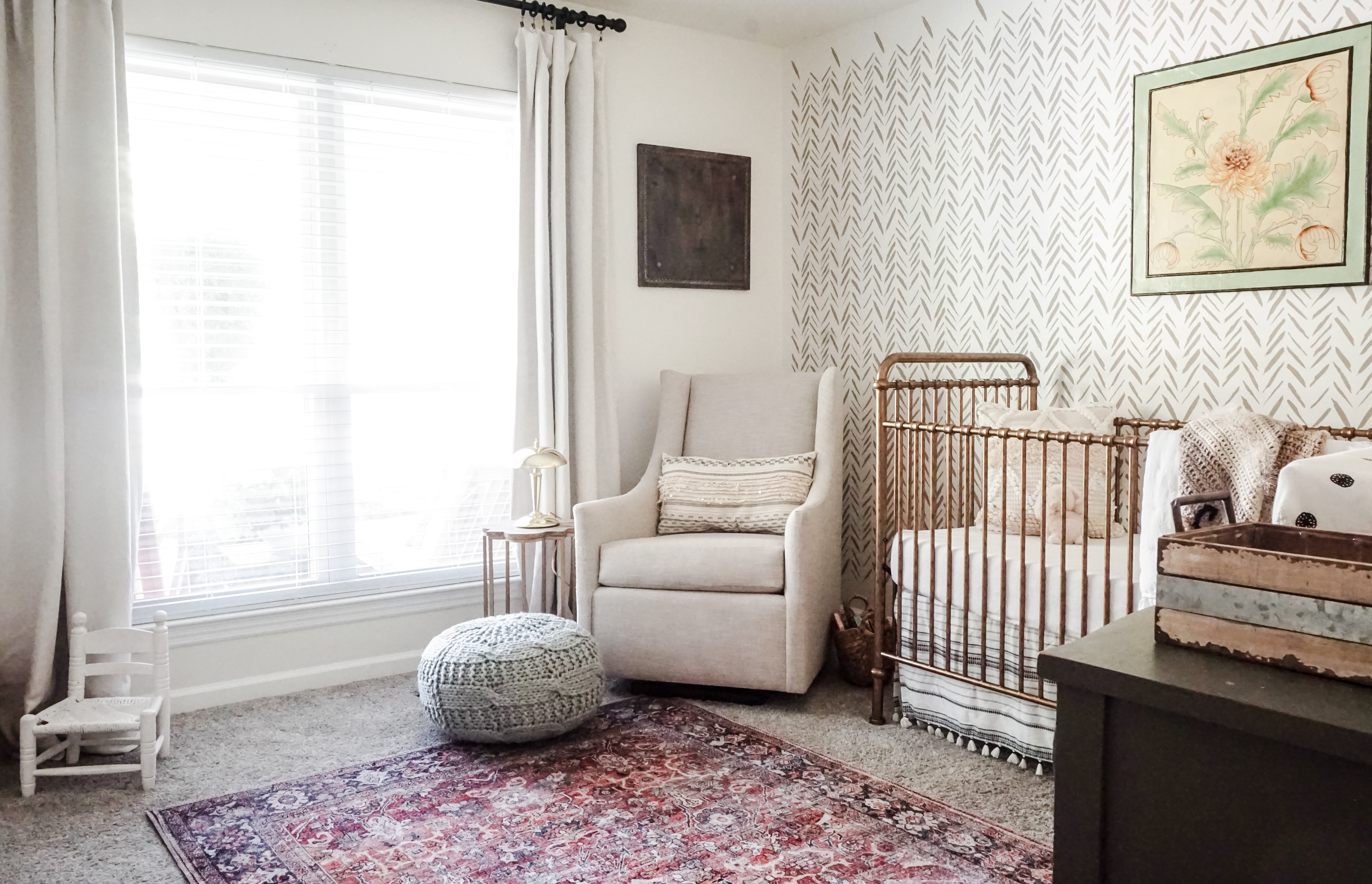
I can’t wait any longer to share about the most beautiful crib I’ve ever seen! The Abigail 3-in-1 Crib in Vintage Gold from Million Dollar Baby is the one piece that makes this room the classy, vintage space that I was going for and is truly a showstopper!
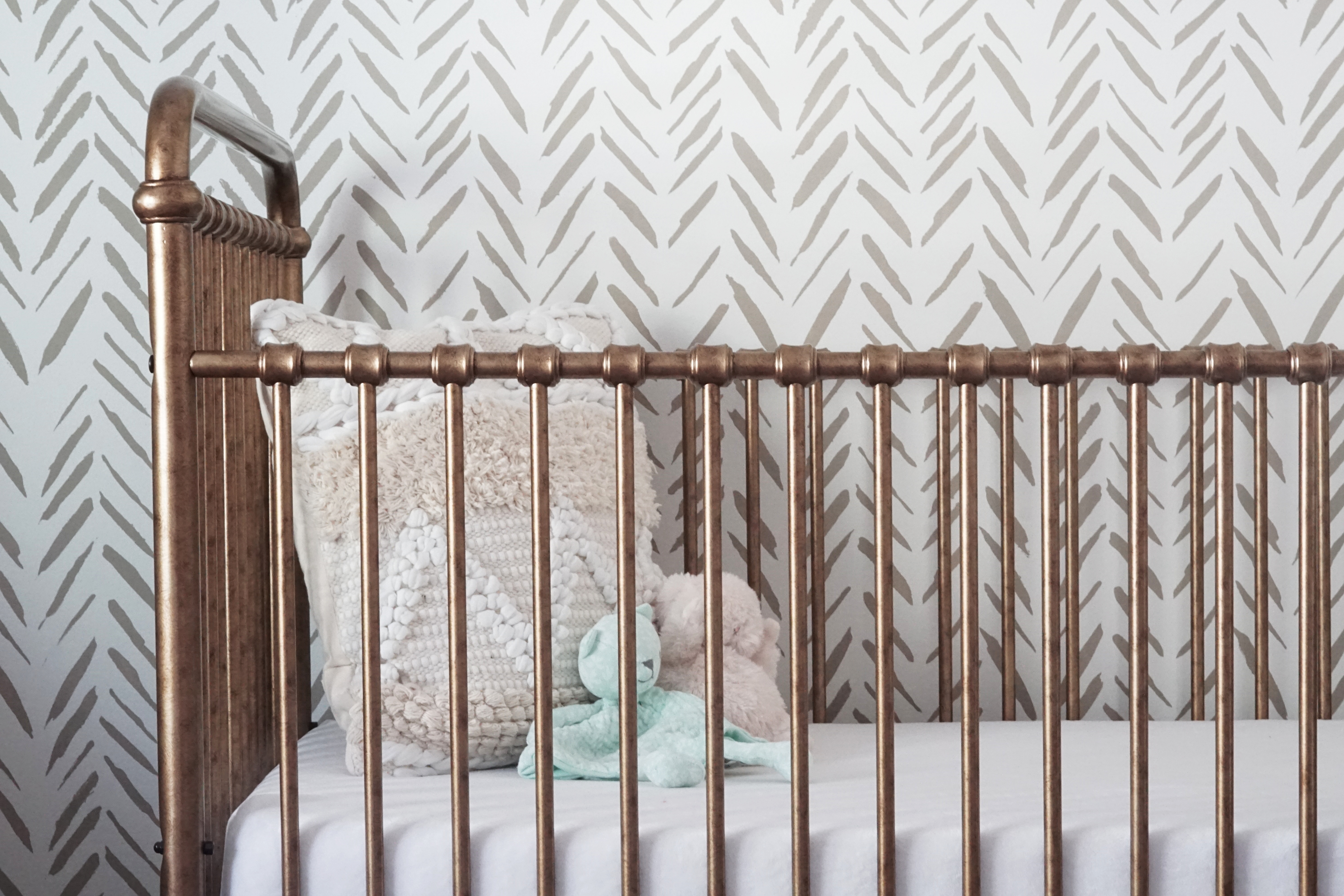
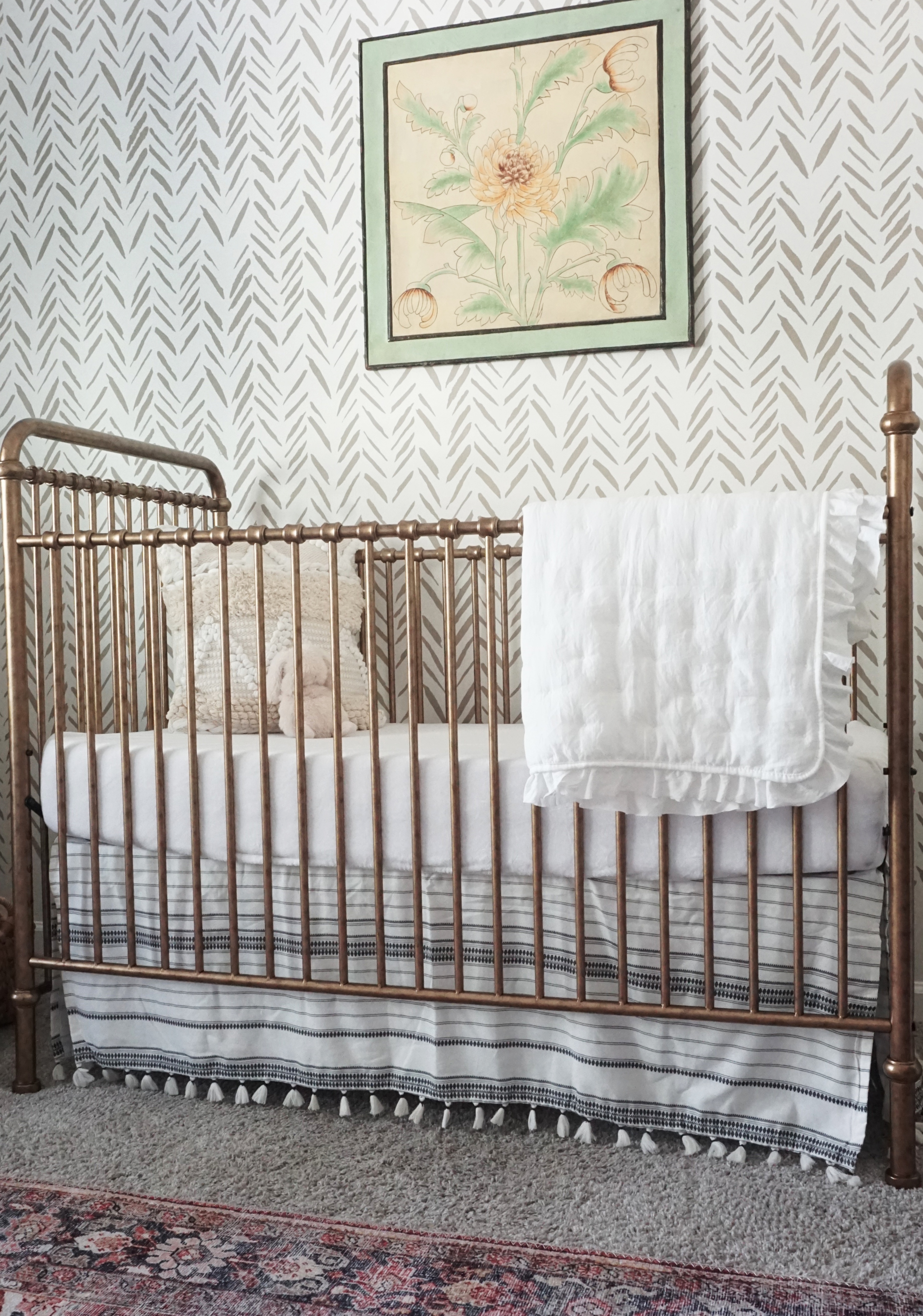
The hand-finished iron in Vintage Gold is a take on vintage American metal cribs while meeting all safety standards of modern cribs. It comes in 3 different finishes (the vintage iron is a close second favorite!).
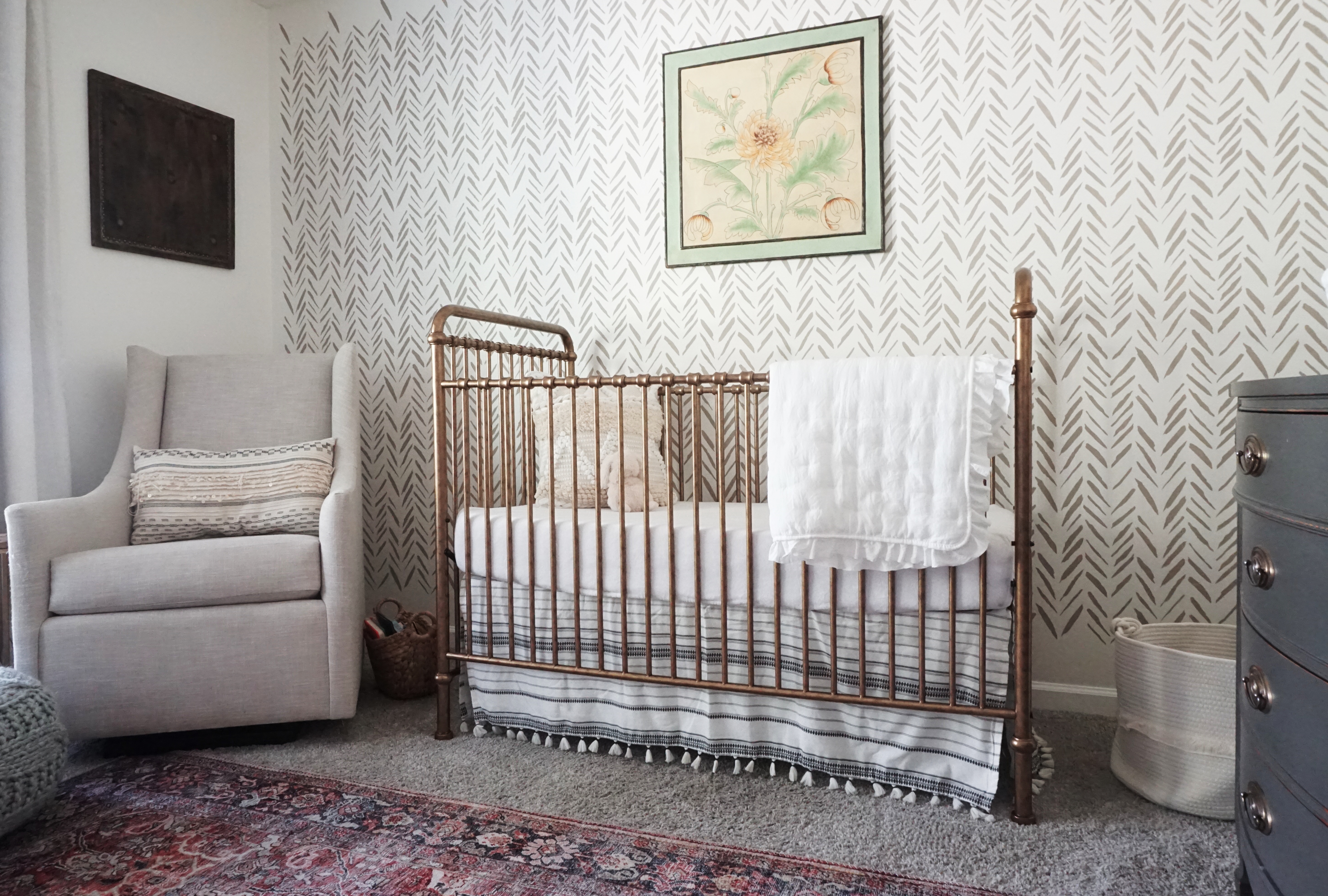
This gorgeous crib completed the nursery and gave my baby girl a bed to truly call her own.
Rug
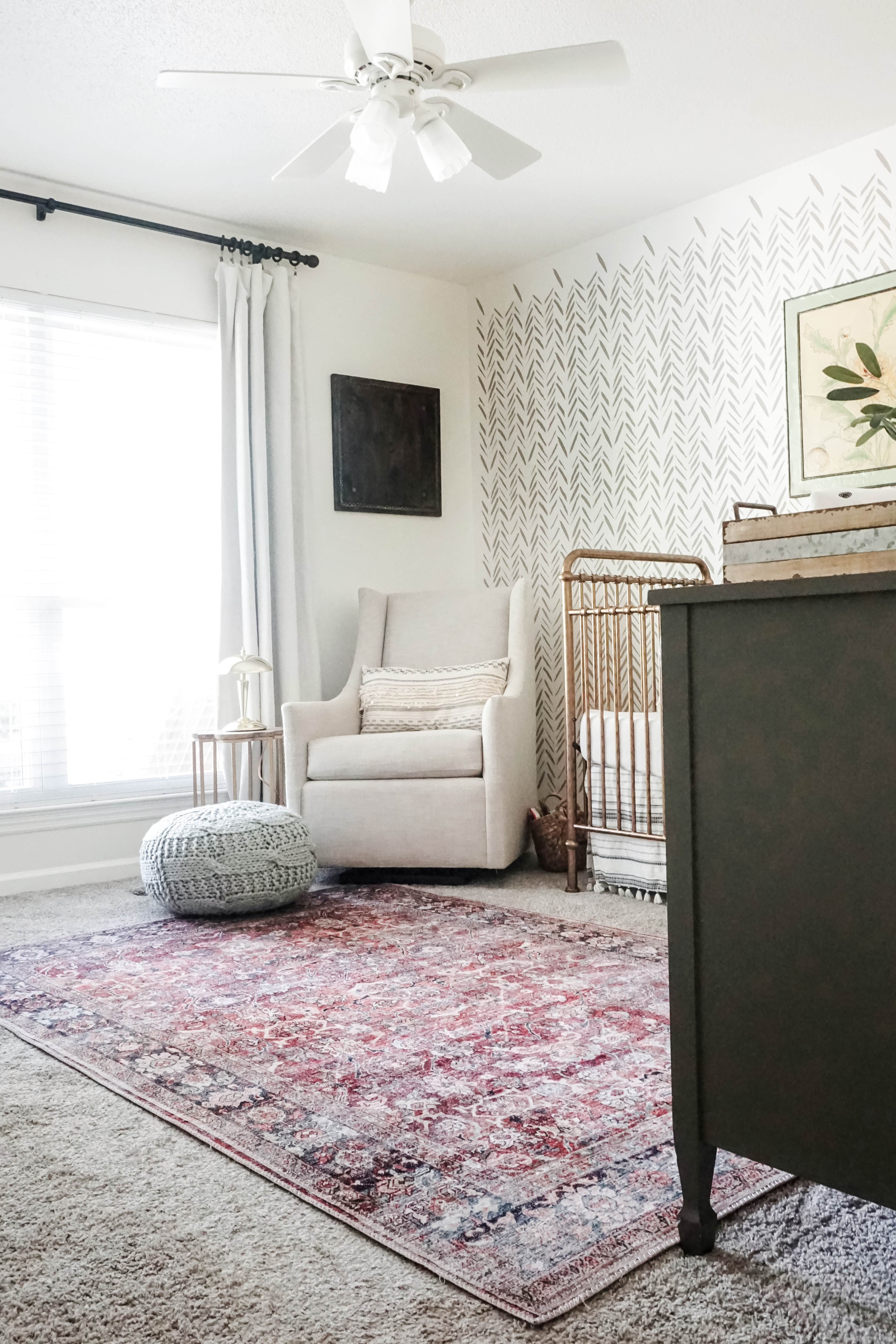
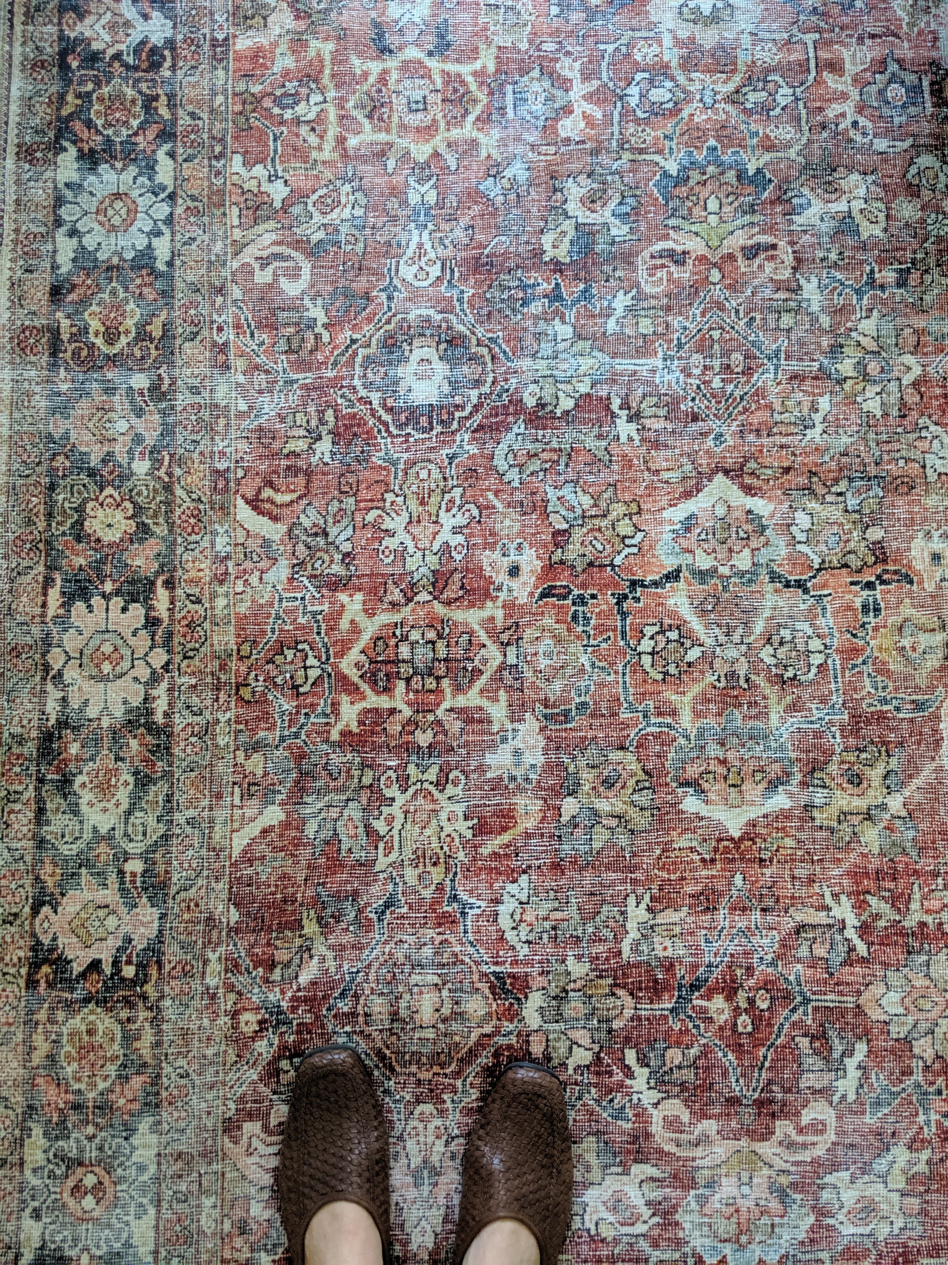
With the crib in mind, I wanted a rug that would tie in the vintage feel without breaking the bank. I went with the Loloi Layla Collection in Spice/Marine. The gold undertones tied in perfectly with the crib while the spice/red pulls the art together.
I can’t say enough about these rugs. They’re soft, thick, durable, and truly looks vintage all while costing less than $120 for a 5’x7′!
Curtains
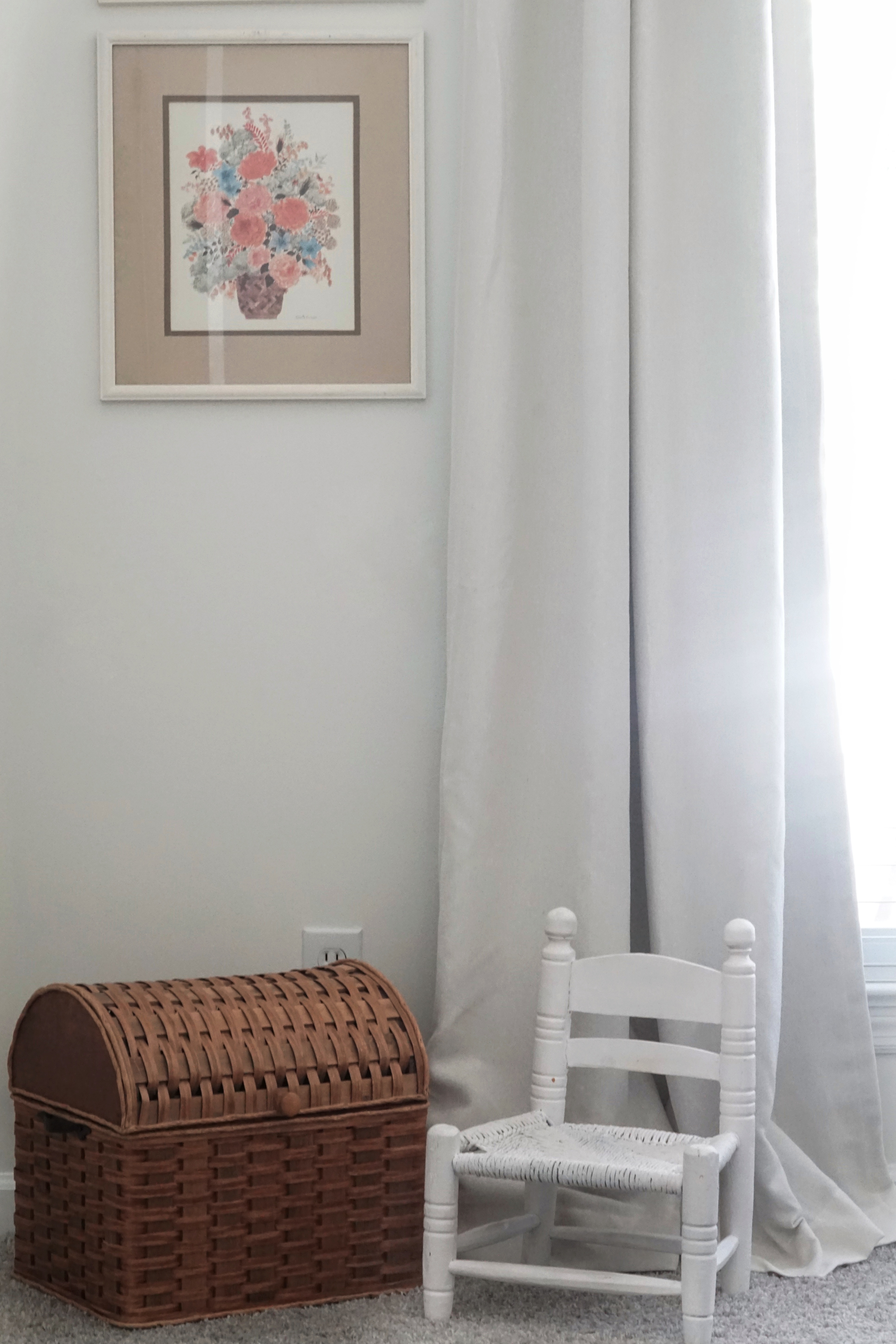
Though I originally planned on going with a charcoal or navy curtain, I ended up deciding that neutral was the best choice since I didn’t want it to steal the show from the crib or rug. Though I loved my blush blackout curtains from Wayfair and would still recommend them, I think these might be a new favorite! I found these 95″ linen blackout curtains from Target for less than $30 a panel. They’re such high quality, luxurious curtains at an amazing price. They also come in a several lengths and colors.
Art
So this is the piece that started it all: my $5 thrift store find.
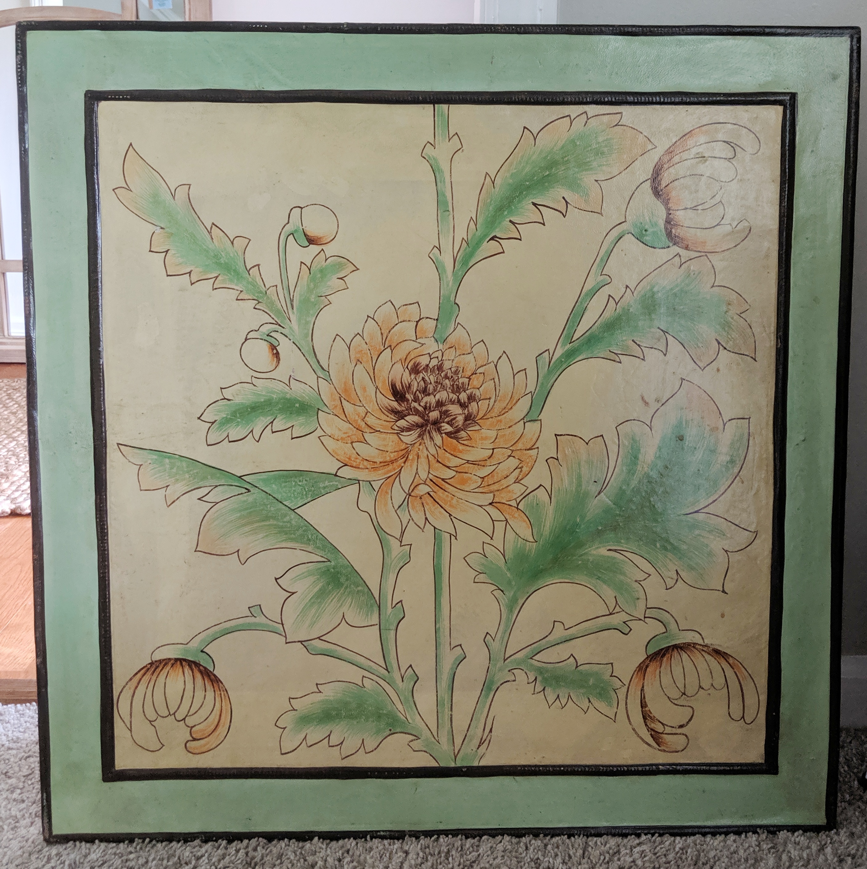
Once realizing how much I loved the look of this large floral art with the stenciled wall, I knew I wanted to base the room around it. The mint threw me off at first, but I decided to just play with the other colors in it instead since I didn’t necessarily want a mint nursery.
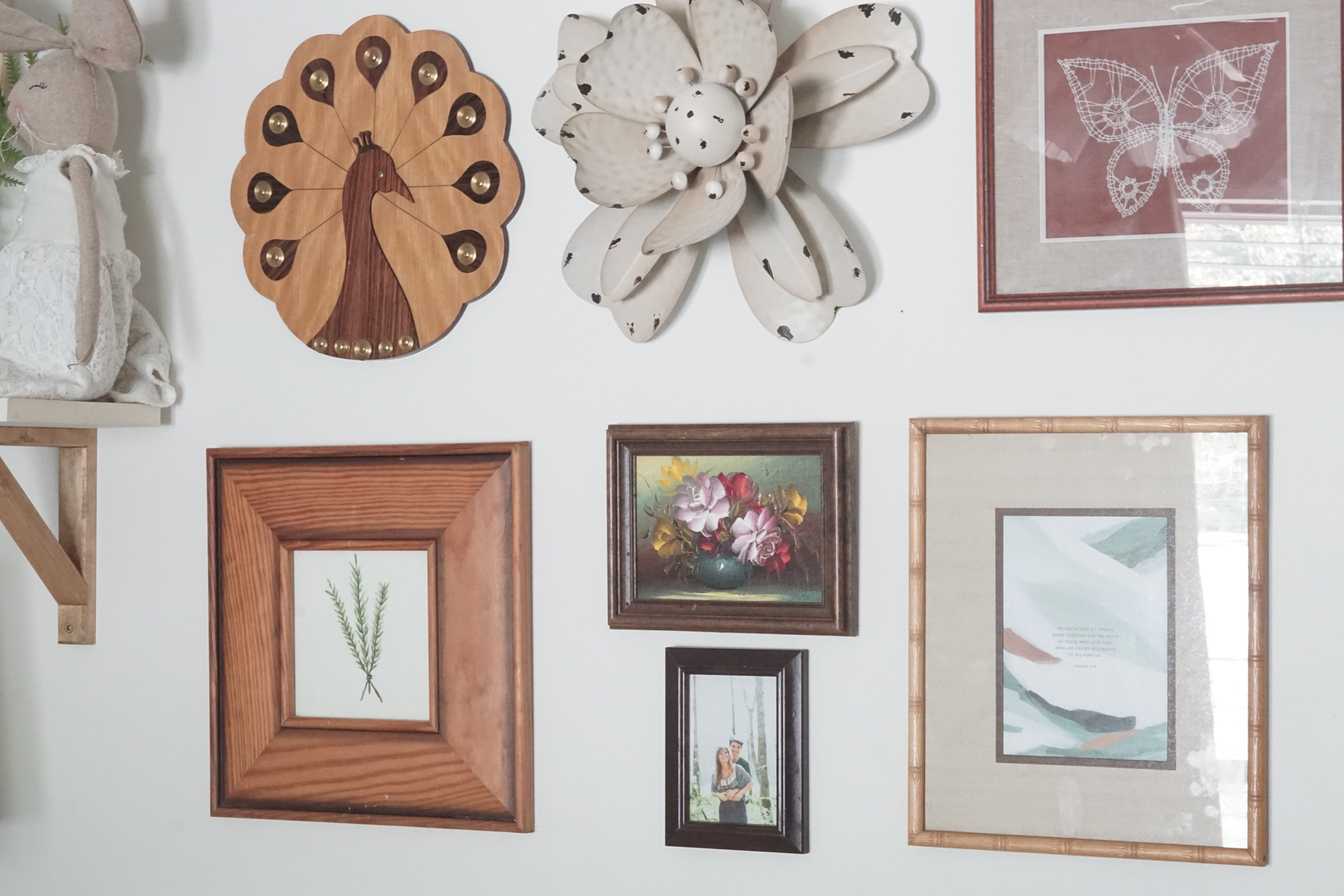
Other than that, I recreated the gallery wall by using pieces I already had and adding in a couple new thrifted pieces as well.
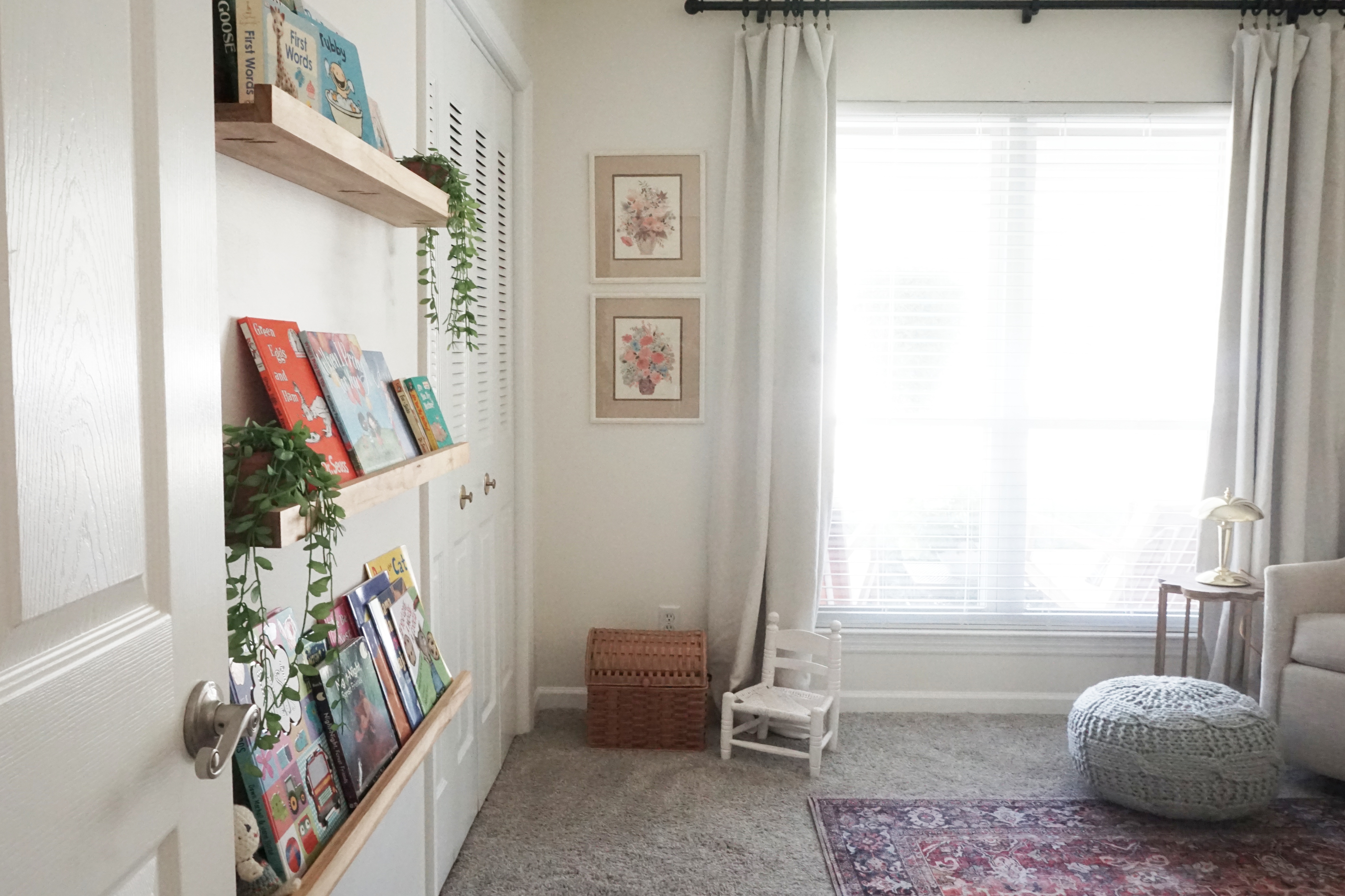
The floral prints were a yard sale find while living in Maine and have been shoved in a closet for a few years. Also the large, unique wooden piece was a thrift store find the anchors the corner of the nursery while tying in with the gold elements.
Nursery Video Tour
Sources
(Some links are affiliated for your ease of shopping.)
Crib | Million Dollar Baby
Crib Skirt | Pottery Barn
Rug | Loloi (Amazon)
Stencil | Cutting Edge Stencils
Glider | West Elm
Curtains | Target
Thrifted: Art, lamp, woven basket, and dresser
