A little kitchen insight
White kitchens fall under the category of “hot topics” for Patrick and me. I have always swooned over them, while Patrick, on-the-other-hand, has been more skeptical. He would raise the debate of white kitchens being a fad. I stood my ground and would always disagree with his argument. If you go back to your grandma’s kitchen, you’re more than likely going to see white cabinets. They are classic when it comes to kitchen design.
Luckily, Patrick lets me make the design choices, though he gives his input more than I like at times. In the case of our own kitchen, I didn’t give him a lot of space for his thoughts when choosing white cabinets. Now that they’re installed, I consider him a convert.
As you scroll through 6 of my favorite kitchens of 2016, you will notice another similarity other than all of them being white: CONTRAST. This is the key to creating a livable, inviting white kitchen. Adding an old piece of furniture or décor item, painting an island, installing a colored backsplash, or throwing in mixed metals elements are just a few of the ways to intensify charm and character to, what can be, a cold, sterile kitchen.
Keep reading to sign up for my 5 tips on how to implement the inspirations below on a budget.
Favorite White Kitchens with Contrast
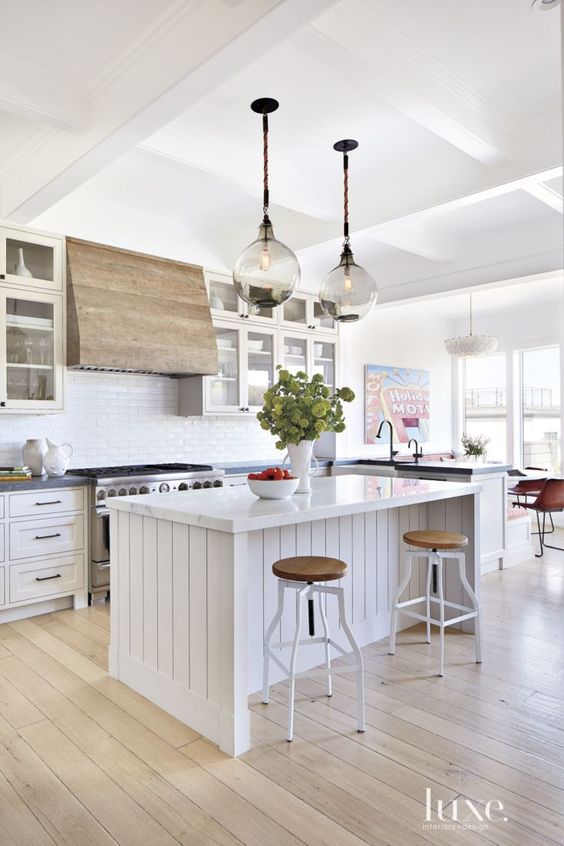
Three things stand out to me with this kitchen: the gorgeous wood range, the textured, planked island, and the smoke glass globe pendants. They each work together beautifully to create a bright, livable space that feels one-of-a-kind.
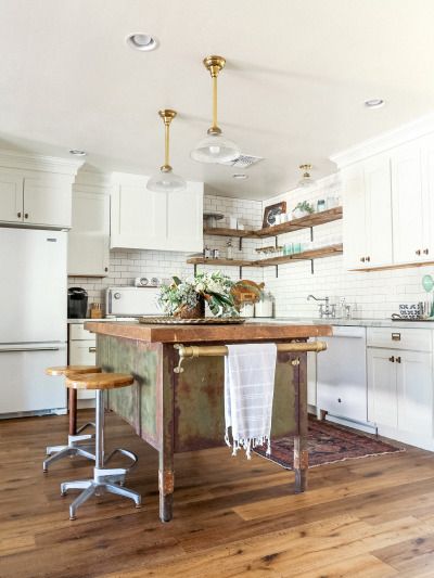
I keep going back to this kitchen. There are so many features that I adore. The brass and wood elements are amazing, but let’s just get it out of the way. THAT ISLAND! Be still my heart. It feels like it was rescued out of an 1800’s kitchen tucked away in the south of France.
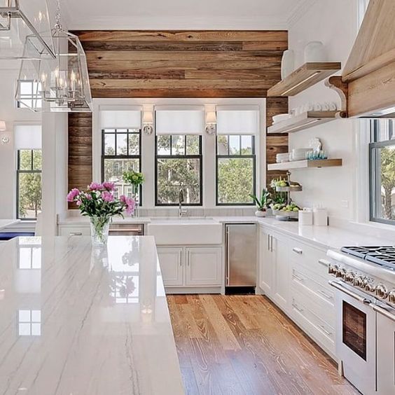
I’m a sucker for reclaimed wood and planked walls, so there was no chance I was passing this kitchen up. It has classy, sophisticated white cabinets, stainless glass lighting, and marble countertops with the rustic element of the planked wall with reclaimed wood, hood range, and floating shelves. The inspiration of this million-dollar kitchen can easily be implemented into a budget renovation by using some creativity.
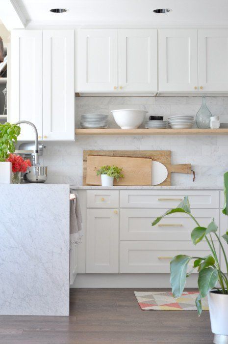
I drew tons of inspiration from this kitchen when designing my own. Three aspects that I clung onto were the white, shaker cabinets, under cabinet open shelf, and touches of wood and green elements. These cabinets came from the RTA Store, which is a great alternative to IKEA.
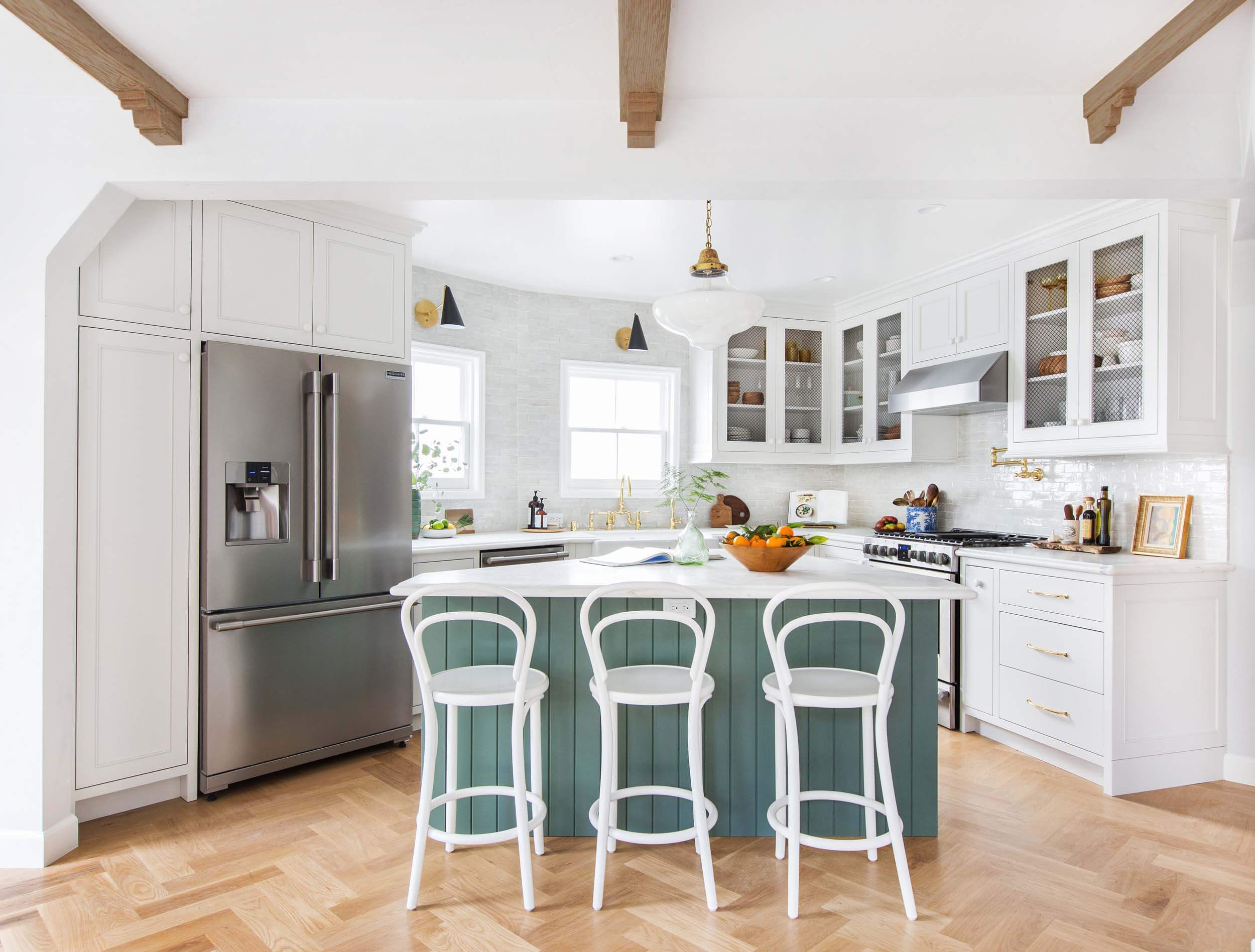
One of my newest design obsessions is Emily Henderson’s newly remodeled kitchen. She’s one of my favorite designers, so of course I think she’s done so many things right with this kitchen. One being that stunning teal island. It’s just a prime example of how thoughtful elements with pops of color make a white kitchen feel warm and inviting. She labels it as English Country, which doesn’t necessarily come to mind when I see this kitchen, but no matter what you label it, it’s gorgeous!
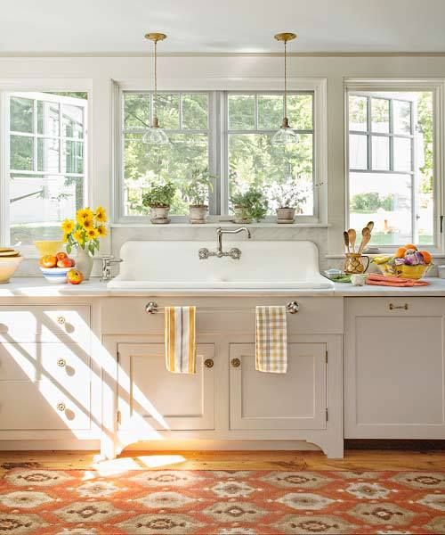
Don’t you just want to grab a cup of tea with your best friend and stay a while? I can just picture myself doing dishes with a stretched smile while joyfully gazing out the wall of windows. Okay, back to reality. This kitchen has a completely different feel from the ones above, but those farmhouse touches are near-and-dear to so many of our hearts, am I right? The farmhouse sink with inviting hints of warm yellows and oranges make this white kitchen stand out from the rest.
Implementing These Looks on a Budget
If your dealing with some serious kitchen envy and wish you had a kitchen like one of these, consider adding these affordable, DIYable elements:
