I definitely think I’ve found my passion, my sweet spot.
Nurseries and Kid’s Rooms
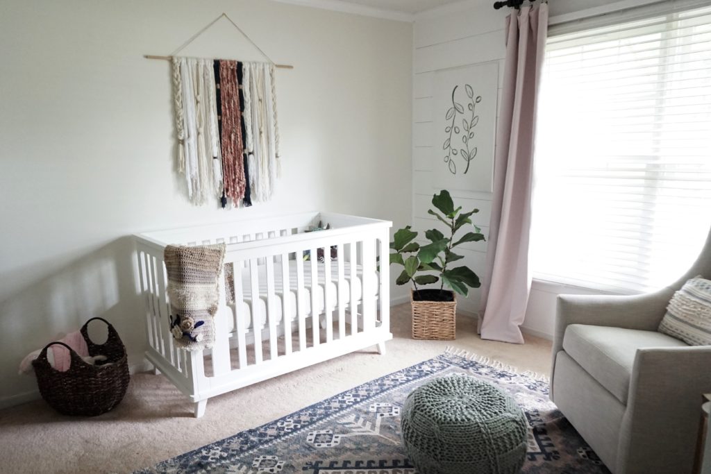
Designing Olive’s nursery was my favorite room I’ve ever done. I loved that I could add pops of color and quirky elements without it being too weird. (Not that I’m opposed to weird in any room.) I saw it as an opportunity to create a space for my child to not only explore, learn, and grow, but to also feel safe and comfortable.
After taking a few weeks off to take care of my family and myself, I had time to reflect on the direction I want to take this blog. Though I’ll still be doing several DIYs, round-ups, and renovations, I want to focus a lot more on spaces for babies and kids. So, today I want to share my design board for if I had a sweet baby boy instead of a girl.
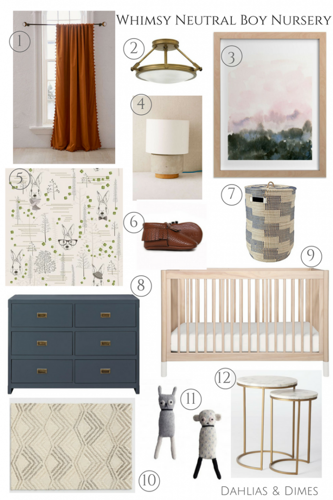
1 | 2 | 3 | 4 | 5 | 6
7 | 8 | 9 | 10 | 11 | 12
Some links are affiliated for your shopping convenience.
It was almost a year ago when we first learned that we were having a girl. I went into the ultrasound with a gut feeling that it was a boy. I had dreams that I was having a boy, and I was nearly convinced that I was going to be a boy mom. But I was wrong! The fact that we were having a girl scared both of us at first, but I wouldn’t have it any other way now. God truly knew what He was doing when He blessed us with a sweet baby girl.
You can read about my husband’s feelings on having a girl here.
Design Features
Wallpaper and Art
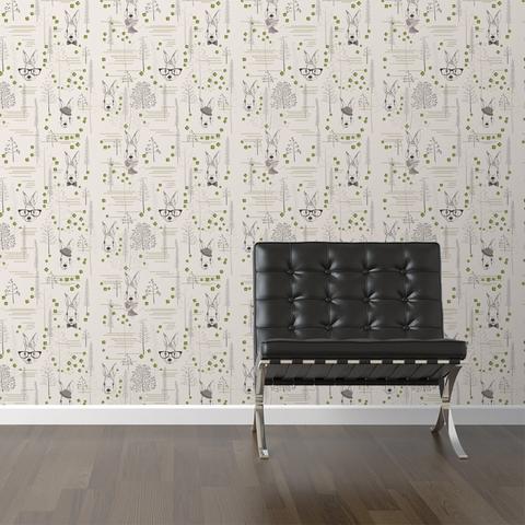
Yes, wallpaper. It’s a trend here to stay a while, so jump on board! If you can’t commit to paper glued on your wall like me, then Walls Need Love is perfect for you! They have removable wallpaper that’s easy to apply and removes clean. There are so many designs to choose from. You can go bold or subtle. Either way, it adds color and texture to a room in a beautiful way.
I would apply this rabbit print on the crib wall and paint the rest of the walls an off white like Swiss Coffee by Benjamin Moore.
To stick with the natural theme, this print from Minted adds a pop of color and will grow with the baby or can be used in many other rooms. Think versatility when choosing art for a nursery.
Lighting
I see so many people skipping on lighting, but it adds so much dimension to a room. This light from House of Antique Hardware is perfect for bringing the brass element from the dresser all the way up to the ceiling.
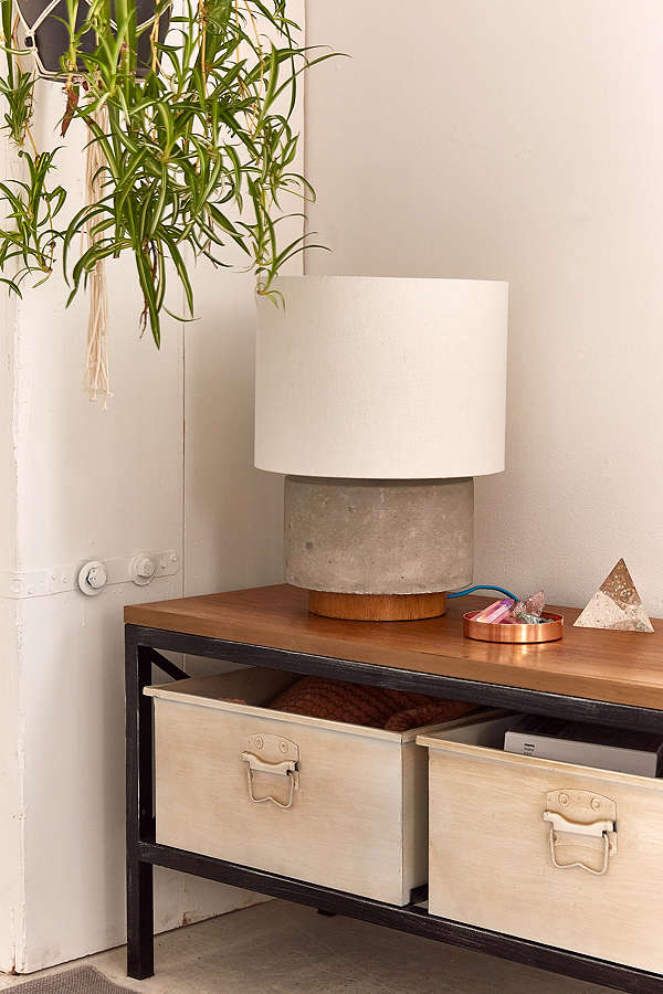
Every nursery needs a good lamp. The last thing you want to do is turn on the bright overhead light in the middle of the night to feed your baby. This lamp from Urban Outfitters is a little out of my price range for lamps (check out where I buy my lamps here), but I absolutely love it. There are so many rooms I’d like to use that lamp in my home now.
Windows and Floors
Curtains and rugs are the areas you can really add a pop of color and pattern. They can be the focal point of a room or the grounding feature.
For a nursery, you will either want blackout curtains or a blackout shade. I wanted my baby to be able to sleep anywhere at first, so sun shining in the room wasn’t a concern. I promise that a baby naps so much better in the dark. It’s like she knows that it’s time to sleep since it’s dark in her room.
These curtains from Urban Outfitters are not only stylish but are blackout as well! Right now, you can take $50 off your order of $150 or more. Such a great deal for these (plus, you can throw in the lamp from above!).
I believe the rust color is currently sold out :(, but the blue ones are a great option as well!
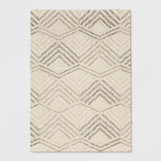
Have you checked out Target’s new Project 62 line? There are seriously some hidden gems in that collection, like this rug! It’s the perfect neutral for so many rooms, and it’s also nice and soft for the baby to roll around on. The 5×7 is less than $200!
Furniture
Crib | Dresser | Nesting Tables
For the furniture, don’t worry so much about getting a matching set. You want each piece to stand alone. This rule of thumb is true for any room. I wanted to tie in the natural wood, brass, and navy elements throughout the space, so each piece coordinates but showcases each element by itself.
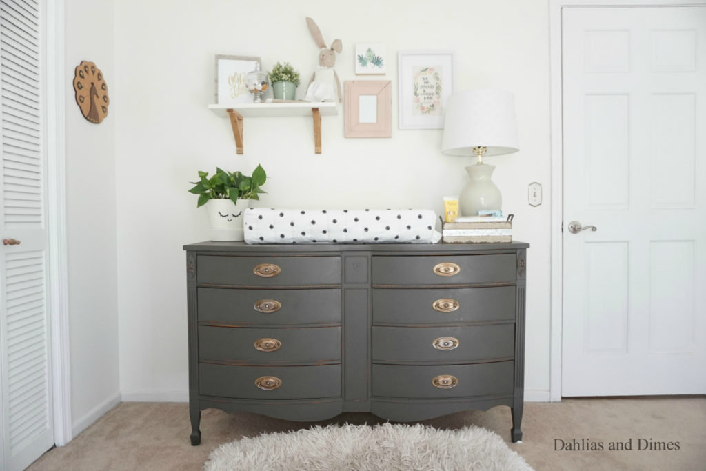
Check out how I refinished a thrifted dresser for Olive’s room here.
Accessories
Basket | Shoes | Stuffed Animals
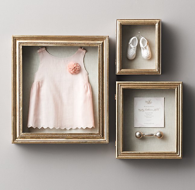
All of the “extra” elements in the room is where you can let your personality shine and get personal. Every nursery needs a good basket…or three, all the sweet baby shoes, and shelves of unbreakable accessories. I have a pair of Sweet n’ Swag’s Moxfords for Olive, and I adore them. It’s so sweet to showcase personal baby items throughout the space such as shoes, newborn gown, or unique rattle or stuffed animal (photo above).
I’m looking forward to showcasing many more nursery and kid’s room design boards around here. If you have any questions or would like some help on your nursery or big kid’s room, I would absolutely love to help! Reach out to me any time. I love hearing from you guys!

See Olive’s nursery reveal here!
 via
via