It feels as though I’ve touched nearly every space in my house except the one you see when you first walk in the door. This project has been a long time coming, but after a year-and-a-half in our home, the entryway is finally getting some love!
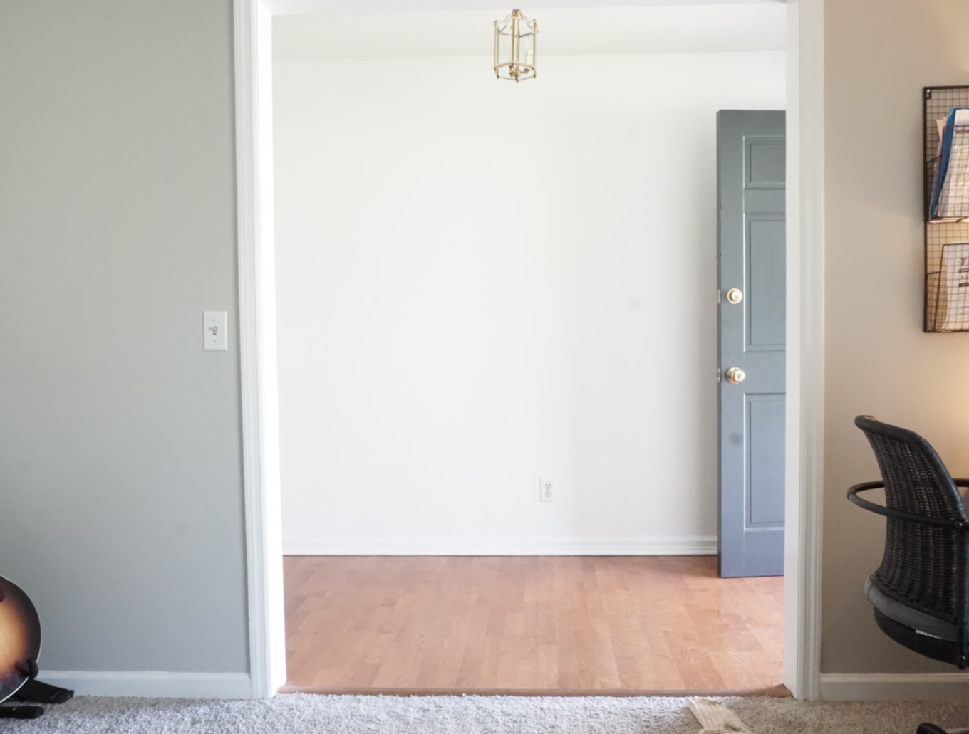
So many changes are coming to this space, and it’s so needed. It’s the first thing seen when family and friends walk in the front door.
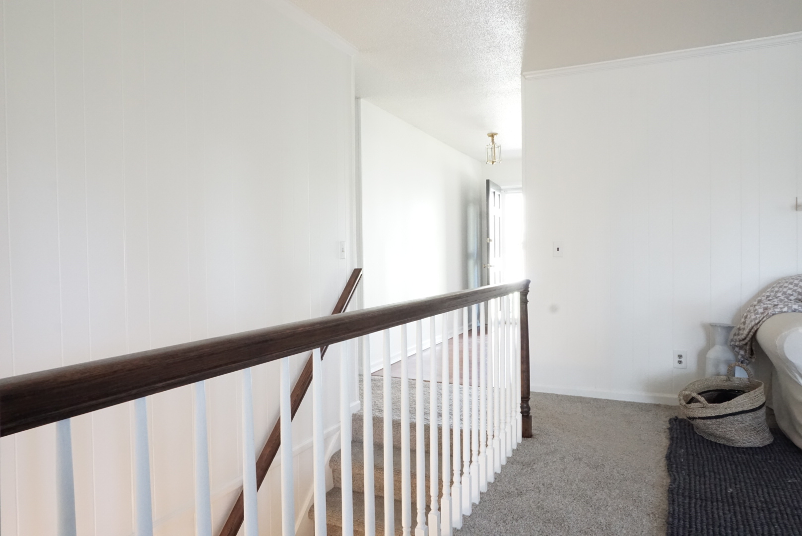
The walls are white and bare, no a single thing on the walls, I just recently added a jute runner, and the light fixture has been here no less than 25 years. Now that we have another baby on the way, this space needs to get done now before it gets placed on the back burner for another 2 years!
The Inspiration
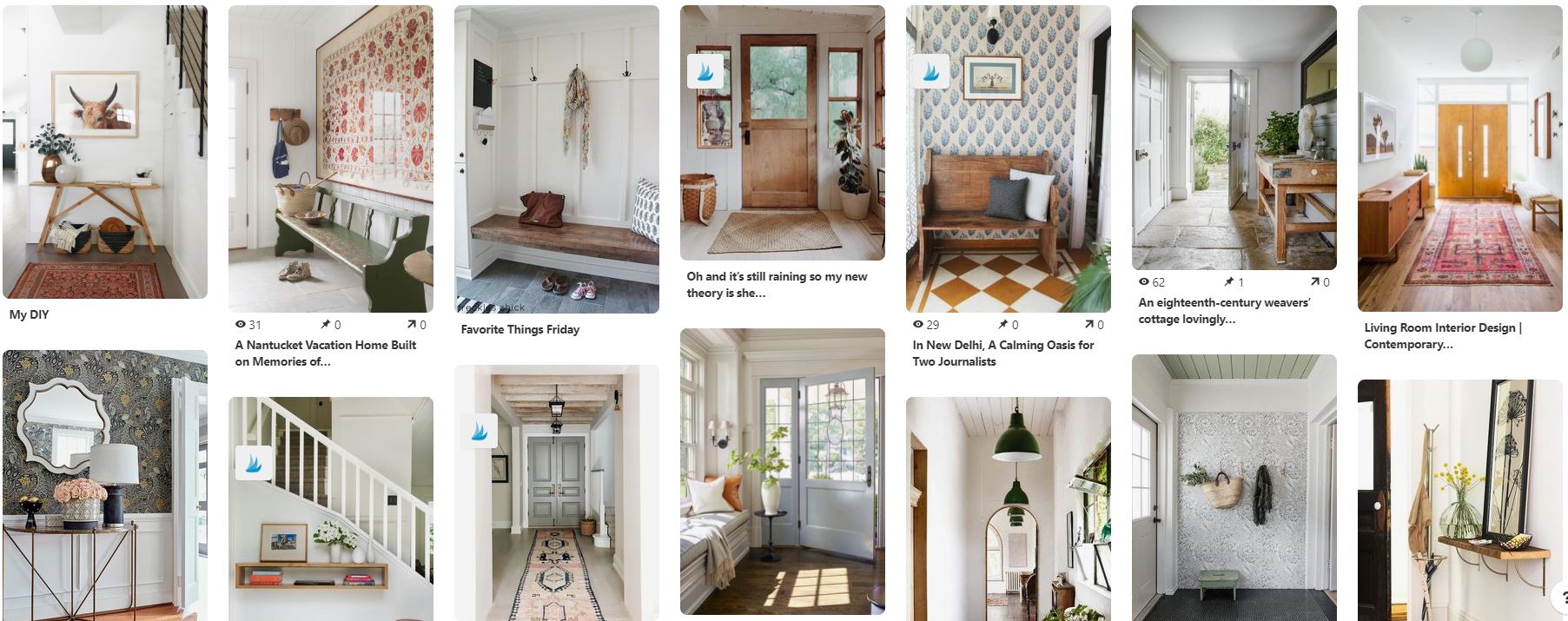
For starters, here’s a peak at my inspiration. It’s just a snapshot of my Pinterest board. Go check out the full board for what’s been going on in my brain lately.
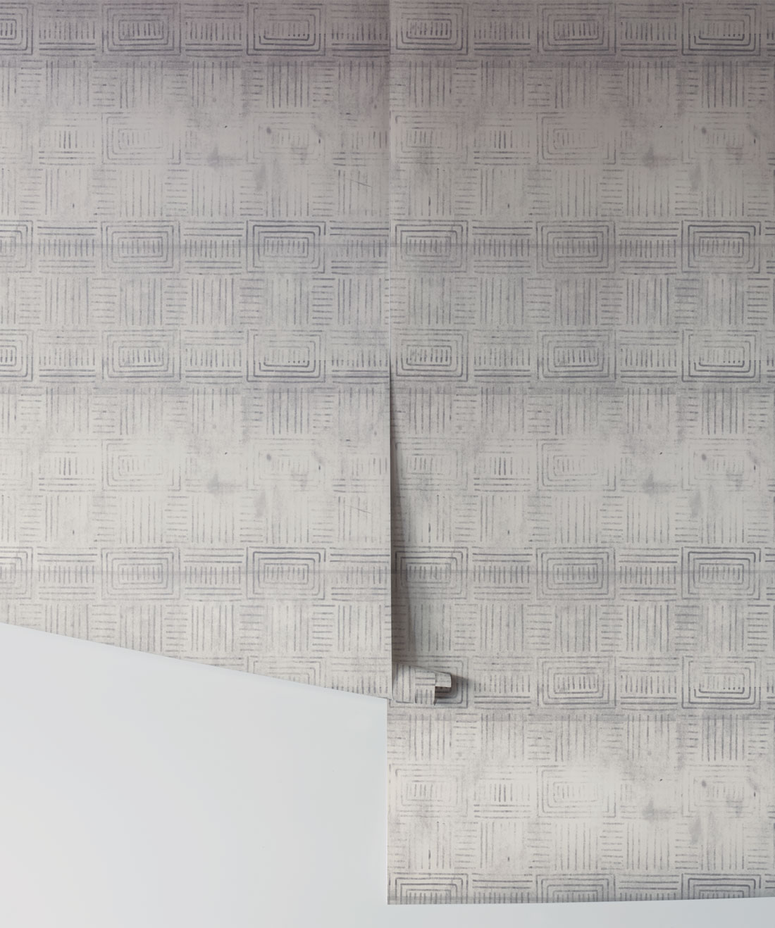
Also, I can’t talk about inspiration without mentioning the one piece that ties the space and the rest of our home together: THE WALLPAPER!
I was looking for a subtle pattern with dark blues/grays to tie into our main floor living space. This print from Milton & King hit the spot! I’ve used their wallpaper once before in our breakfast nook, and I just love so many of their designs. This time around, I’m using their removal wallpaper. It’s basically like a big sticker. I’ll let you know how the installation goes!
The Design
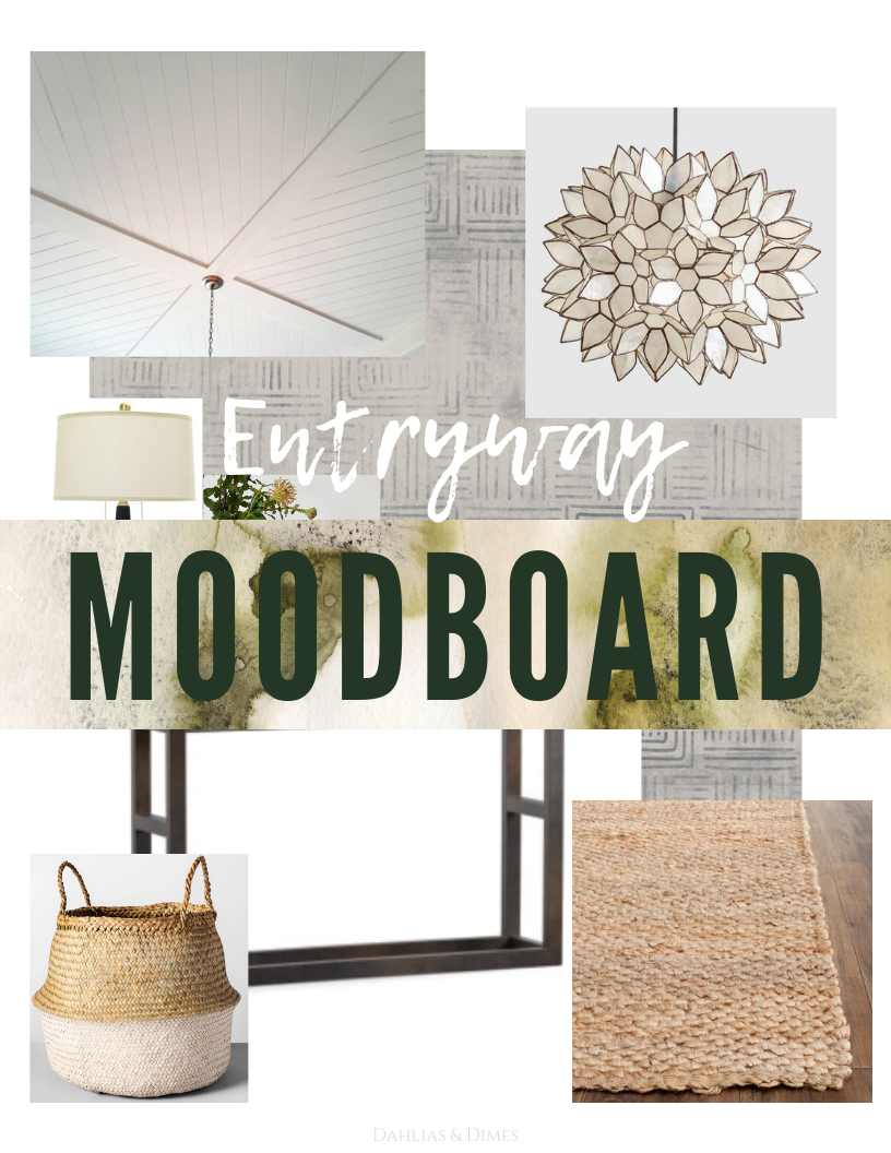
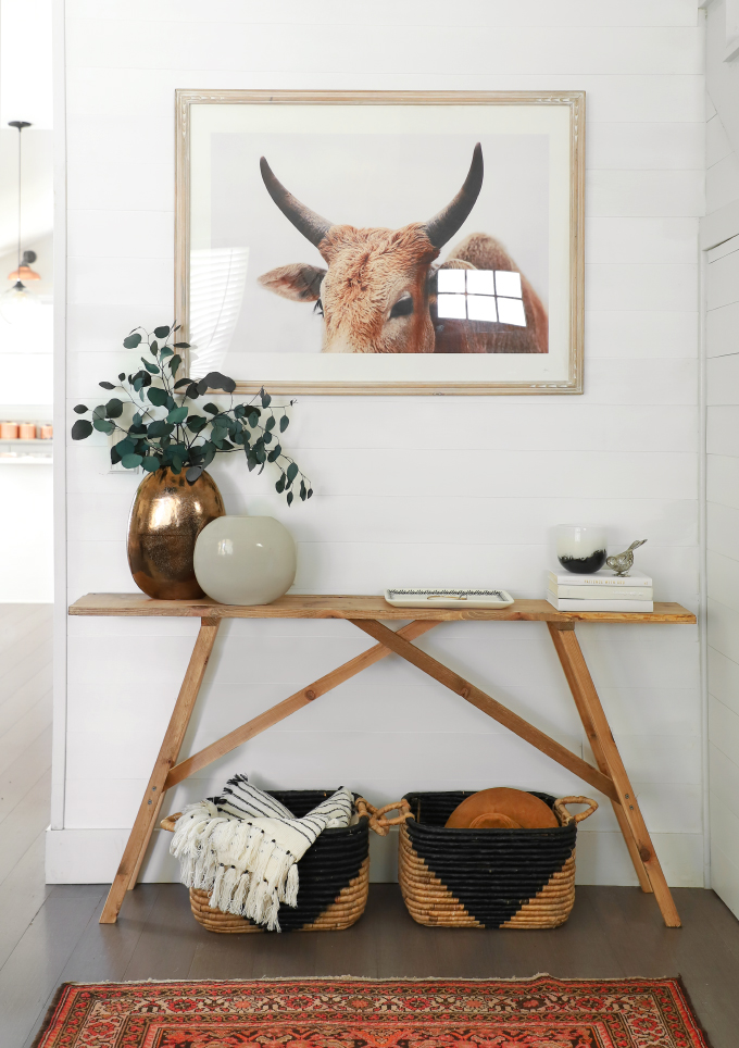
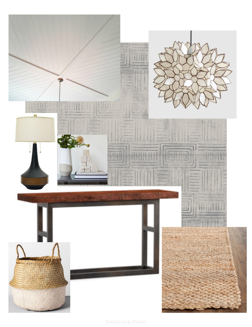
Here’s the design I’ve come up with for our space. It’s several minimal, neutral elements with tons of texture and a pop of color and pattern.

1 \\ Planked Ceiling 2 \\ Wallpaper 3 \\ Pendant 4 \\ Lamp 5 \\ Vases 6 \\ Table 7 \\ Basket 8 \\ Runner Rug
The Details
The Ceiling
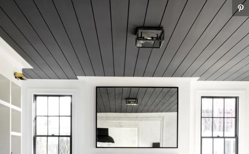
The start at the top. We have popcorn ceiling all throughout our house. You couldn’t pay me enough to scrape it off, and I love the look of a planked ceiling even more than a smooth one. So we’re going to start by planking this small space with white plank boards.
Lighting
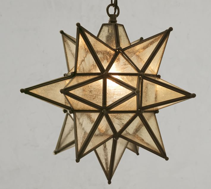
Let’s move onto the light fixture. I’ve been casually looking at new light for this space for about a year now. I wanted something eclectic and funky, yet neutral enough to carry you into the rest of the living space. World Market does lighting so well, plus, there always running sales and coupons. I chose the Small Capiz Lotus Pendant, and I think it’s going to be PERFECT for this space.
Walls
For the walls, one side of the wall leading into the office will remain Polar Bear White by Behr. It’s the color of our entire main living space. BUT on the large, blank wall, I will be adding Milton & King’s removable wallpaper in Layered Boho. (I’ll have an entire post all about why I chose removable and how to install it in a about a month.) It has just the right amount of pattern without being overwhelming and adds a depth of color to the space the coordinates so well with the rest of our home.
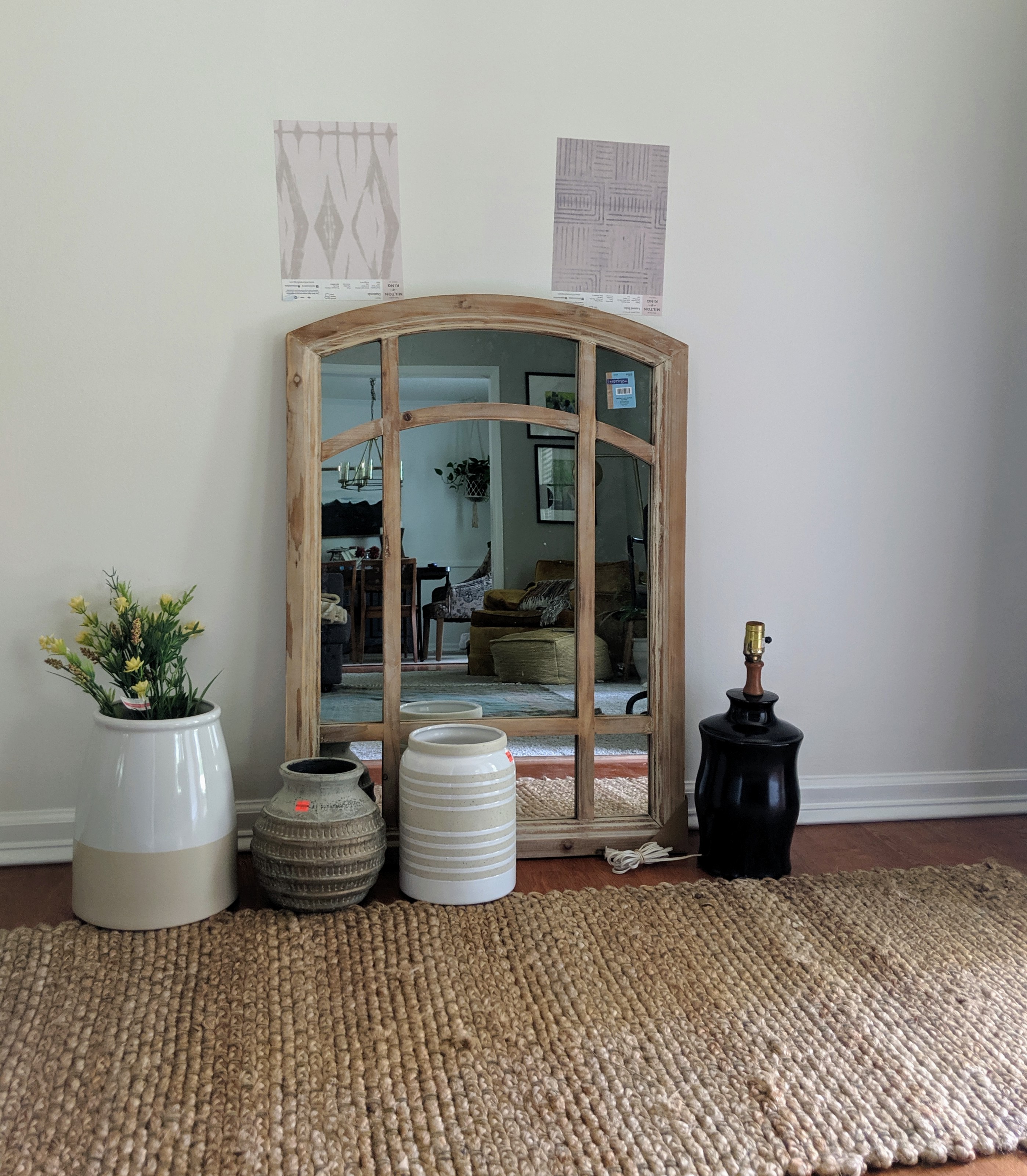
Console Table
We have already started to build a console table, which we will have to scrap because it’s just not quite right (i.e. safety reasons). I decided to build one for two reasons: 1 // MONEY, of course! 2 // Our entryway is only 4 1/2′ wide. Many console tables are way too large for this space. I need one no larger than 12″ deep in order to not crowd the walkway yet still have a space for guests to put their bag and keys. We will be using this tutorial from I Spy DIY!
The goal is to finish this project by mid August so that I can move on to revamping the nursery for baby girl coming in November, and also creating a big girl room for my 2 year old! I have a full plate until baby comes. Bring help!
– Diana
