Our kitchen was the first and only one that I have designed so far. I had viewed many kitchens, created mood boards and Pinterest boards, but didn’t necessarily consider a few small things that would make my kitchen function well and not just look pretty. This is a “learn from Diana’s mistakes” post. I should definitely make this a series! I wanted to share a few tips to consider while designing your own kitchen.
Functional Work Space
(One Kitchen Design)
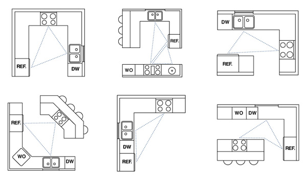
This is arguably the most important feature to remember. There are several kitchen shapes, and they each should fall into the “6’ triangle”. The triangle is the highest peak of the ergonomically desired kitchen consisting of the three most used work zones: the sink, stove/oven, and refrigerator. I will admit that we broke this rule with our refrigerator placement, but it hasn’t been an issue for us so far. You obviously need to work with the space you have, but consider having your sink and cooktop in a 3’-6’ distance for ease of prepping and cooking. Also think about which appliances your family use most often. If your family uses a microwave every day, consider working it into your functional design. For example, place it above your oven, create an open base cabinet in your island, or build it into a wall cabinet.
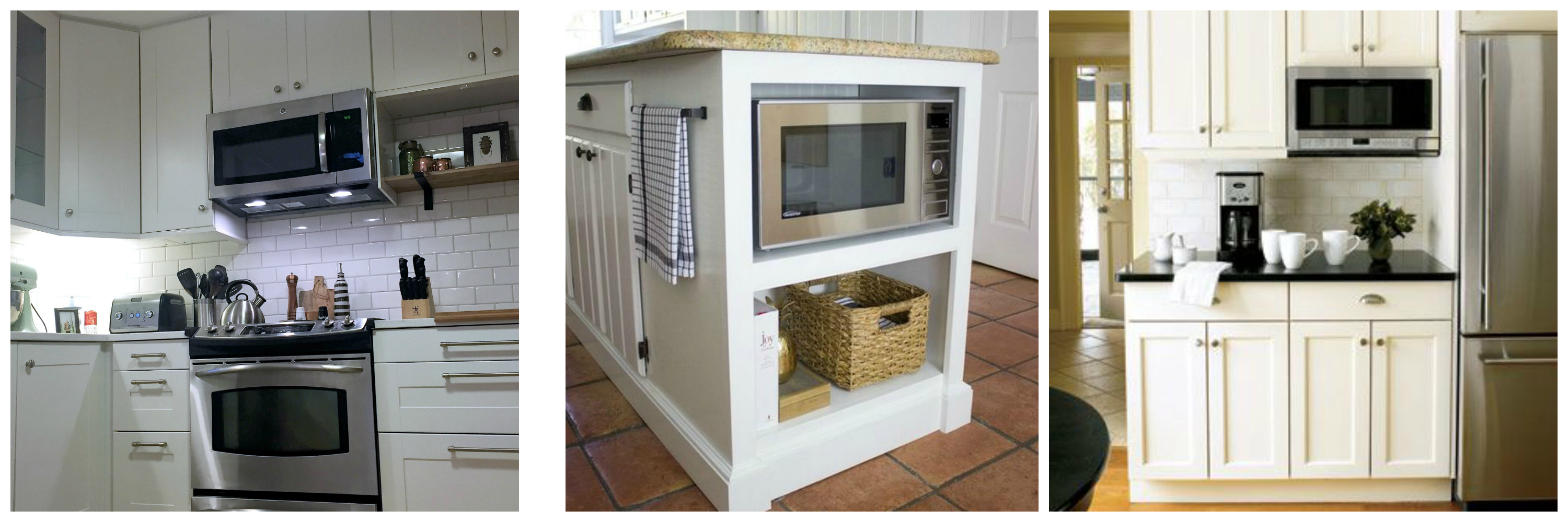
Dahlias and Dimes – Driven by Decor – Good House Keeping
Storage Solutions
Two features come to mind when thinking of storage features: deep drawers and corner solutions.
When thinking of kitchen drawers, it’s easy to consider the typical 15” drawers found in older kitchens. It’s great to have a few of these for dish towels or utensils, but also consider wide, deep drawers for pots, pans, and small appliances.
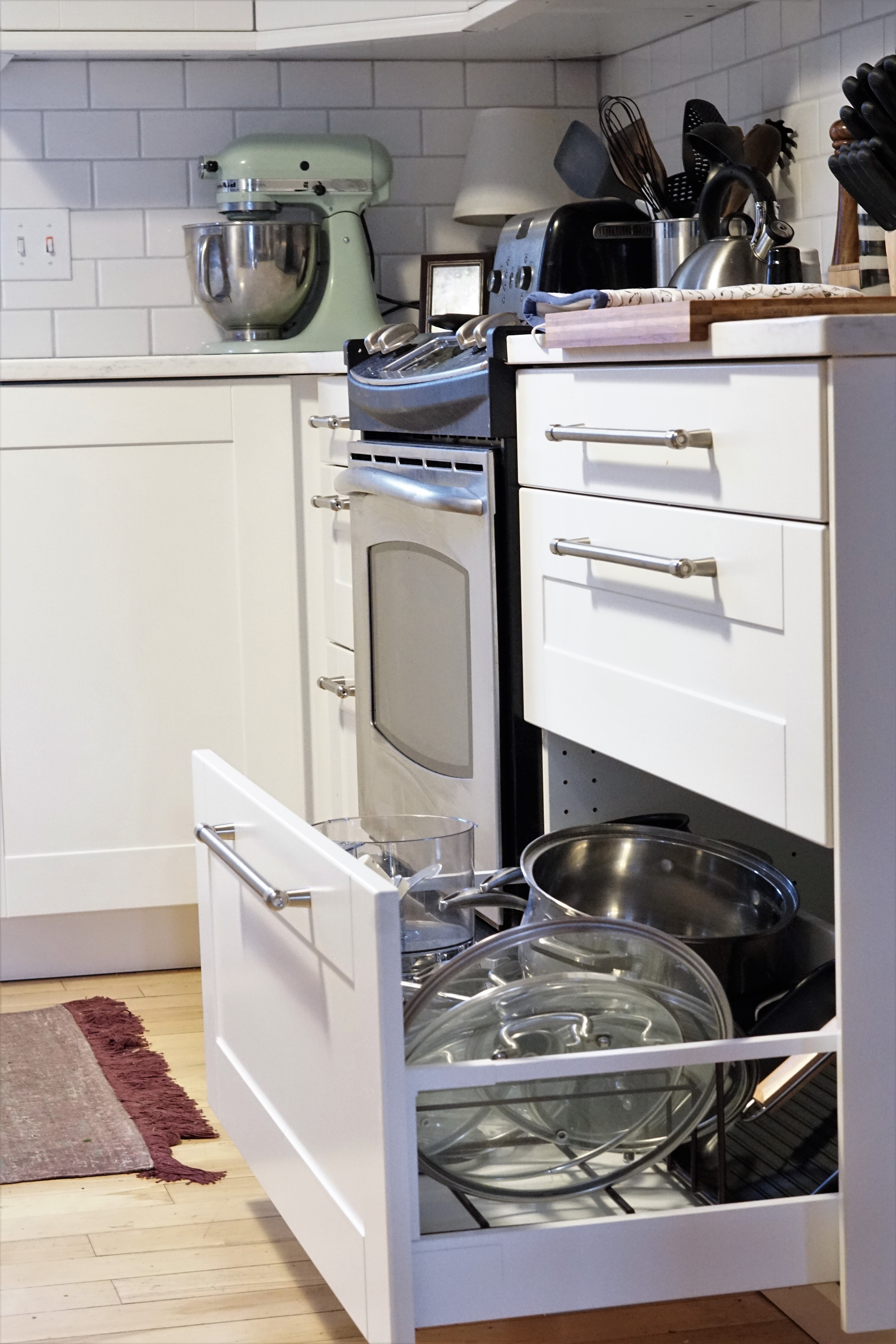
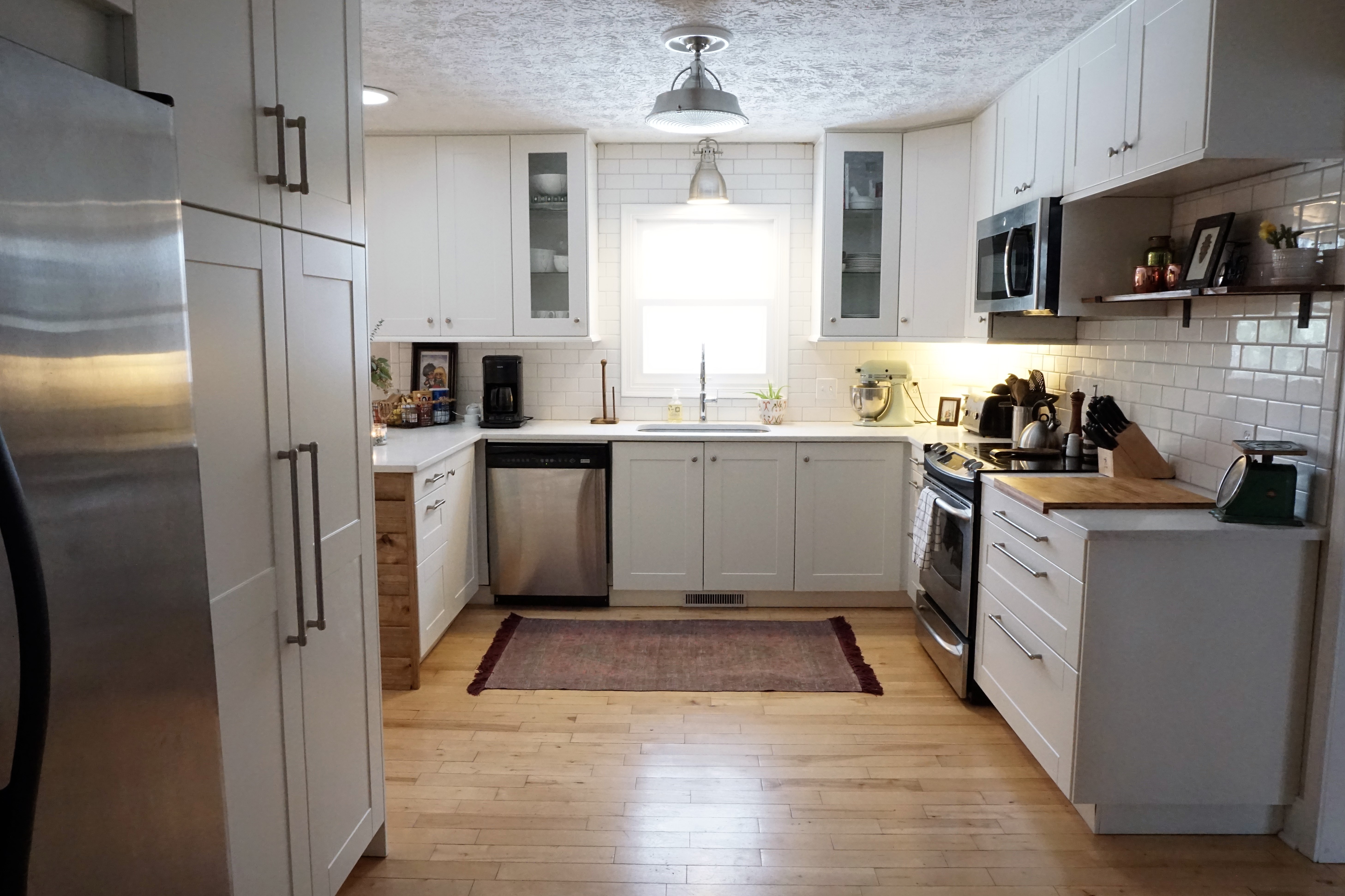
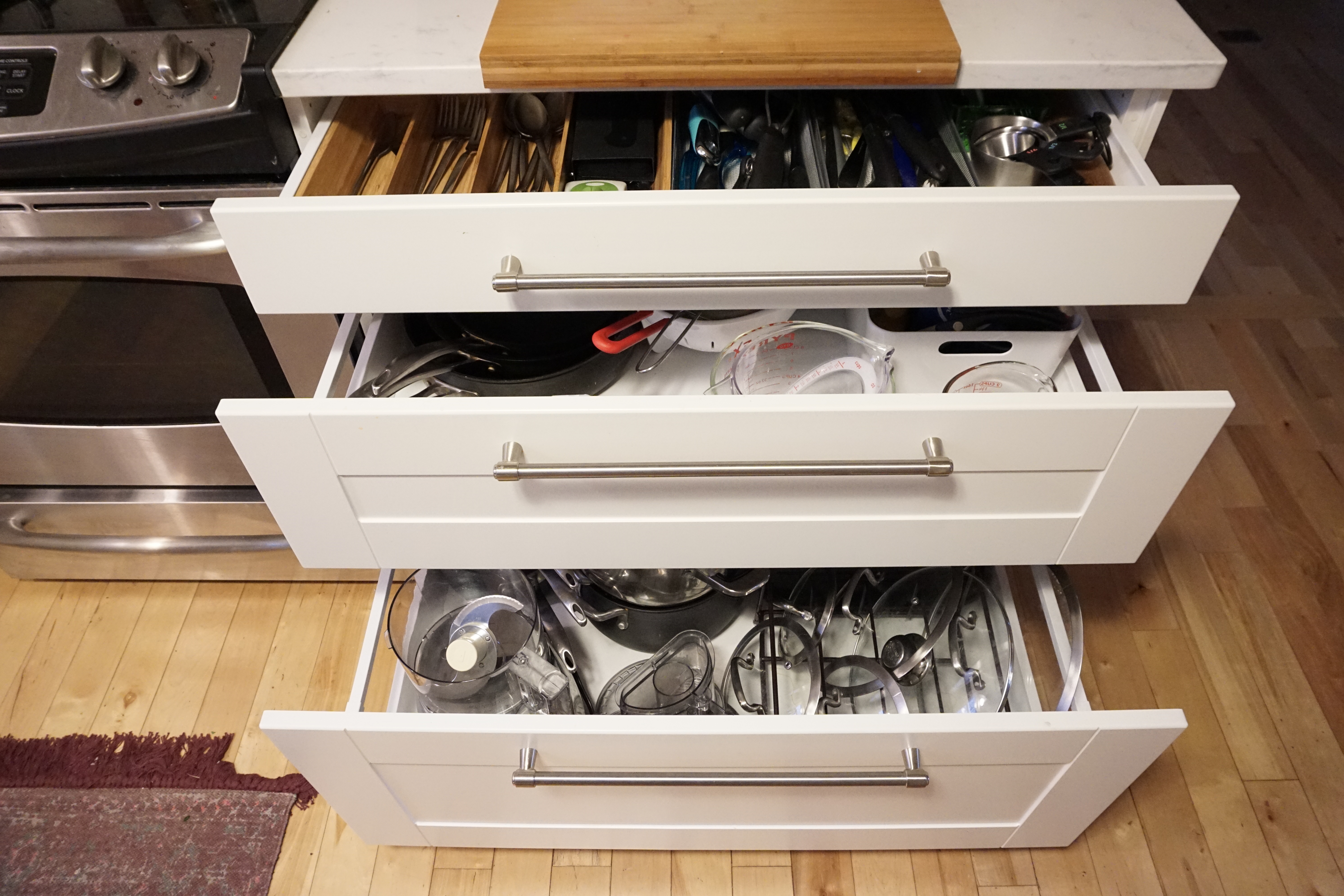
We have three 36” drawers right next to our stove, and they’re easily one of the best features of our kitchen, yet they were completely by mistake. We originally had a 15” and 24” in that spot, but we got a little overly excited when widening our doorway and didn’t leave enough space for our original plan. After days of frustration trying to figure out what to do, we learned that IKEA has a 36” option. This was the best mistake that happened. We drove 100 miles to IKEA to return our old drawers and purchase the 36” drawers. I love having a space large enough for my pots, skillets, and lids without digging into a dark, cluttered cabinet. Plus, I feel like we gained more usable space with the 36” drawer because we can use different storage solutions within the drawer if needed.
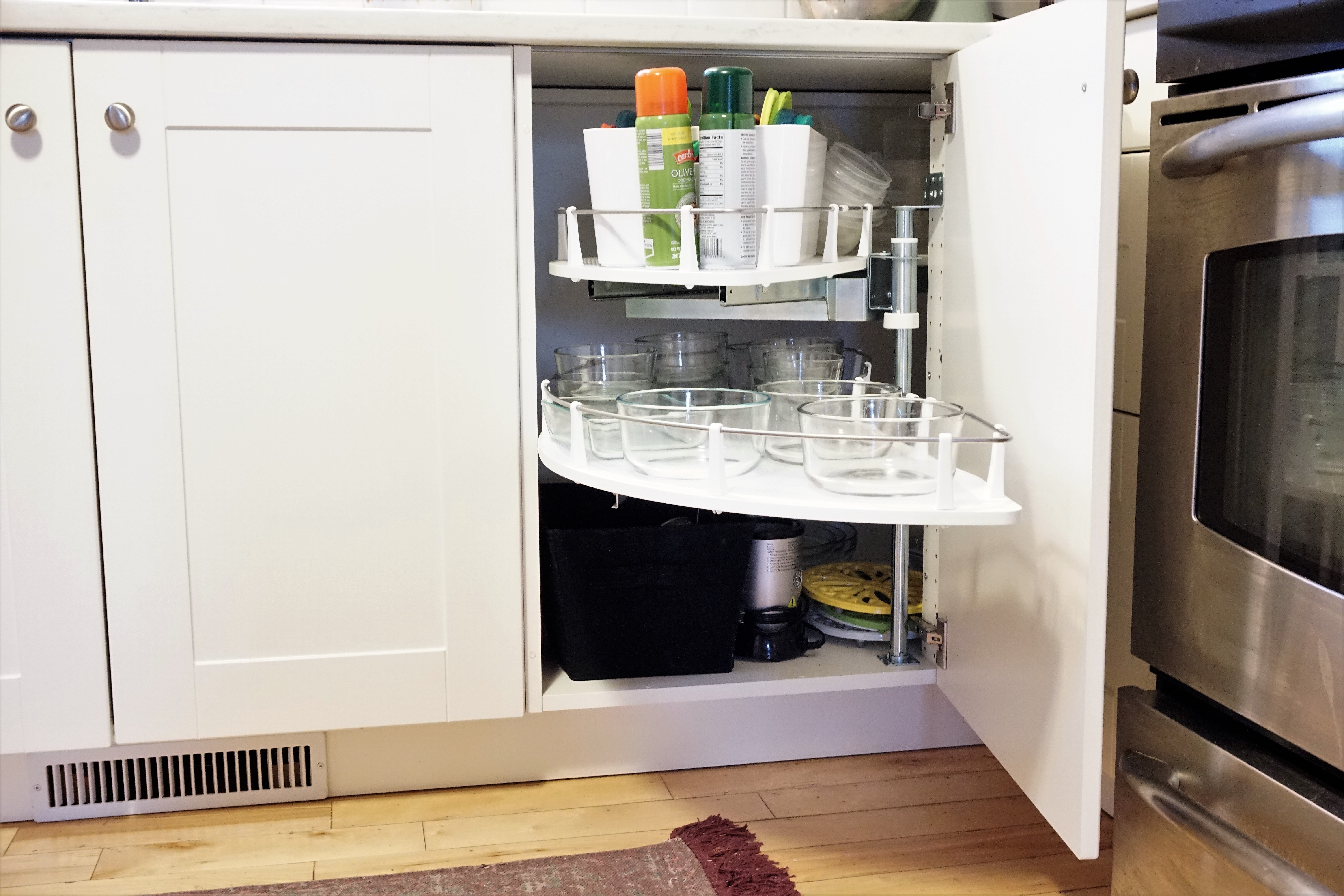
Corner solutions are also something to highly consider. If you can get away without using a corner cabinet, congratulations, you’ve really saved yourself some commonly unused space. When designing a kitchen, your goal is to use every square inch of space possible. Many companies make great corner storage solutions so that you don’t waste the space in the deep, dark corners of your kitchen. Take advantage of these products. IKEA has a great pull-out corner base cabinet that makes it easy to use a lot of the square footage in the corners.
Cabinet Height
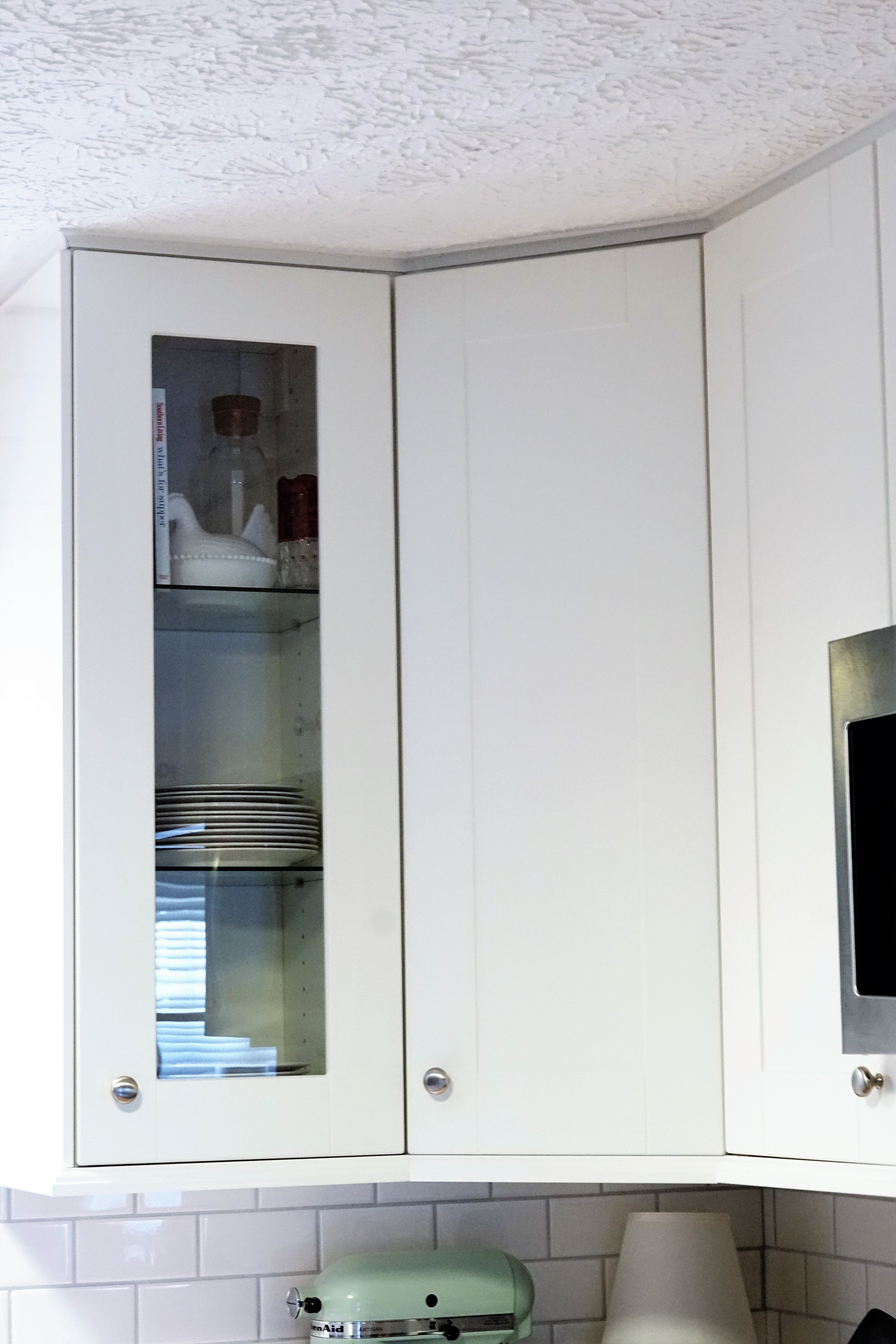
This might be a minor feature to consider, but it’s one that I wish we would’ve put more thought into. As I mentioned above, it’s important to use every square inch of your kitchen, so it only makes sense to choose wall cabinets the go to the ceiling. We have 8′ ceilings and chose 40” wall cabinets, which was our tallest option. I have two issues with this choice: I need a stool to reach the upper shelves, and I wish we would’ve had space to use a more decorative or substantial trim on top. It’s great having the extra space for items that I don’t use often, but I also don’t feel like I take advantage of it knowing I have to pull out my stool to reach those items. If you do choose tall cabinets, keep in mind that trim comes in standard sizes. You’ll want to hang your cabinets so that you’ll be able to choose a standard trim (1 ¼”, 1 ¾”, 2”, etc.). We did not consider this and only left room for a small cove piece which took heaps of caulk in several places. Let’s just say it was the last thing finished months after we finished everything else.
Trash Bin Placement
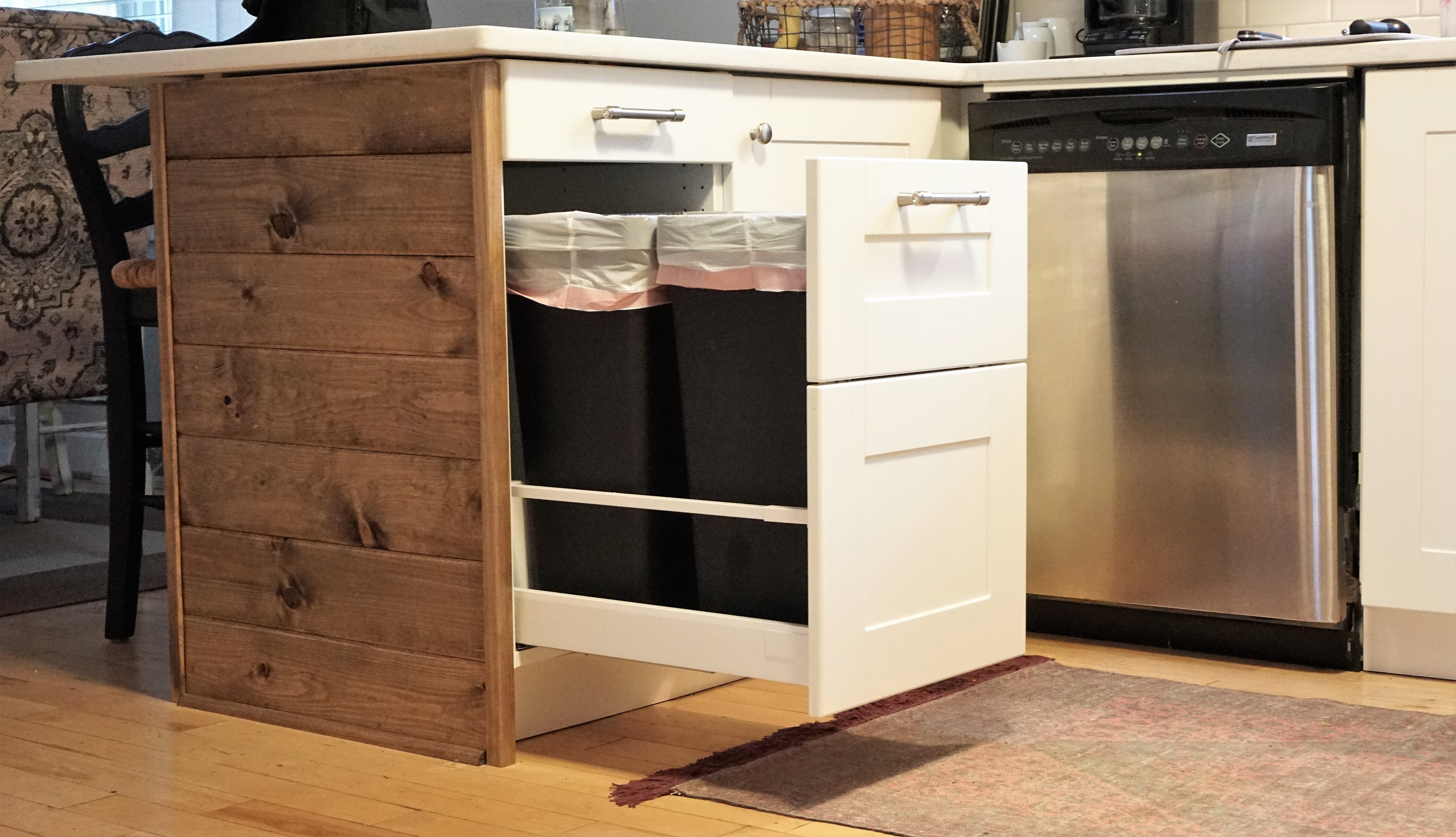
A built-in trash bin was on the very tip top of my kitchen must-haves. I despised our old white trash bin that not only took up valuable space, but it always looked filthy. I originally designed it next to the oven. It made sense in my mind at the time. Chop, cook, dispose all in one space. The IKEA kitchen specialist kindly advised me otherwise. She said that she didn’t think it was very sanitary to have smelly garbage next to your cooking zone and below your silverware. Brilliant! I, ignorantly, didn’t even think about those things. You also want to rethink having your bins under the sink if you can. I could just picture me trying to do the dishes and our future children constantly interrupting me to throw something away. We finally fit it in to the end of our peninsula, which was the best choice with our layout. All in all, it needs to be in a place away from your most frequent work zone but somewhere that is convenient for your family and guests to access.
Honorable Mentions
Soft close hinges – a pleasure for so many of your senses. They’ve spoiled us so much, we find ourselves slamming other drawers and cabinets around our house.
Undermount Sink – makes cleaning the countertop a breeze by wiping the crumbs straight into the sink. They’re also deep, which is nice when washing large pots and pans.
Spice Drawers – We didn’t need these, but it’s a great solution to fill in some unused space in your design.
There are obviously a lot more things to consider when designing your kitchen, but these were just a few things that were either important to us as we were designing our kitchen or an afterthought that we wished we would’ve included in our design initially. In the end, you need to design a kitchen that best meets the needs for your family. Think of those needs before you consider the trendy option. You’ll be thankful you did in the end.
Do you have any tips that were an afterthought in your design for future renovators?
Don’t forget to subscribe and follow us on Instagram and Facebook so that you never miss a post. We are continuing our kitchen series with several tutorials, design options, and budget saving tips, so you don’t want to miss out!
